Web Designer: User Guide
- Preface
- 1. Introduction
- 2. Prerequisites
- 3. Logging in and logging out
- 4. Browse page
- 5. Design page
- 6. Creating a new template from scratch
- 7. Creating a new template from a master template
- 8. Editing a template
- 8.1. Managing the template properties
- 8.2. Adding objects to a template
- 8.3. Editing the properties of an object
- 8.4. Editing text in a text object -
- 8.5. Editing container objects -
- 8.6. Editing Table objects -
- 8.7. Using conditional properties
- 8.8. Changing the order of objects
- 8.9. Deleting objects from a template
- 9. Working with data
- 10. Using styles and themes in a template
- 11. Multilingual templates
- 12. Application settings
- 13. Saving templates
- Glossary
Preface
Intended audience
This manual is intended for all users that need to use Web Designer to create or edit templates.
Document structure
Each chapter describes concepts and procedures for understanding how to use Web Designer for designing and editing templates.
-
Chapter 1 Introduction
This chapter describes the basic functionality of Web Designer and explains a number of essential Web Designer concepts.
-
Chapter 2 Prerequisites
Chapter 2 of this guide describes both the hardware and software prerequisites for running Web Designer.
-
Chapter 3 Logging in and logging out
The 3rd chapter of this guide explains how to get access to Web Designer and how to log out of the Web Designer web application environment.
-
Chapter 4 The Web Designer browse page
This chapter explains the layout and functionalities offered by the Web Designer browse page.
-
Chapter 5 The Web Designer design page
The 5th chapter explains the basic layout of the Web Designer design page and also explains how to select objects.
-
Chapter 6 Creating a new template from scratch
This chapter explains how to create a new template starting from a blank template.
-
Chapter 7 Creating a new template from a master template
Chapter 7 explains how to create a template on basis of an existing master template.
-
Chapter 8 Editing a template
The 8th chapter explains the techniques for editing a template and also introduces the concept of using conditional properties and text.
-
Chapter 9 Working with data
This chapter explains how to add data models to the template and use them to insert data fields in texts, properties and conditions.
-
Chapter 10 Using styles and themes in a template
This chapter explains how to use styles and themes to control the look and feel of template objects. It also explains how to preview your templates.
-
Chapter 11 Multilingual templates
Chapter 11 explains how to create multilingual templates i.e. templates that have text objects with text expressed in multiple languages.
-
Chapter 12 Application settings
The 12th chapter explains how to add and use application settings.
-
Chapter 13 Saving templates
This chapter explains how to save template and how to save templates as a master template.
-
Chapter 14 Glossary
The 14th chapter explains a number of frequently used terms and concepts.
1. Introduction
This user guide explains how to perform basic template editing tasks using the Web Designer application. It is assumed the user has basic familiarity with the use of a personal computer and a web browser.
Previous experience with the Sciptura Engage Template Editor will help you in getting started with Web Designer but is not essential.
1.1. What is Web Designer?
Web Designer is part of Design Studio. It is used to manage templates. Generally speaking, templates are combined with data from a data model to produce communications such as web pages, emails and/or PDF files. A simple example: a template containing fixed content such as text and images and data fields such as the name and address of a customer can be combined with a data model containing customer names and addresses. In the simplest of cases the combination of the template with a data model containing 10 customer names and addresses will result in the creation of 10 communications i.e. one per customer in the data model. So the data fields will be replaced with data coming from the data model associated with the template. The resulting communications will be a combination of the fixed content on the template and the replaced data fields.
Web Designer allows you to manage templates and supports the following template related activities:
-
Creating new templates from scratch.
-
Creating new templates based on a master template.
-
Creating of master templates.
-
Editing existing templates.
-
Deleting obsolete templates.
Web Designer is a web application. In computing, a web application or web app is a client–server application in which the client (or user interface) runs in a web browser.
1.2. Concepts
1.2.1. Templates
Templates are combined with a data model to generate output such as web pages, emails and/or PDF files.
A template can contain both static elements such as the logo of your company and data fields for dynamic elements such as the name and address of the addressee.
After associating a data model with the template, the template’s data fields are replaced with actual data such as customer names and addresses to generate communications that are to be sent to the addressees.
Templates support multilingual content. This allows you to define for example a French, an English and a Dutch text to be integrated as content in one text object. During the merge of the template with the data in the data model, one would either use the French, English or Dutch text depending on for example the preferred language of the person to whom you are sending an email. This feature saves you from having to create three templates: one template with French content, one with English content, and a third template with Dutch content leading to an increased risk for inconsistencies and increased template maintenance effort.
1.2.2. Tags
Apart from properties of a resource (template | content block), the Design Studio also supports adding extra information to a resource in the form of tags which could contain additional meta information, for example, department (marketing, finance,..), a short description of the resource, or just a keyword to help template designers categorise and quickly find the resources of interest. The Design Studio supports:
-
Defining tags label and tag value list through the WebDesigner Application Settings (refer to section 12.2).
-
Selecting/ Adding tag value while creating or editing a resource.
-
Restore tag labels & values when uploading a resource that contains tags to a working project.
1.2.3. Styles and themes
Styles allow you to manage the look and feel of the content included in your template. A style can for example control the font characteristics and the sizing and positioning of images used in the template. In addition to this, styles can optionally also insert content in your template such as a company logo or a standardized company footer. Content introduced via the application of a style cannot be removed from the template through Web Designer. Styles are grouped into themes and themes have to be registered before they are made available for use in Web Designer. Style and theme development and registration is done outside of Web Designer.
1.2.4. Objects
A template can contain different types of objects.
Web Designer supports the following built-in object types:
-
Text objects: the content of a text object can be static, dynamic (i.e. data fields) or a combination of both.
-
Image objects: an image object inserts an image in the output. Web Designer can use all image types supported by your browser.
-
Container objects: a container object holds one or more other objects. A container object is used to group a number of other objects.
-
QR Code objects: a QR code object generates a QR code based upon the data, the size (in %) and the error correction level. The data itself can be static, dynamic (i.e. data fields) or a combination of both.
-
Spacer objects: a spacer object will create spacing between two other objects.
-
Divider objects: a divider will create spacing between objects with a horizontal line.
Web Designer supports the definition of additional, customer provided object types called pluggable objects. Pluggable objects can for example be used to allow you to include additional content types in your templates such as video or an image slider.
Web Designer allows you to view and change the properties of the objects included in your template. Changing the object properties allow you to influence the behavior of the objects used in the template. The properties can be managed via the Properties panel in the righthand area of the design page as mentioned in section [The Web Designer design page].
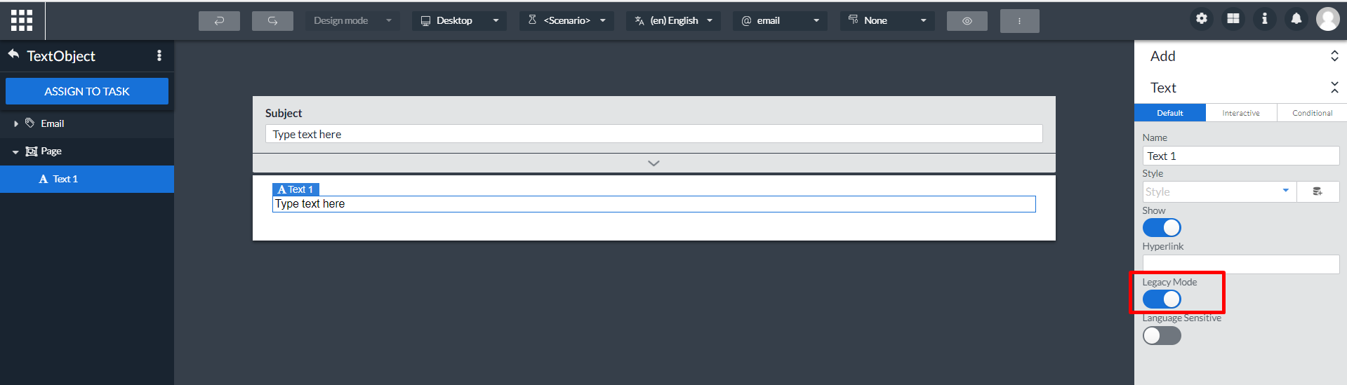
1.2.5. Text objects -
There are 2 types of text object: Legacy and Non-legacy. The non-legacy mode offers improvements, additional features and better faster output generation. You can switch between these types by selecting the existing text object in the template, then enabling the Legacy mode property for the Legacy text object and disabling the Legacy mode property for the Non-legacy text object. For more information, please preference Editing text in a text object.
|
When switching from non-legacy to legacy all of the changes introduced during non-legacy mode are lost. As a user you can easily undo this in case this is unwanted behavior. We do not advice switching from non-legacy to legacy mode. |
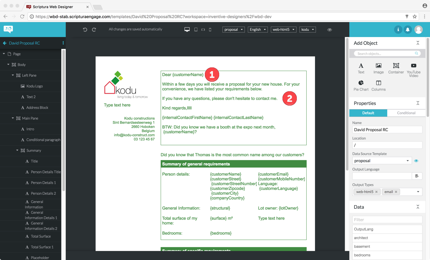
A text object can contain both static and dynamic text.
Static text is text that you enter when editing the template and that will come out without modification on the resulting communication.
Dynamic text works differently. While designing the template you can insert data fields in a text object. Data fields are easily recognized by looking for data field names enclosed in { and } characters such as {customerName}.
The data fields will be replaced when the template is merged with actual data from the data model. To facilitate template design, Web Designer supports the use of sample data sets. This allows you to substitute the data fields with sample data simulating the data field substitution that will take place during actual merging of the template and the data.
Section Editing a template provides additional details in how to work with dynamic text in templates.
| 1 | A paragraph with both static, Dear, and dynamic text, {customerName}. |
| 2 | A paragraph with static text only. |
Text objects have the following properties:
-
Name: the name of the text object.
-
Style: the style applied to the text of the text object and thus controlling the presentation of the text.
-
Show slider: a slider that controls if the text object should be shown or hidden. This property is typically used in combination with a condition. The result of the condition can then be used to control if the object should be shown or hidden.
-
Hyperlink: the web address that will be opened when the receiver clicks the text object.
-
Language Sensitive slider: a slider that controls if this text object is language sensitive or not. Language sensitive objects allow for the definition of text per enabled language.
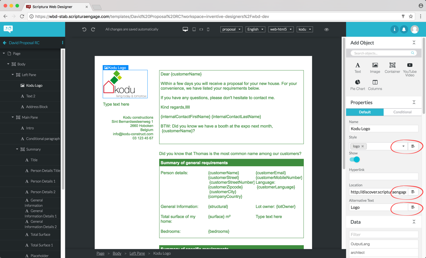
1.2.6. Image objects -
Image objects allow you to include images in your template.
Image objects have the following properties:
-
Name: the name of the image object.
-
Style: the style applied to the image object controlling the presentation of the image.
-
Show slider: a slider that controls if the image should be shown or hidden.
-
Hyperlink: the destination web address that will be opened when the receiver clicks the image.
-
Location: the web address of the image you want to show. There are different methods to point to the source of your image.
-
A http(s) URL as your source is supported in all output formats.
-
A relative path to the image (relative to the location of your template) is supported in all formats except email. In case of html, the references will stay relative.
-
-
Alternative text: a text that is displayed if the receiver cannot view the image for some reason.
1.2.7. Container objects -
Container objects are used to logically group objects. You can for example use this to easily apply a style to multiple objects without having to do this object by object. Grouping objects can also be used to document the structure of a template by defining container objects such as header, body and footer.
Container objects have the following properties:
-
Name: the name of the container object.
-
Style: the style applied to the container object and the member objects of the container object controlling the presentation of the member objects.
-
Show slider: a slider that controls if the container object and thus the member objects should be shown or hidden.
-
Hyperlink: the destination web address that will be opened when the receiver clicks one of the objects in the container.
-
Repeat: repeats the container for each element that matches the repeat query. See Repeating objects.
1.2.8. QR Code object -
QR code objects allow you to generate QR codes in your template.
QR code objects have the following properties:
-
Name: the name of the QR code object.
-
Style: the style applied to the QR code object controlling the presentation of the QR code.
-
Show slider: a slider that controls if the QR code should be shown or hidden.
-
Data: the data that needs to be encoded in the QR code. This data can be static, dynamic (i.e. data fields) or a combination of both.
-
Size (px): the height and width of a QR code. A QR code must always be a square so they cannot be changed seperately.
-
Error correction level: It’s possible to read a QR Code if a certain amount of it is unreadable. The level of error correction determines how much of the code may be unreadable without losing the ability to read the original data. Raising this level improves error correction capability but will also raise the amount of data inside the QR Code. There are four levels to choose from: Low, Medium, Quartile and High.
1.2.9. Spacer object -
Spacer objects are used to create spacing between objects.
Spacer objects have the following properties:
-
Name: the name of the Spacer object.
-
Style: the style applied to the Spacer object controlling the presentation of the Spacer.
-
Show slider: a slider that controls if the Spacer should be shown or hidden.
-
Height (px): the height of the space between two objects
1.2.10. Divider object -
Divider objects are used to create spacing between objects, with a line separating them.
Divider objects have the following properties:
-
Name: the name of the Divider object.
-
Style: the style applied to the Divider object controlling the presentation of the Divider.
-
Show slider: a slider that controls if the Divider should be shown or hidden.
-
Height (px): the height of the space between two objects
-
Line Position (%): the position of the horizontal line. This only has an effect when the Divider option was selected.
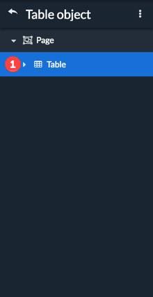
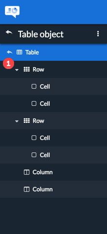
1.2.11. Table object -
Table objects are used to represent information in the form of a table. A table object will have two rows and two columns by default. The table object makes use of a focused outline view. More information about this in the Focused outline section.
General table/row/column properties
-
Name: the name of the object.
-
Style: the style applied to the object controlling the presentation.
-
Show: a slider that controls if the object and thus the member objects should be shown or hidden.
Table properties
-
Margin: The space in between the table and other content. This property will be temporary and is 30px by default to provide enough space for the table helpers. Accepts any valid CSS, for example: 50%, calc(50% - 20px), 2rem.
-
Number of header rows: Specify the number of header rows. This value will never be more than the number of rows minus one.
-
Number of footer rows: Specify the number of footer rows. This value will never be more than the number of rows minus one. The amount of header rows also has precedent on the number of footer rows.
-
Width: This property does not currently do anything.
-
Total Width: This property does not currently do anything.
Row properties
-
Repeat: repeats the row for each element that matches the repeat query. See Repeating objects.
Column properties
-
Width: Allows you to specify the relative width for columns.
For example, when having 3 columns you could specify 1 / 1 / 2 for the widths.
The third column will be as wide as the first two columns combined.
You can also change the width by dragging, see Resize columns for more information.
1.2.12. Object default and conditional properties
Objects can have up to two sets of properties: the default properties and optionally a set of conditional properties.
The default properties are used whenever:
-
No conditional properties have been defined.
-
The condition(s) associated with the conditional properties are not met.
Multiple conditions can be chained together using logical AND (all conditions have to be met) and OR (any of the conditions has to be met) operators allowing you to create more complex conditions. It is also possible for a condition to control multiple properties giving you additional flexibility.
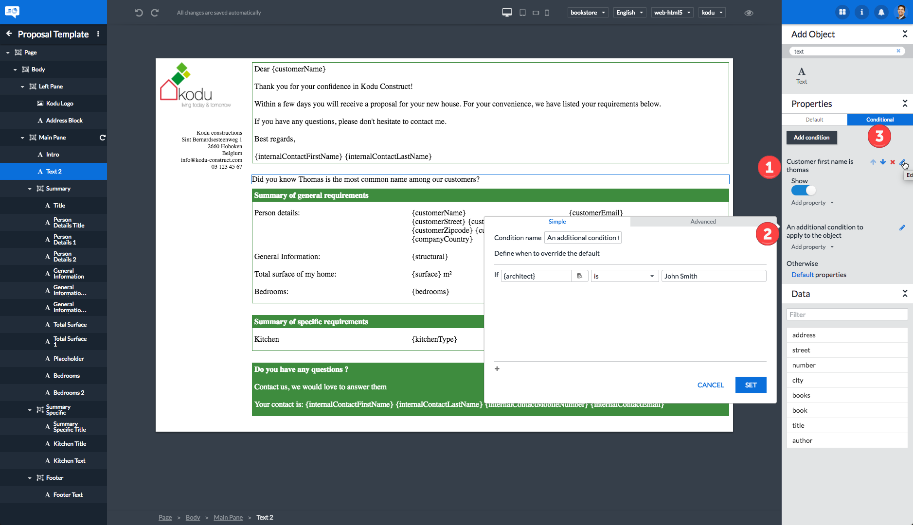
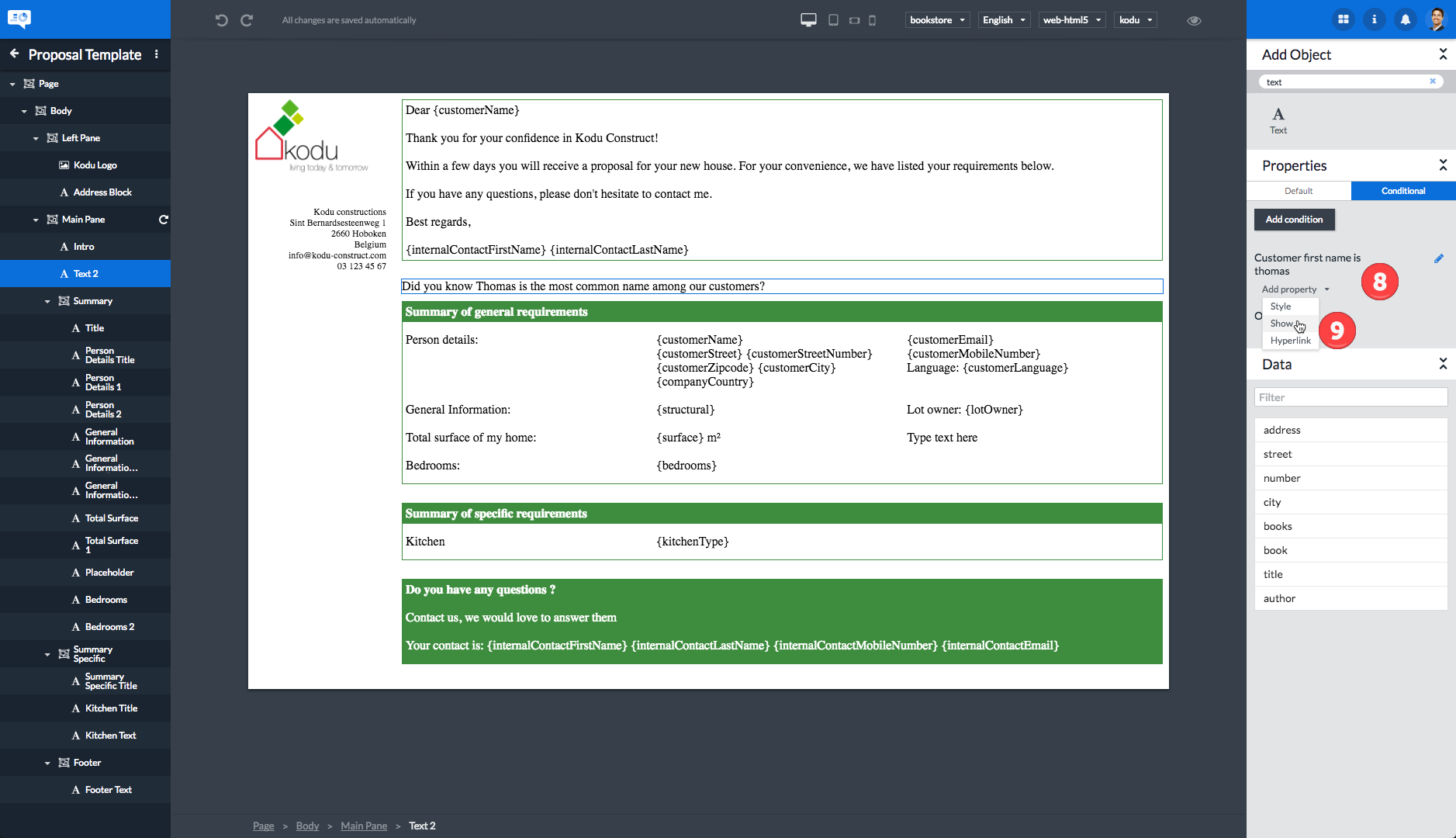
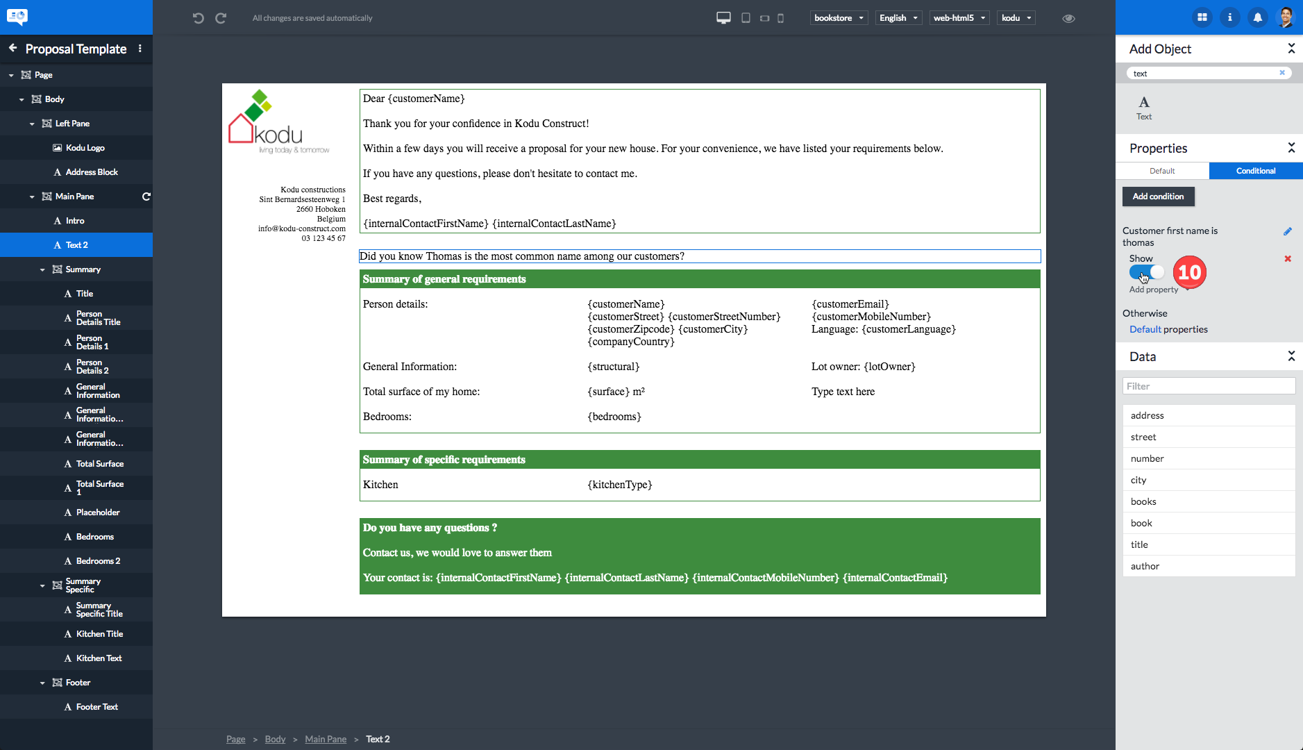
A simple example: on an email template you want to display a text object only if the customer name is Thomas.
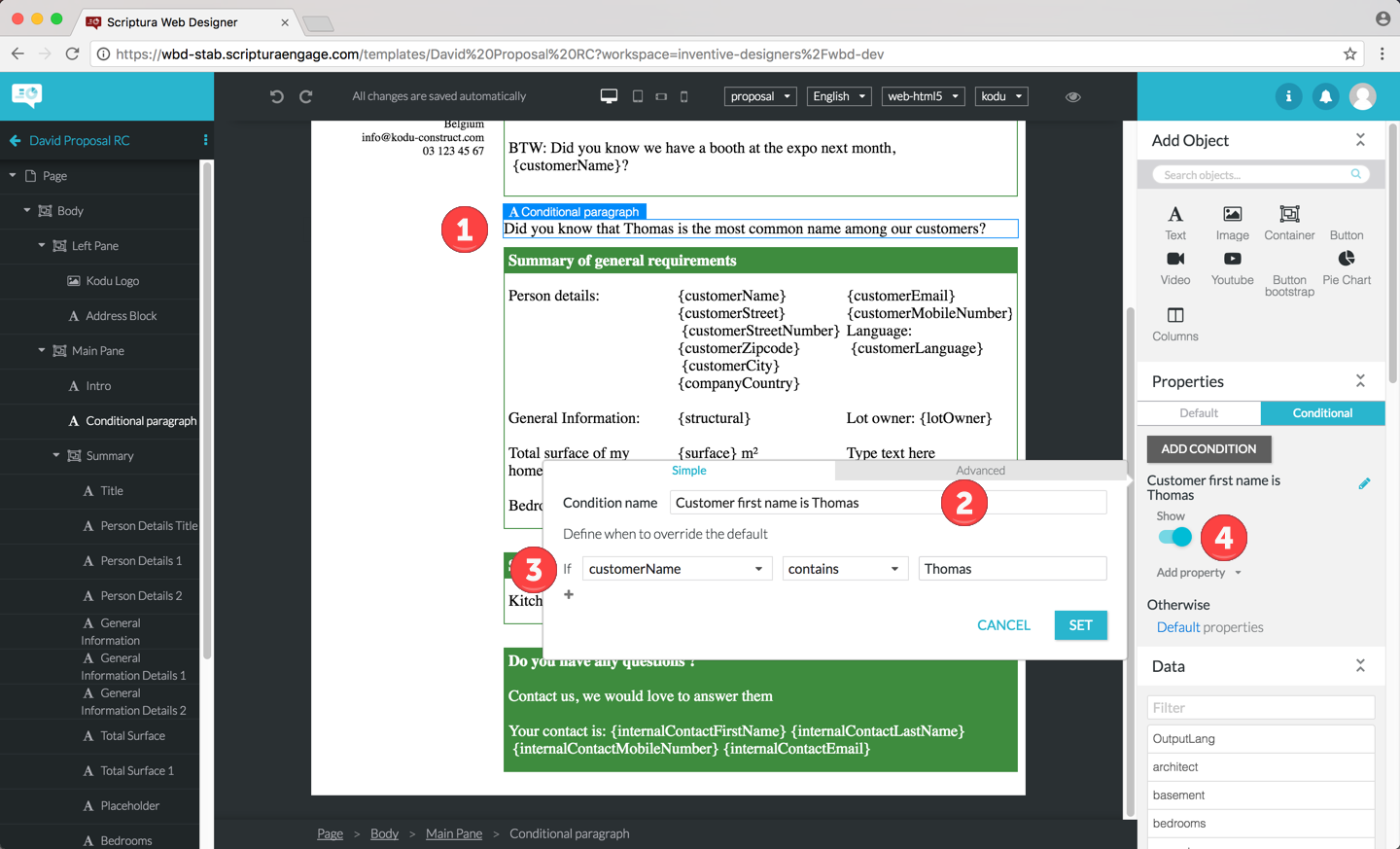
| 1 | The text object that should only be displayed if the customer name includes Thomas. |
| 2 | The name of the condition. |
| 3 | The simple condition - it is assumed the customerName field includes both first and last names of the customer. |
| 4 | The property to use if the condition is met so the text object should be shown if the simple condition is met. |
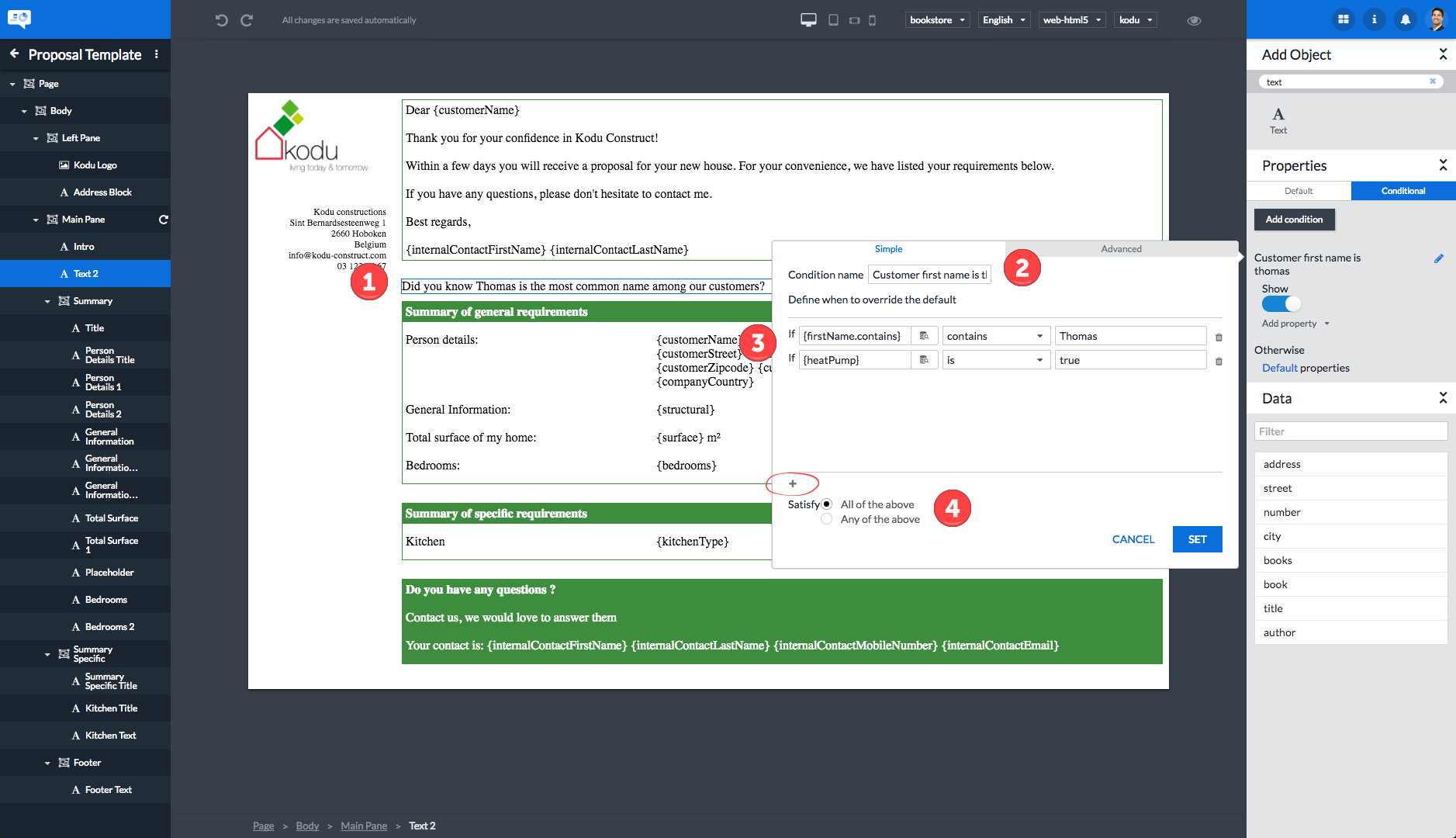
Let’s expand this simple example to demonstrate the use of more complex conditions:
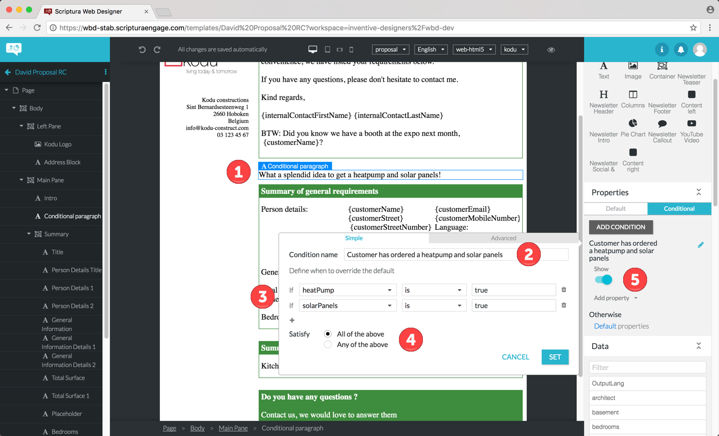
| 1 | The text object that should only be displayed if the customer ordered both the heatpump and solar panels. |
| 2 | The name of the condition. |
| 3 | The complex condition - it is assumed the heatPump and the solarPanels field contain the value true if the customer ordered the heatpump and solar panels. |
| 4 | The logical relation indicating all conditions have to be met to trigger display of the text object. |
| 5 | The property to use if the complex condition is met so the text object should be shown if the complex condition is met. This would of course be combined with a default property to hide the text object. |
In the last example the text object is subject to multiple condition sets which are applied to the object in the order as listed:
| 1 | The first condition set controlling the Show property - should the object be displayed or not. |
| 2 | The second condition set controlling the Style property - how is the text of the object styled. |
| 3 | The different icons for managing the condition set: |
-
Move the condition set up in the list of condition sets: .
-
Move the condition set down in the list of condition sets: .
-
Delete the condition set: .
-
Edit the condition set: .
|
Make sure to test conditional properties extensively. Conditional properties is a very powerful concept that can easily lead to unexpected behavior if not used correctly. |
More details regarding the use of conditional properties can be found in section Using conditional properties.
2. Prerequisites
2.1. Hardware prerequisites
Computer:
-
Processor: Intel Core i3 or compatible.
-
Memory (RAM): 2 GB RAM or more.
Screen resolution:
-
Minimum resolution: 1920 x 1080 (FHD standard).
High speed Internet access.
2.2. Software prerequisites
Since Web Designer is a web application the software prerequisite is browser related.
Currently supported browsers:
-
Google Chrome released within the last 2 years
You can check Google Chrome’s version by typing
chrome://helpin the Google Chrome address bar.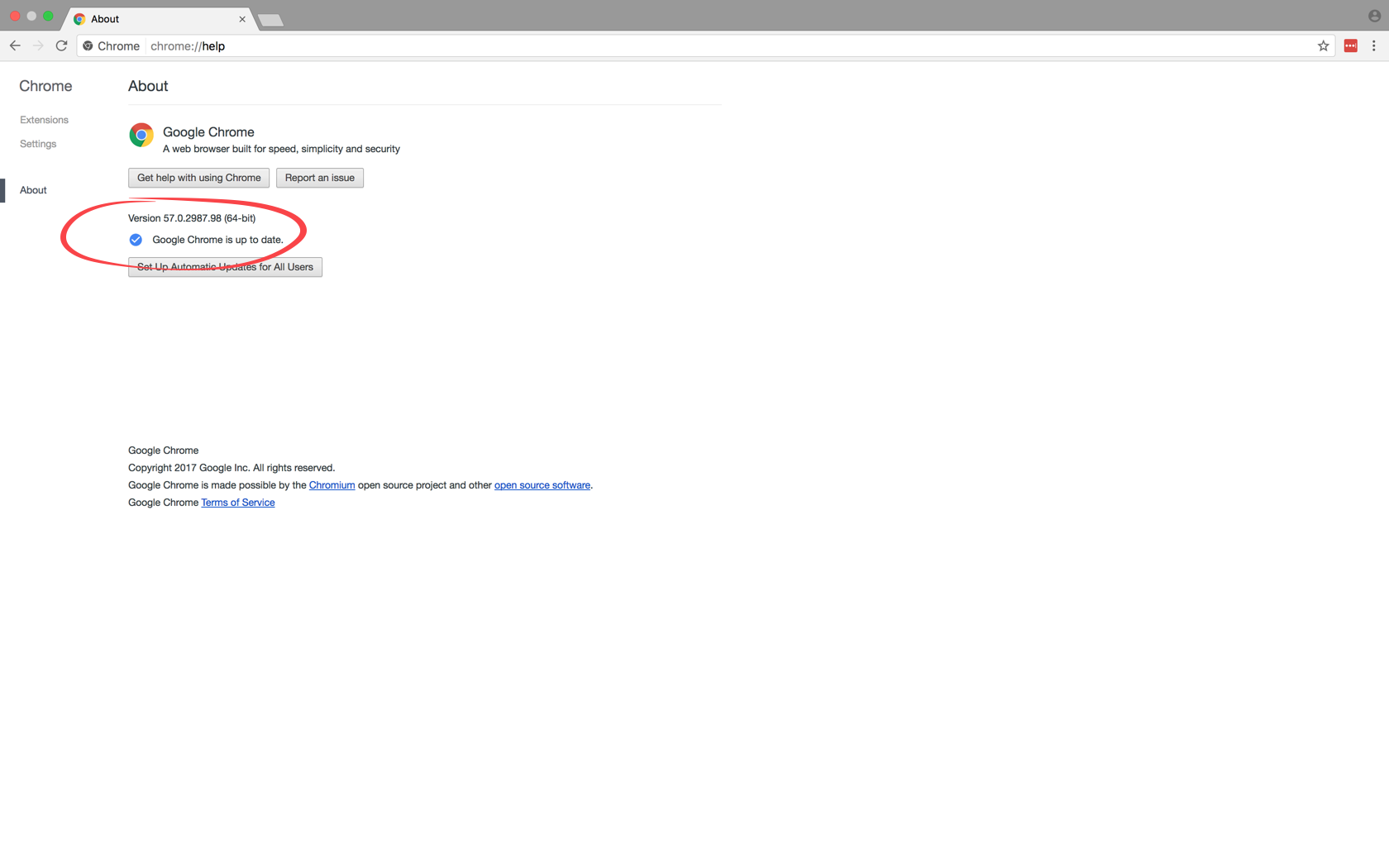 Figure 6. Checking the Google Chrome version
|
Make sure your computer is compatible with the Google Chrome system requirements. |
Other browsers such as Mozilla Firefox might work but are officially not supported. If you encounter an issue with the application, please try again with one of the supported browsers before contacting service desk.
3. Logging in and logging out
Since Web Designer is a web application, you need to start your web browser and open the Web Designer web site. You will be presented with a login page allowing you to enter your username and password.
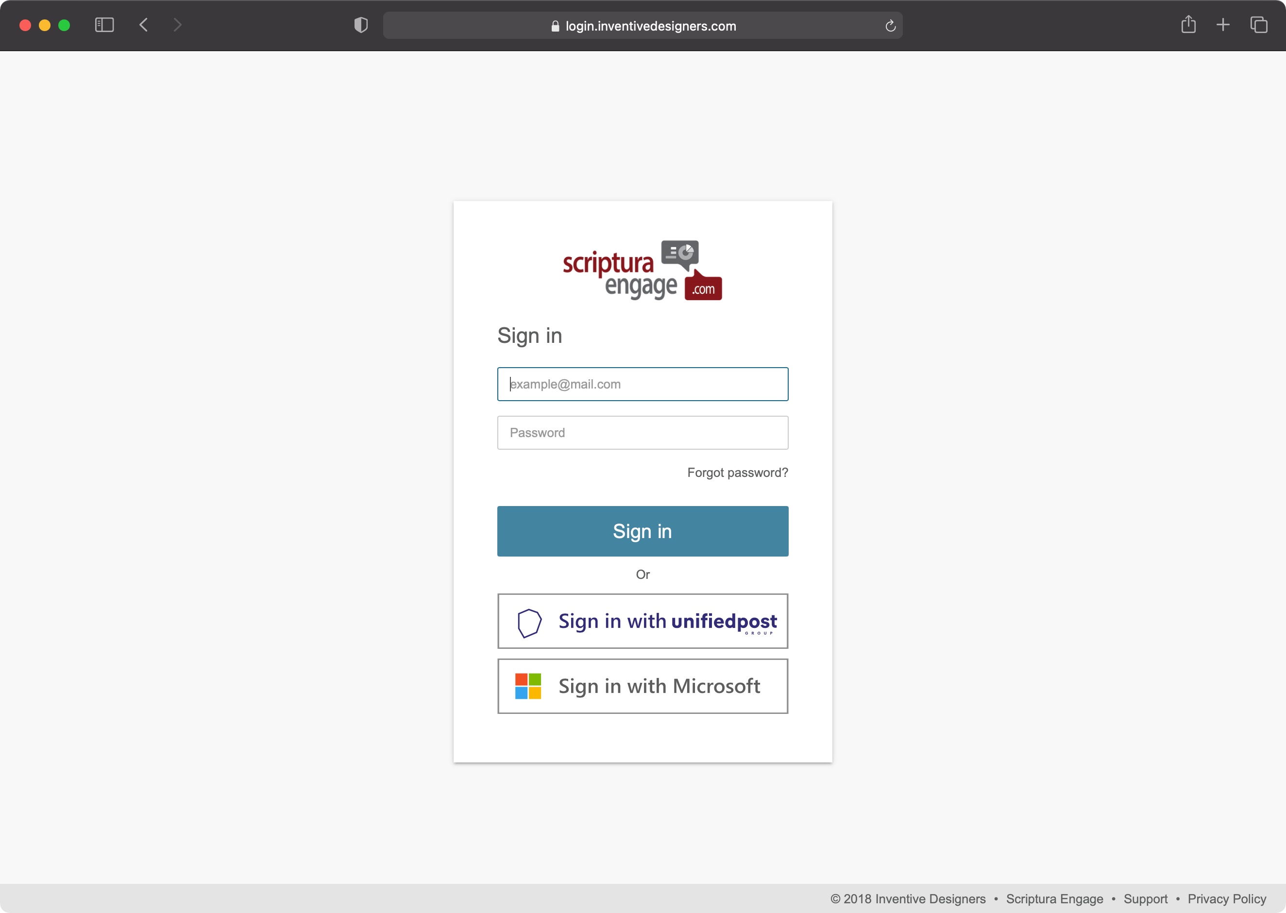
-
Navigate to the Web Designer URL (Uniform Resource Locator): https://design-app-eu1.scripturaengage.com/design
-
Enter your username and password and click the Sign in button. OR click one of the available additional login buttons. (e.g. Sign in with unifiedpost)
If you do not have a username and password or you are unable to sign in using any of the additional login buttons, you should contact your IT department. They will do whatever is necessary to provide you with the ability and the information needed for signing in.
Please note that your password is case sensitive, e.g. PASsword is not the same as PASSWORD. Check the state of the caps lock/shift lock key on your keyboard.
As soon as you have finished working with Web Designer it is best to log out of the application. This can be done in the same way from both the Web Designer browse page and from the Web Designer design page.
| 1 | Click on the user icon at the top right corner of the browse page. |
| 2 | Click the Log out entry in the popup menu. |
| 1 | Click on the user icon at the top right corner of the design page. |
| 2 | Click the Log out entry in the popup menu. |
4. Browse page
Once you have logged in successfully, your browser will display the Web Designer browse page.
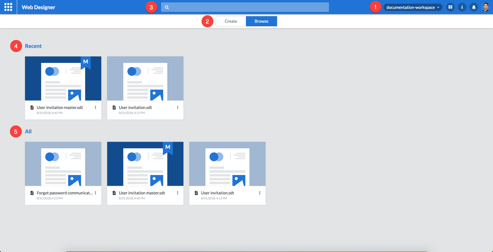
Following user interface elements can be seen on this page:
| 1 | The Web Designer  , ,  and and  icons. icons. |
| 2 | The  slider. slider. |
| 3 | The Search bar. |
| 4 | The list of templates recently used by you. |
| 5 | The list of all available templates. |
Each of these user interface elements is explained in more detail in the following sections.
4.1. Application menu
4.1.1. Workspace -
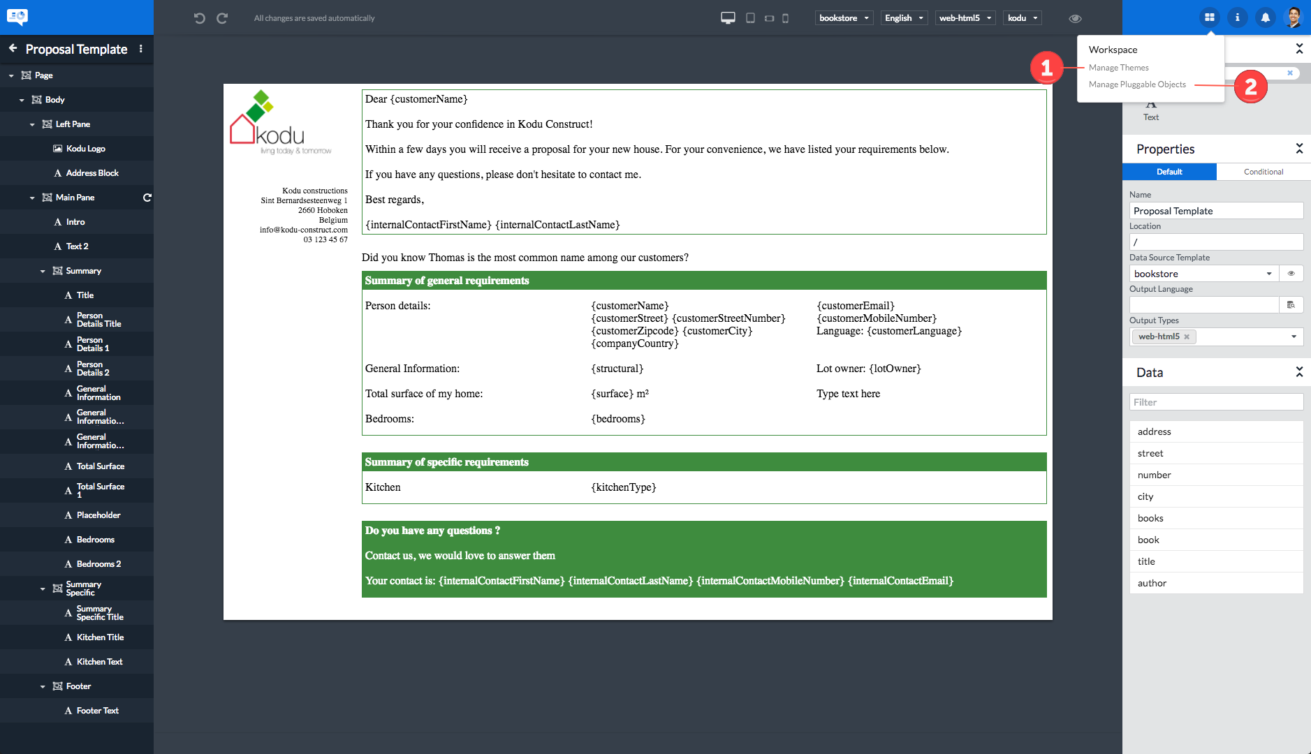
The workspace menu will only be displayed if you have access to either the Manage Themes or the Manage Pluggable Objects page.
Clicking the button will display a menu allowing you to access:
| 1 | The Manage Themes page |
| 2 | The Manage Pluggable Objects page |
4.1.2. Information -
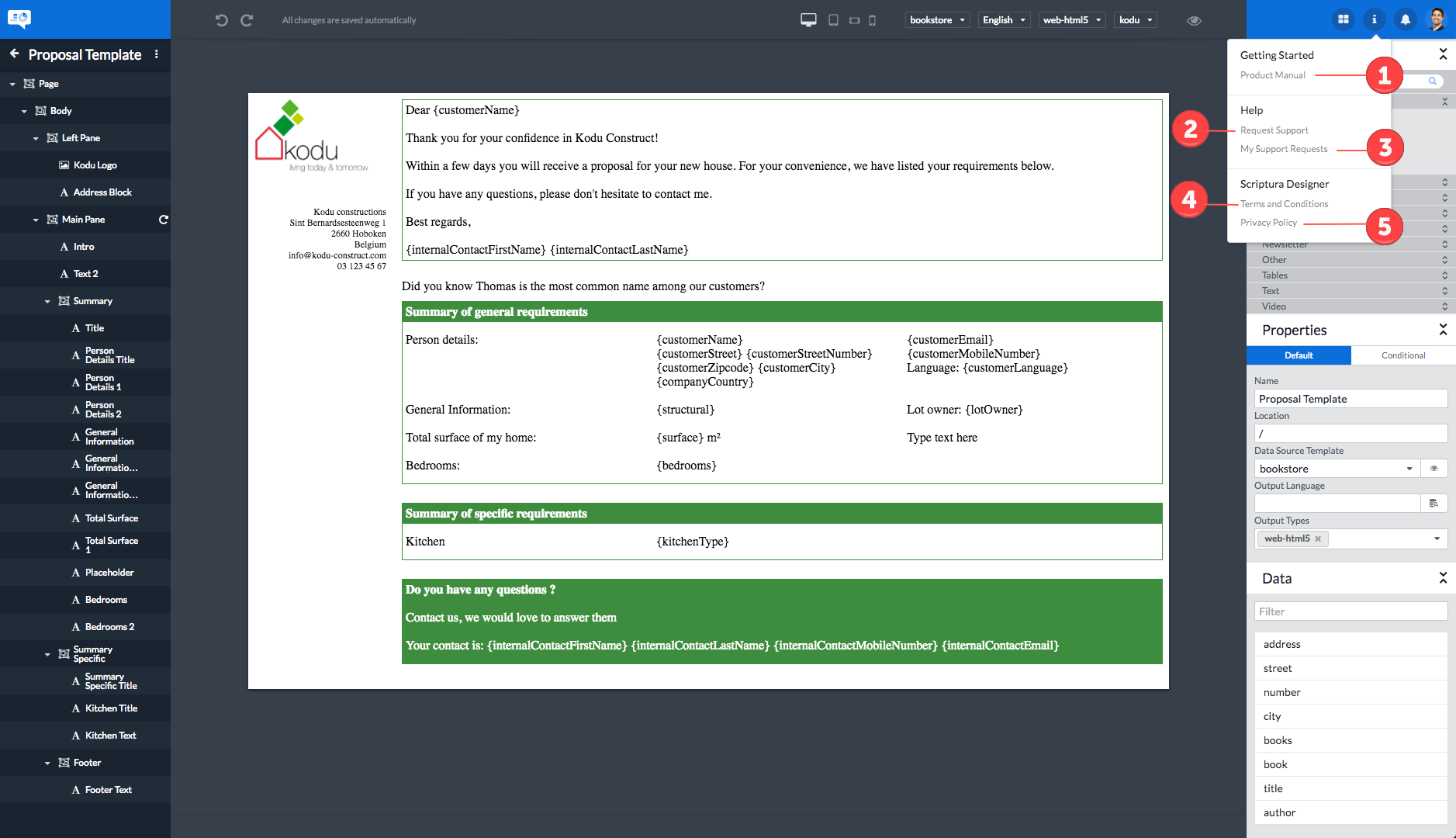
Clicking the button will display a menu allowing you to:
| 1 | Access this Web Designer User Guide. |
| 2 | Send a support request to the Inventive Designers support organization. |
| 3 | Review the status of your support requests on the Inventive Designers support site. |
| 4 | Consult the Terms and conditions applicable to using Web Designer. |
| 5 | Consult the Inventive Designers Privacy policy. |
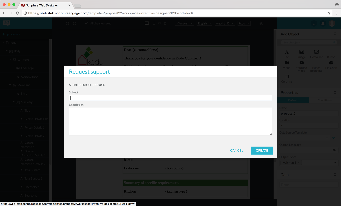
You can send a support request to the Inventive Designers support organization using the Request support entry in the information menu.
Complete the Subject and the Description fields and click the CREATE button to send the support request.
|
In order to allow the Inventive Designers support organization to help you in the best way possible, make sure to include all relevant information in your support request. It is particularly important to include all information necessary to be able to reproduce the problem you are experiencing. |
You can verify the status of your outstanding support requests by clicking the My support requests entry in the information menu.
You will be presented with the login page of the Inventive Designers support website.
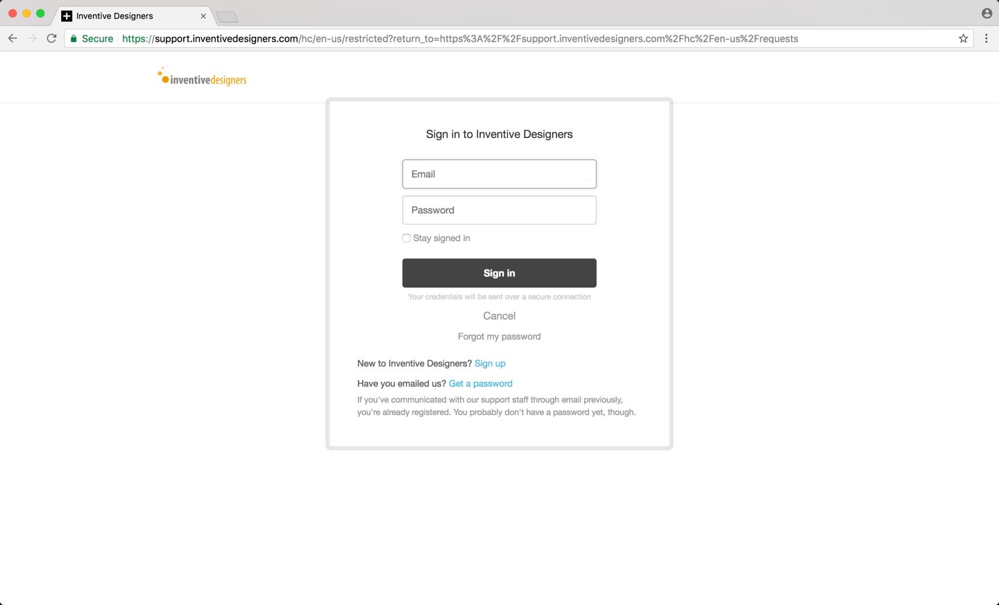
Now simply follow the instructions as displayed on the login page:
-
Enter your email address and password and click the Sign in button.
-
If you are new to Inventive Designers, click the Sign up link.
-
If you have already emailed our support staff but don’t have a password yet, click the Get a password link.
4.1.3. Notifications -
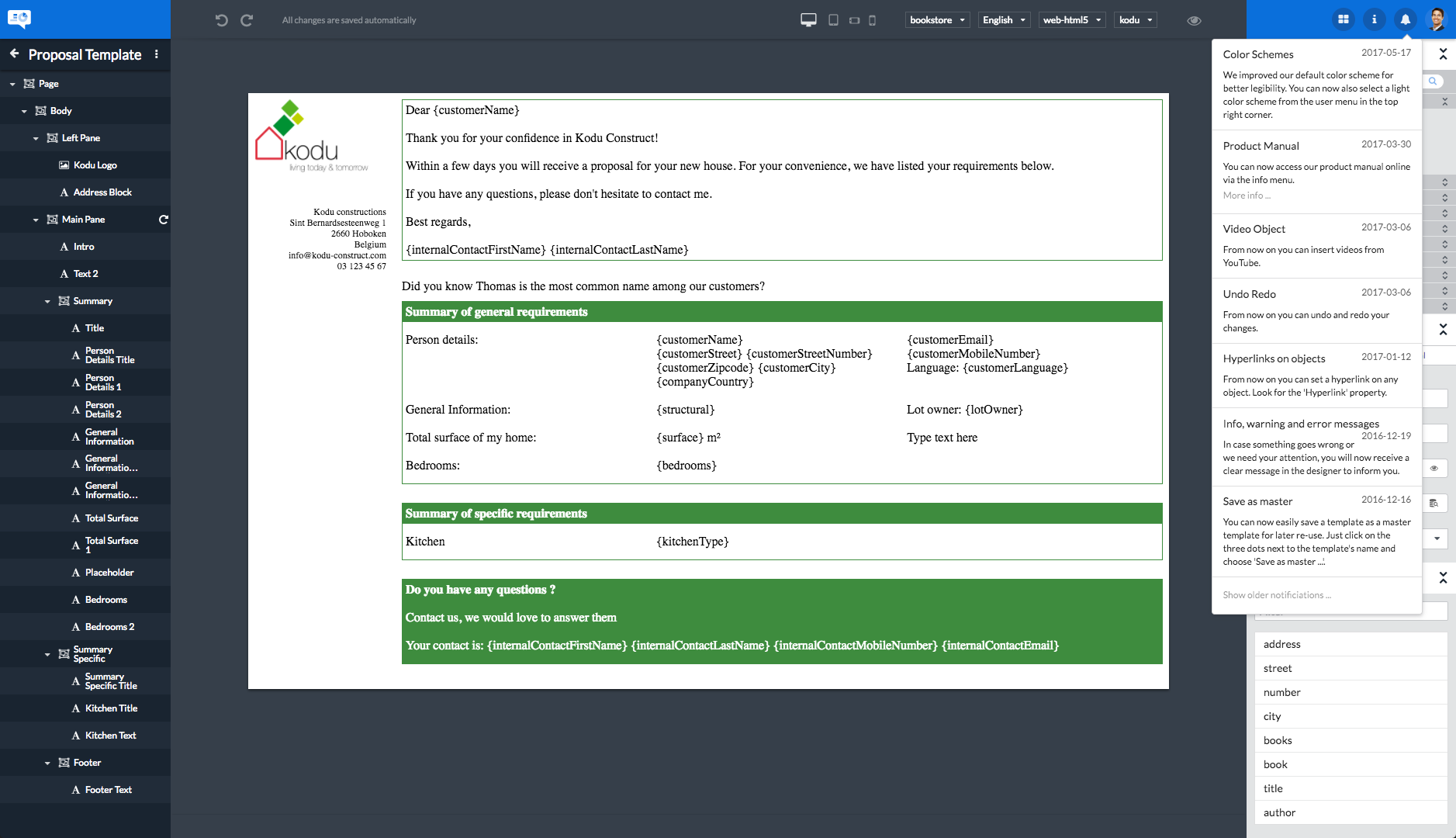
Clicking the button will display a list of Web Designer news items informing you of the latest changes and enhancements made available. The news items are listed in reverse chronological order. Click the Show older notifications… menu entry at the bottom of the list to see older notifications. The notification list can be closed by clicking the notification icon.
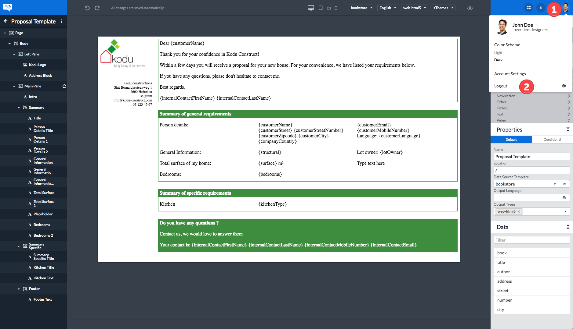
4.1.4. User -
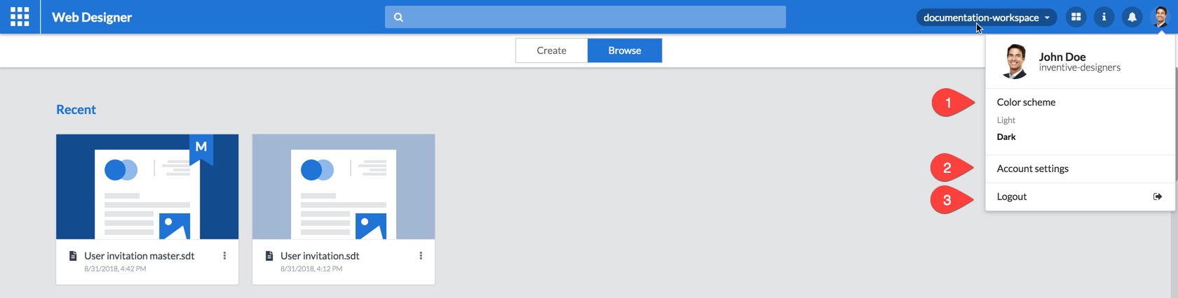
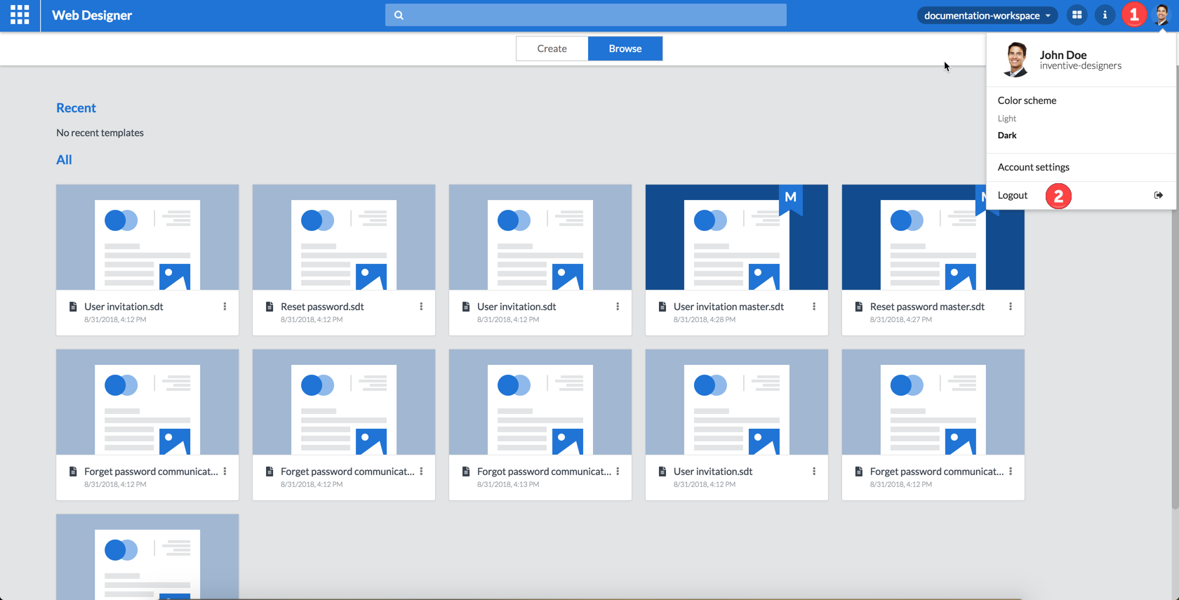
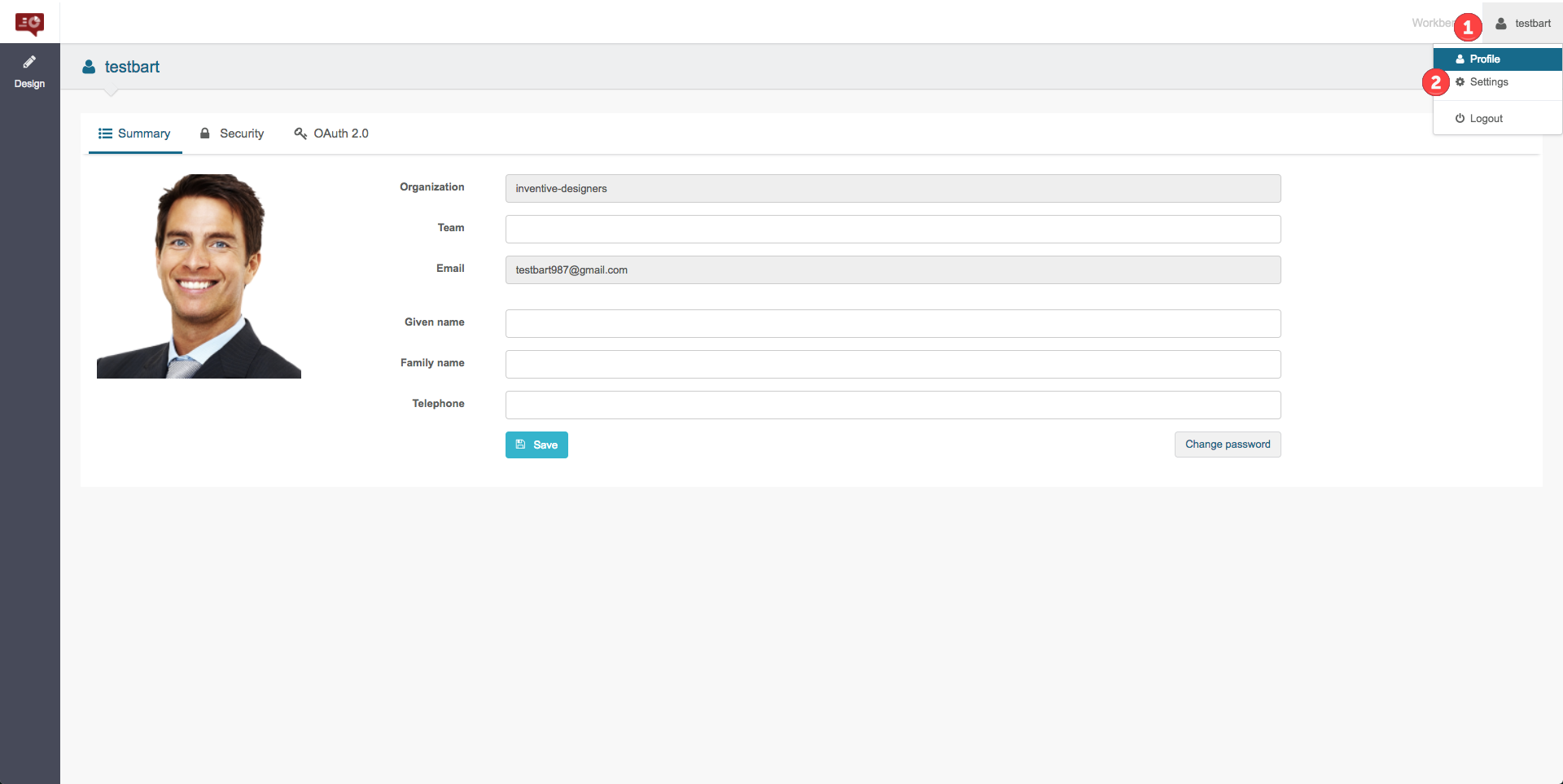
Clicking the icon will display a menu that allows you to:
| 1 | Select the user interface color scheme to use. |
| 2 | Access the account and user settings page. |
| 3 | Log out from Web Designer. |
This icon acts as a toggle: repeated clicking will open and close the menu.
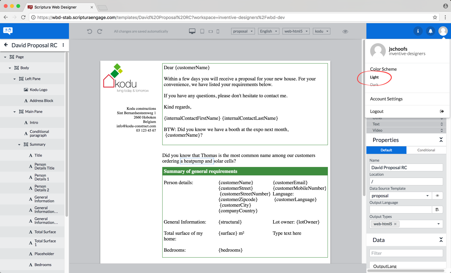
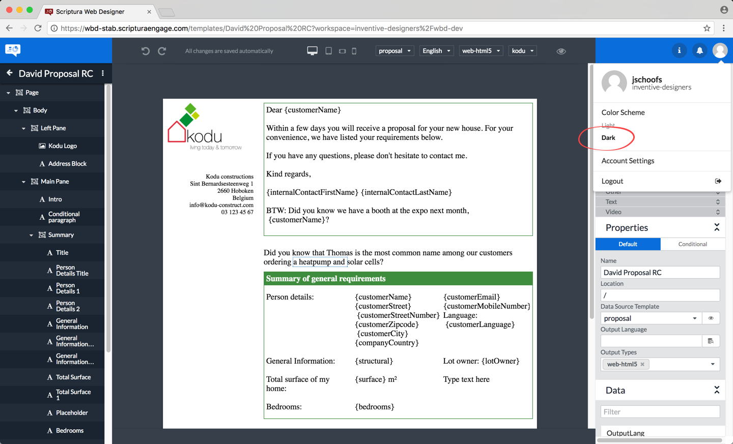
Color scheme
This menu option allows you to select the user interface color scheme you want to use. The currently active color scheme is displayed in bold.
Do note the browse page looks the same regardless of the chosen color scheme. The design page does look different however.
Account settings
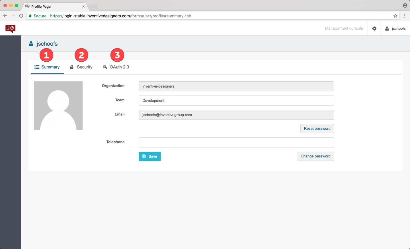
The account settings page has three tabs:
| 1 | The Summary tab. |
| 2 | The Security tab. |
| 3 | The OAuth 2.0 tab. |
Display a tab by clicking it.
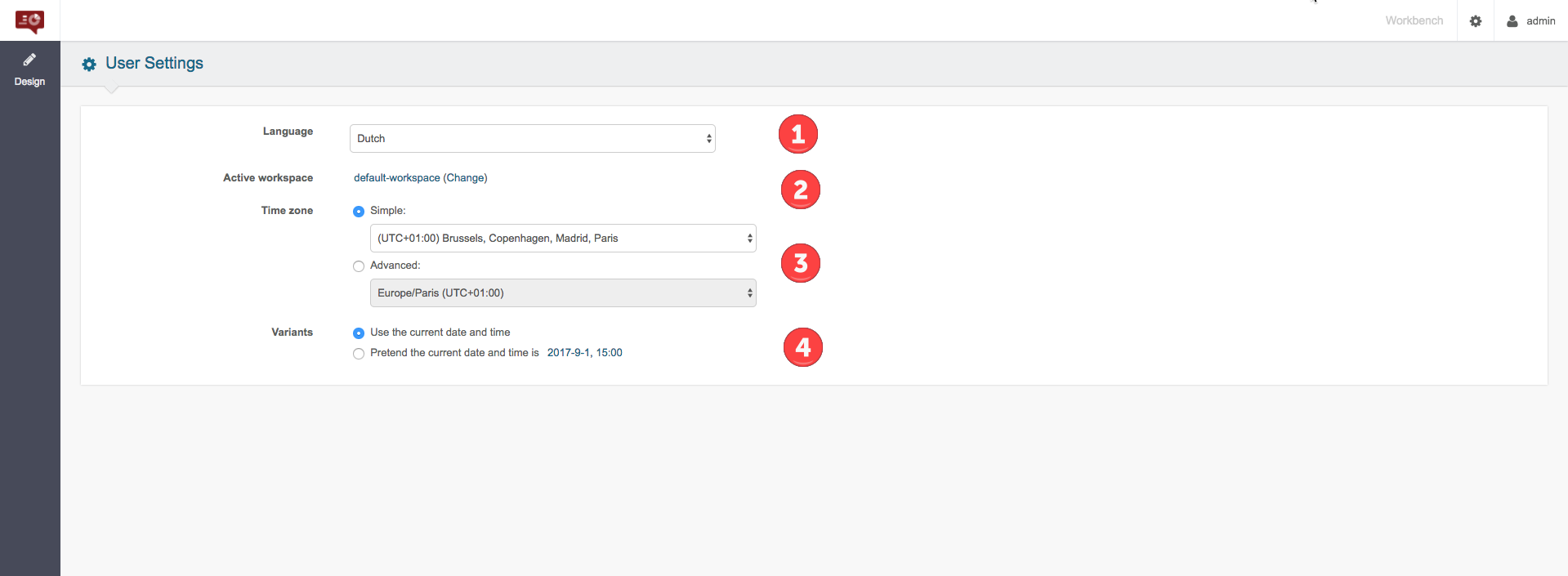
The Summary tab
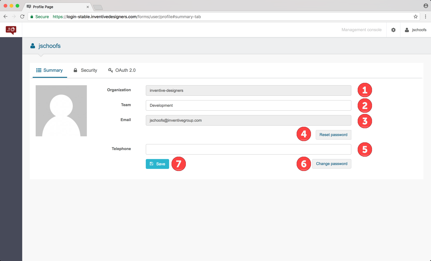
| 1 | Your organization (read-only). |
| 2 | Your team - do not change unless instructed. |
| 3 | Your email (read-only). |
| 4 | The Reset password button allows you to reset the password associated with your email address based Web Designer login. An email will be sent to your email address containing a link that will allow you to reset this password. |
| 5 | Your telephone number. |
| 6 | The Change password button allows you to change the password associated with your internal authentication system such as Microsoft’s Active Directory for example. |
| 7 | The Save button allows you to save changes you made to the Team and/or Telephone fields. |
The Security tab
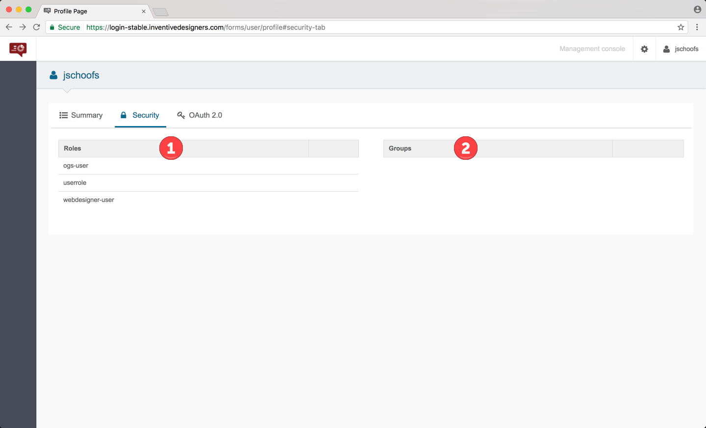
The information listed on this tab is purely for information only:
| 1 | The roles that have been assigned to you. These roles control what Web Designer functionalities you are allowed use. |
| 2 | Any additional groups you are a member of. |
The OAuth 2.0 tab
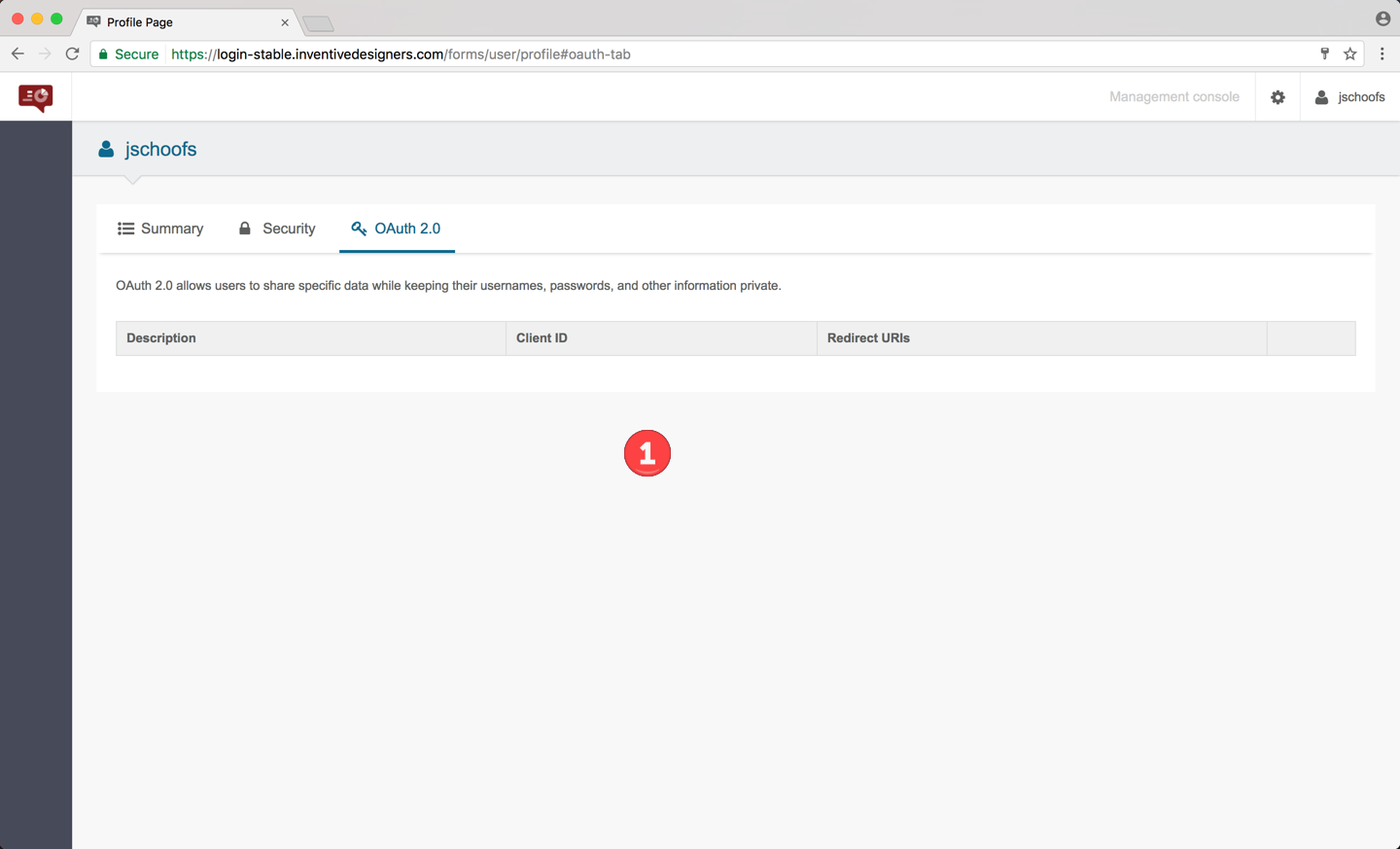
The information listed on this tab is purely informational:
OAuth is an open standard for authorization, commonly used as a way for Internet users to authorize websites or applications to access their information on other websites but without giving them the passwords.
| 1 | This tab simply lists the OAuth associations registered for your use. |
4.2. The CREATE/BROWSE slider
This slider allows you to put the Web Designer browse page in create or browse mode. Simply click the mode you want to activate.
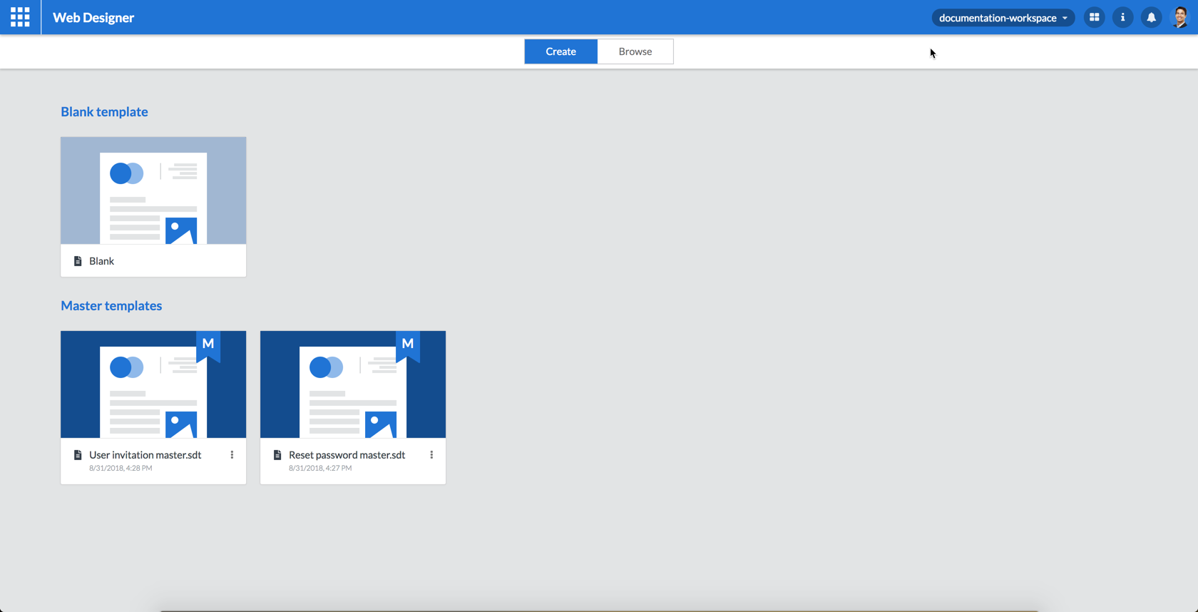
4.2.1. Create mode
In create mode your Web Designer browse page will only show:
-
A master template named Blank. Use this template to create a new template starting from zero.
-
The other available master templates. Use one of these templates to create a new template based on a previously created master template.
|
This mode is exclusively used to create new templates. This mode cannot be used to edit existing templates. Use browse mode to edit existing templates. |
4.2.2. Browse mode
Putting the Web Designer browse page in browse mode allows you to get access to all templates available to you.
Browse mode should be used when you want to edit or delete an existing template.
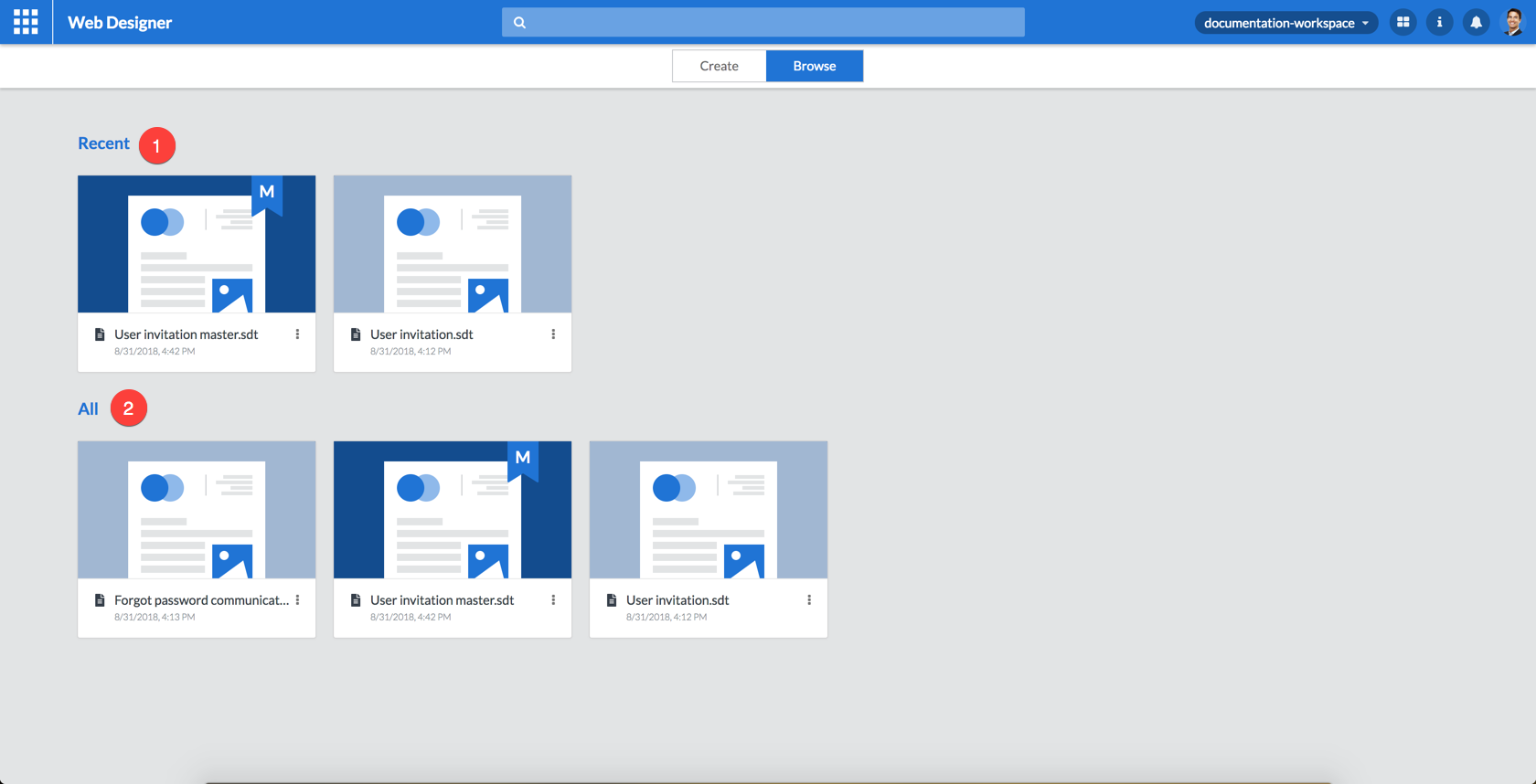
In browse mode, the templates available to you are listed in two groups:
| 1 | The list of templates most recently used by you. |
| 2 | The list of all templates including the master templates available to you. |
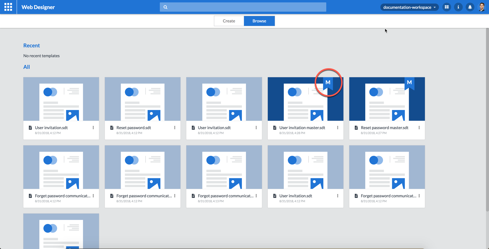
Master templates are flagged with an extra M label and have a dark blue background:
4.3. Template tiles
Click the template tile once to select it and double click it to open the template for editing.
Clicking the template tile’s icon brings up a menu that allows you to:
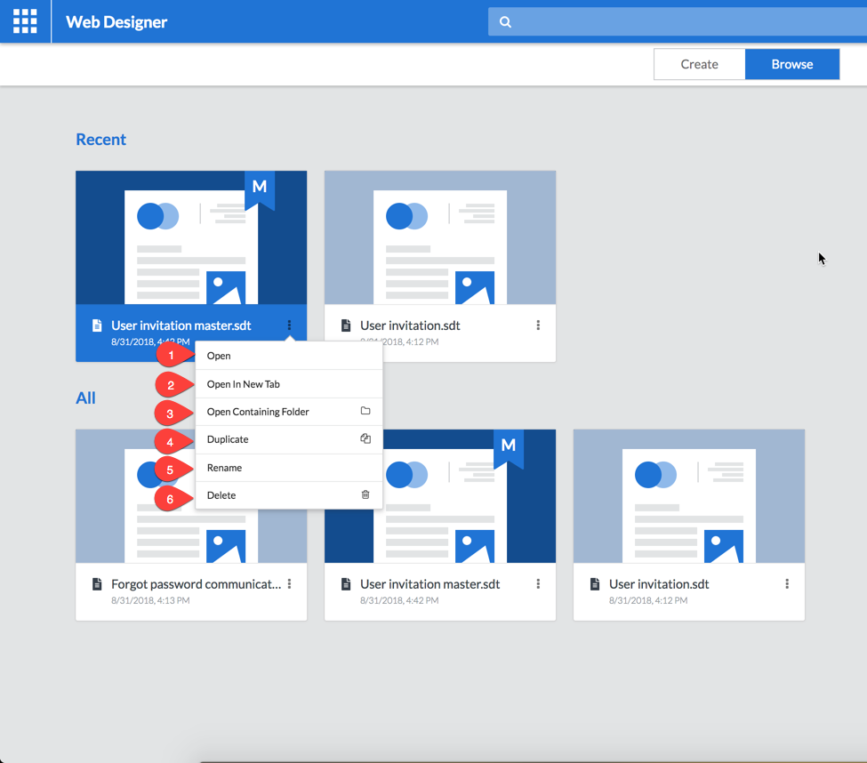
| 1 | Open the template. |
| 2 | Open the template in a new browser tab. |
| 3 | Open the folder containing the template. |
| 4 | Duplicate the template. |
| 5 | Rename the template. |
| 6 | Delete the template. |
The third option will take you to the Resource Browser application which allows you to access and manage resources on the resource server:
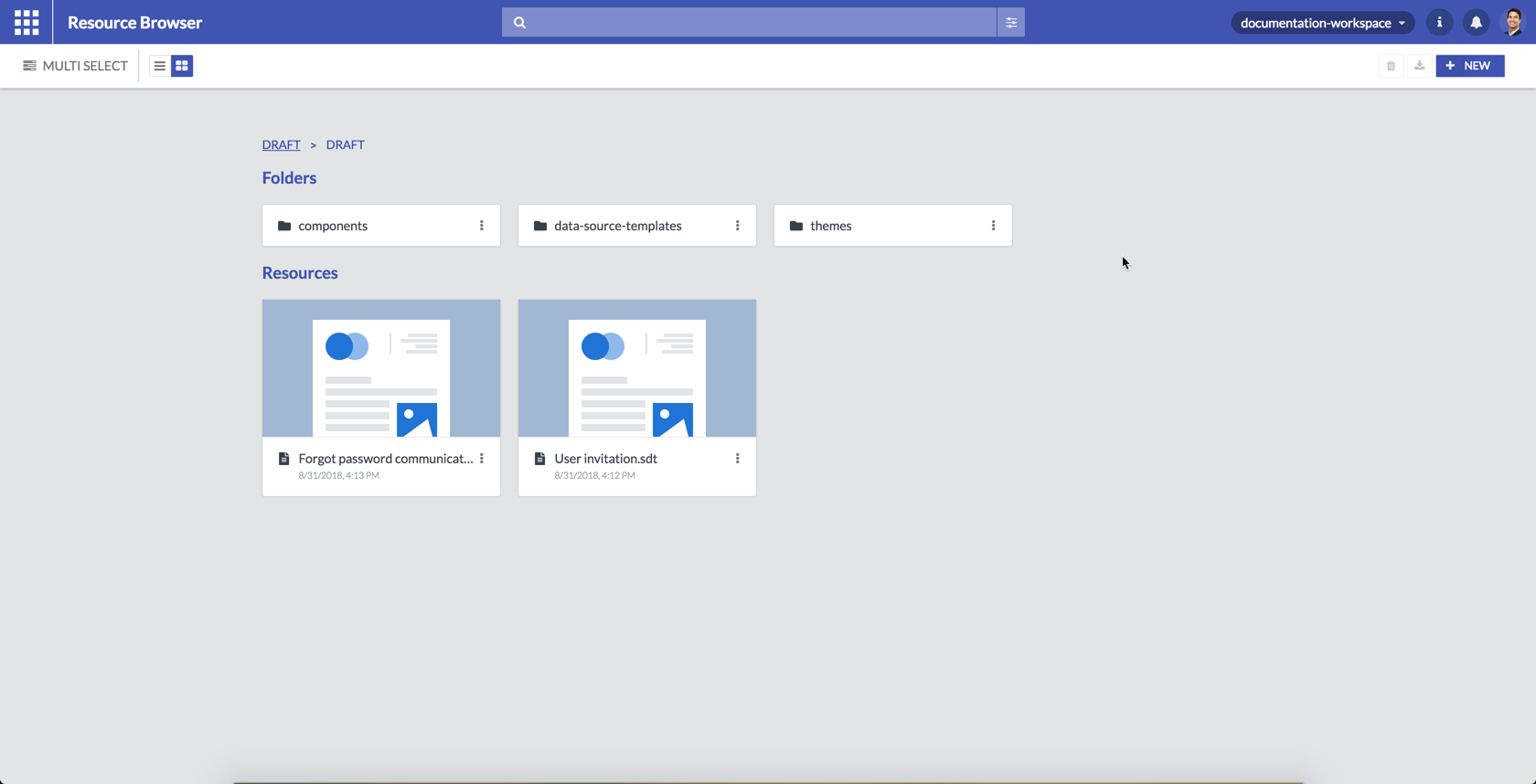
A detailed discussion of the functionality of this application is beyond the scope of this guide.
The fourth option allows you to make a copy of the template under a new name. You will be asked to provide a new name.
The fifth option allows you to rename the template. You can edit the name and press enter when you are done renaming it.
The sixth option allows you to delete the template. You will be prompted to confirm the deletion of the template:
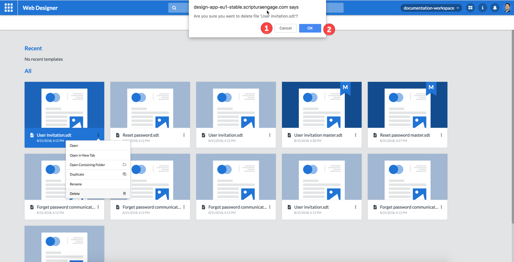
| 1 | Click the Cancel button to cancel te deletion of the template. |
| 2 | Click the OK button to confirm the deletion of the template. |
|
Make sure you select the correct template to delete. Deletion of a template cannot be undone easily! |
4.4. Search box
The search box allows you to search for the template that you want to work with. Just start typing the name of the template and as you type, the templates corresponding to your search string will be displayed.
|
The search operation is not case-sensitive. |
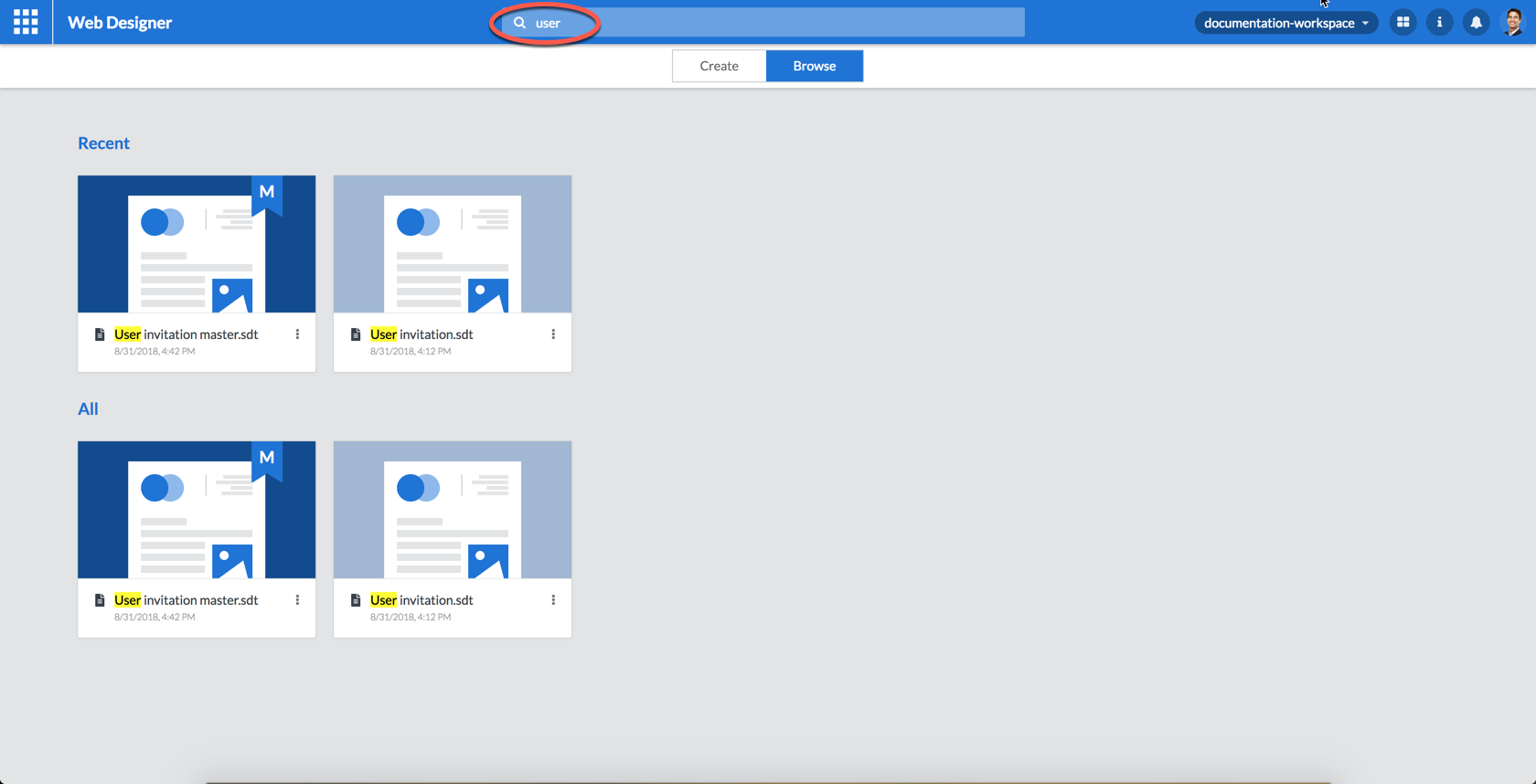
The tiles representing the templates found behave as explained in the Template tiles topic.
|
As can be seen in the preceeding figure a template compatible with your search string can be displayed in both the Recent list and the All list. Both tiles represent the same template. |
5. Design page
After selecting the template to edit or create you will see the Web Designer design page. Before looking at the different tasks that can be performed from this page we will take a look at the layout of the design page.
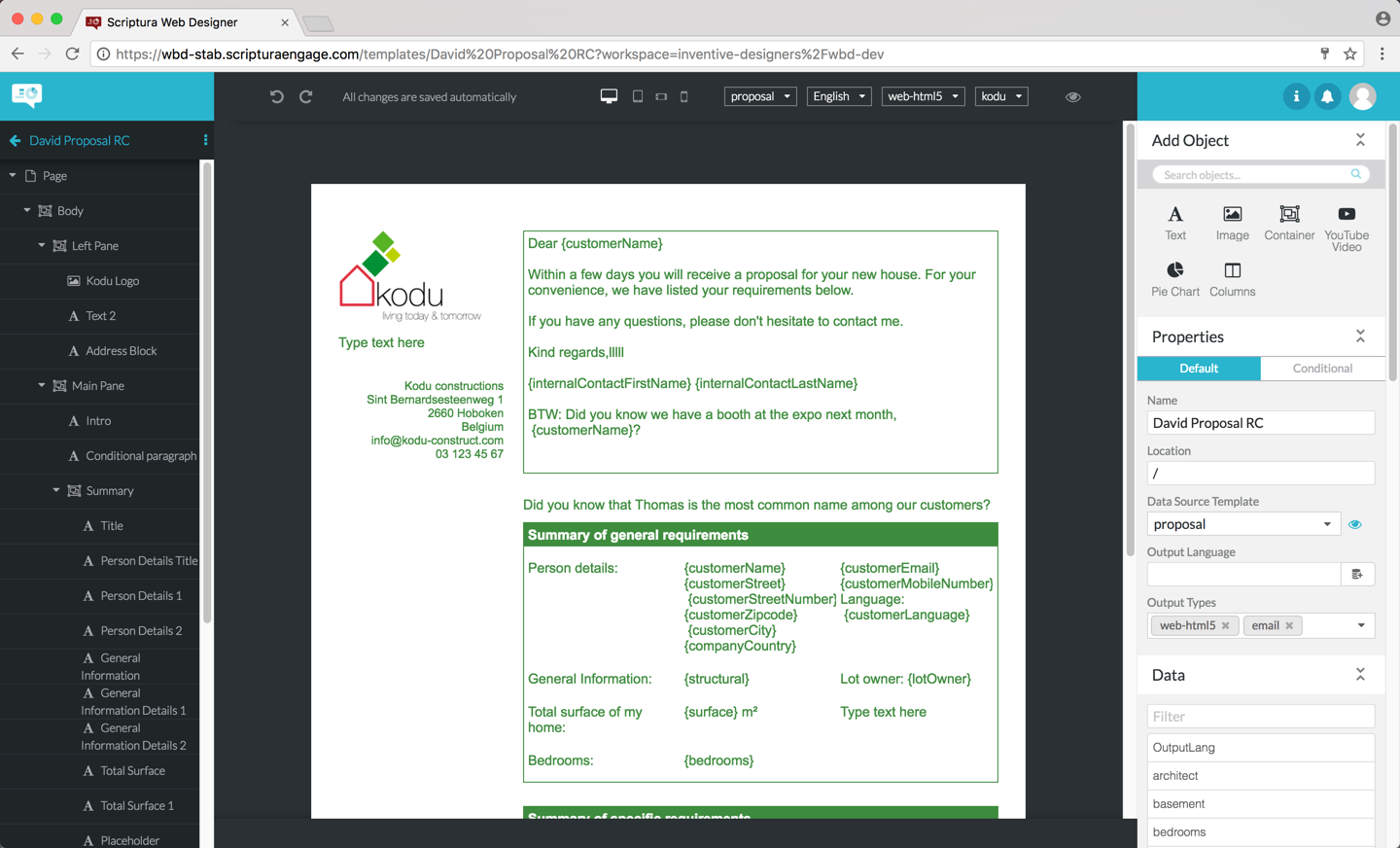
The design page is made up of three areas: the lefthand area, the central area and the righthand area.
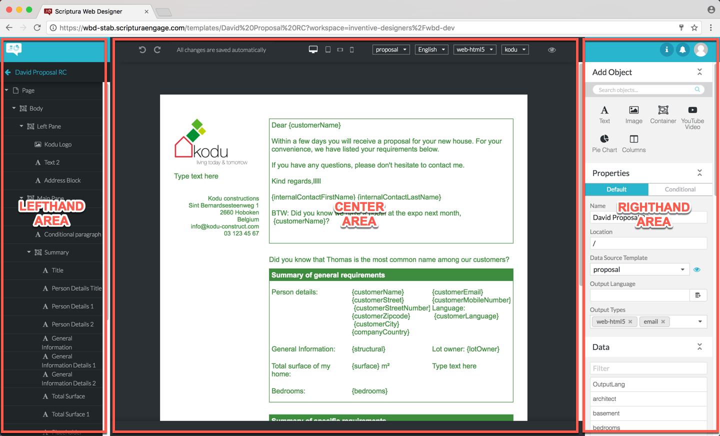
5.1. The lefthand area
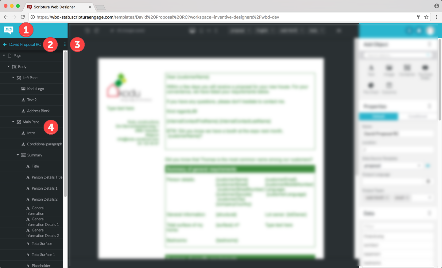
| 1 | Clicking the white text balloon toggles the Web Designer application menu at the top of the center pane: the first click will display the Web Designer application menu and the next click will hide the Web Designer application menu and so on. |
| 2 | Clicking the left pointing arrow will bring you back to the Web Designer browse page. The name of the template you are editing is displayed to the right of the arrow. Changing the name of the template can be done by clicking its current name and then entering the new name.If the new name entered is not unique you will get an error message and you will have to change the name so that it is unique. |
| 3 | Clicking the button allows you to save the current template as a master template. A master template can be used as a starting point for creating new templates. |
| 4 | The outline gives you a structured overview of the objects included on your template and allows you to select an object. |
5.1.1. Selecting an object
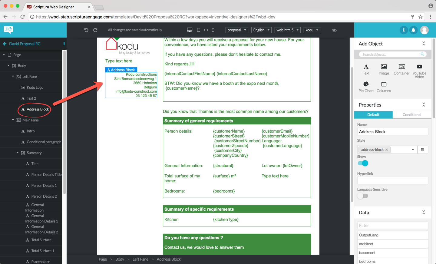
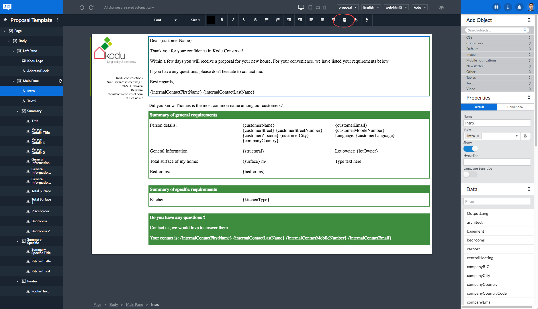
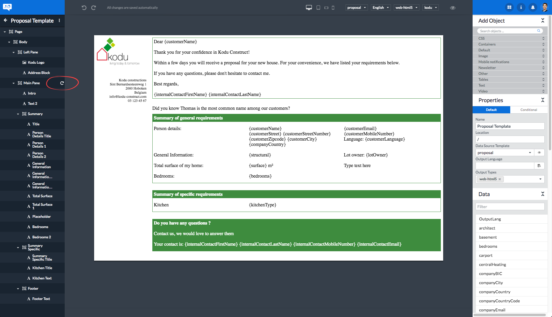
Selecting an object by clicking the object in the object tree will also select the object in the template as show below. In this example the object Address Block was selected in the outline. The Address Block object is also selected in the template and the path leading to the object is displayed at the bottom of the screen. Objects can also be selected by clicking them in the template. Hovering the pointer over an object only highlights the object by displaying a blue border around the object. As soon as you click on the object, the highlighted object is effectively selected.
A selected object will have its name displayed in white letters on a blue background in its title label. In addition to this the selected object is highlighted in the outline at the left.
5.1.2. Focused outline
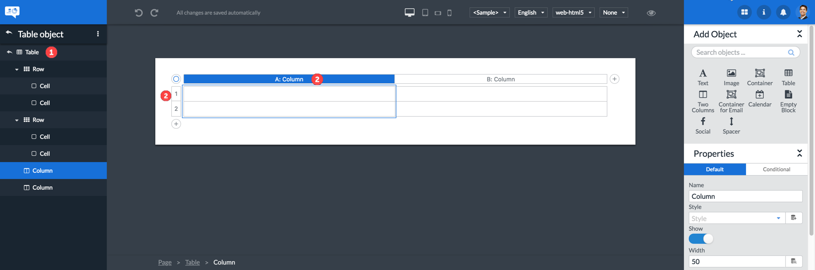
Some objects such as the table object have a focused outline. When the focused outline is active, the outline will only show the children from that object. If the focused outline of an object is not active, the object is in the outline, but its children are not.
5.2. The central area
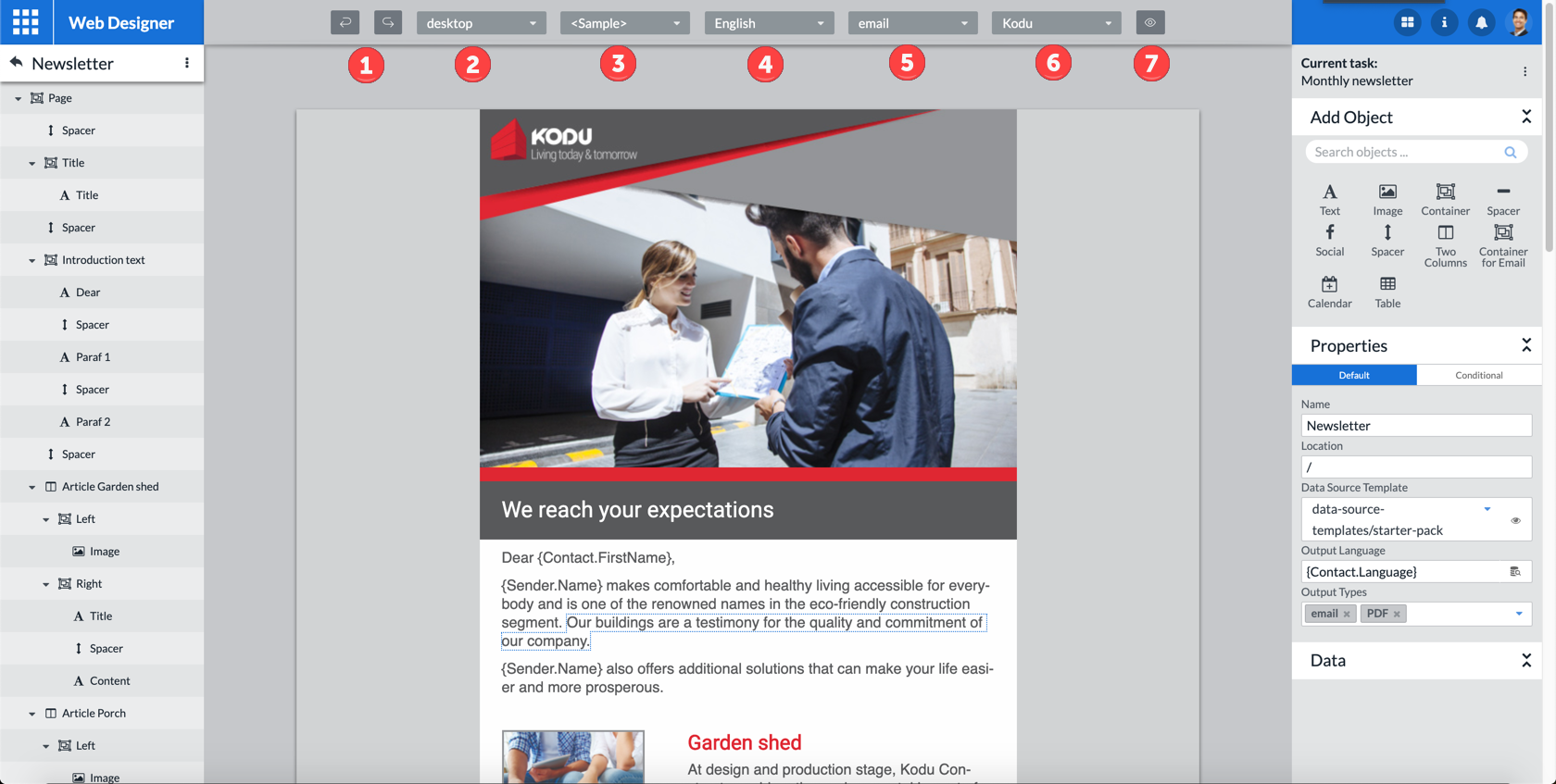
The top part of the central area is taken up by the Web Designer toolbar.
| 1 | You can undo your last editing actions by clicking the icon. In a similar fashion you can redo undone editing actions by clicking the arrow. |
| 2 | The preview of your template will be tailored for the device selected in the output device selector. You can take a look at how your template will be displayed on a PC screen, a tablet device, a smartphone in landscape orientation and a smartphone in vertical orientation. See also item 8 in this list explaining the icon. |
| 3 | Clicking the sample data selector allows you to load a sample data set in your template to preview the impact of the data fields on your template design. Sample data are only made available after you have associated a data model with the template first. Refer to section Managing the template properties for more information on how to do this. |
| 4 | Clicking the language selector allows you to select the language for which you want to enter content in your template. The Manage… menu entry allows you to define what languages should be displayed via this menu. More details regarding the use of languages can be found in the section Multilingual templates. |
| 5 | Use the output type selector to adapt the template design and the preview page to the output type you want to use. The menu entries in this selector correspond to the output type listed in the Output Types template property. |
| 6 | Clicking the theme selector will trigger the display of a menu allowing you to select the theme you want to use. It also allows for the management of themes made available for selection via this menu. More details regarding the use of themes can be found in section Using styles and themes in a template. |
| 7 | Clicking the icon triggers the display of the template in full preview mode. In this mode the left and right areas are hidden to maximize the preview zone. |
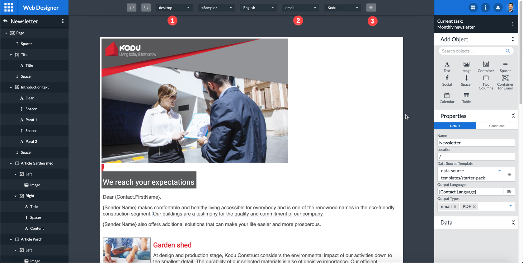
5.3. The righthand area
Apart from the , , and icons at the top, the righthand area is made up of three functional panels:
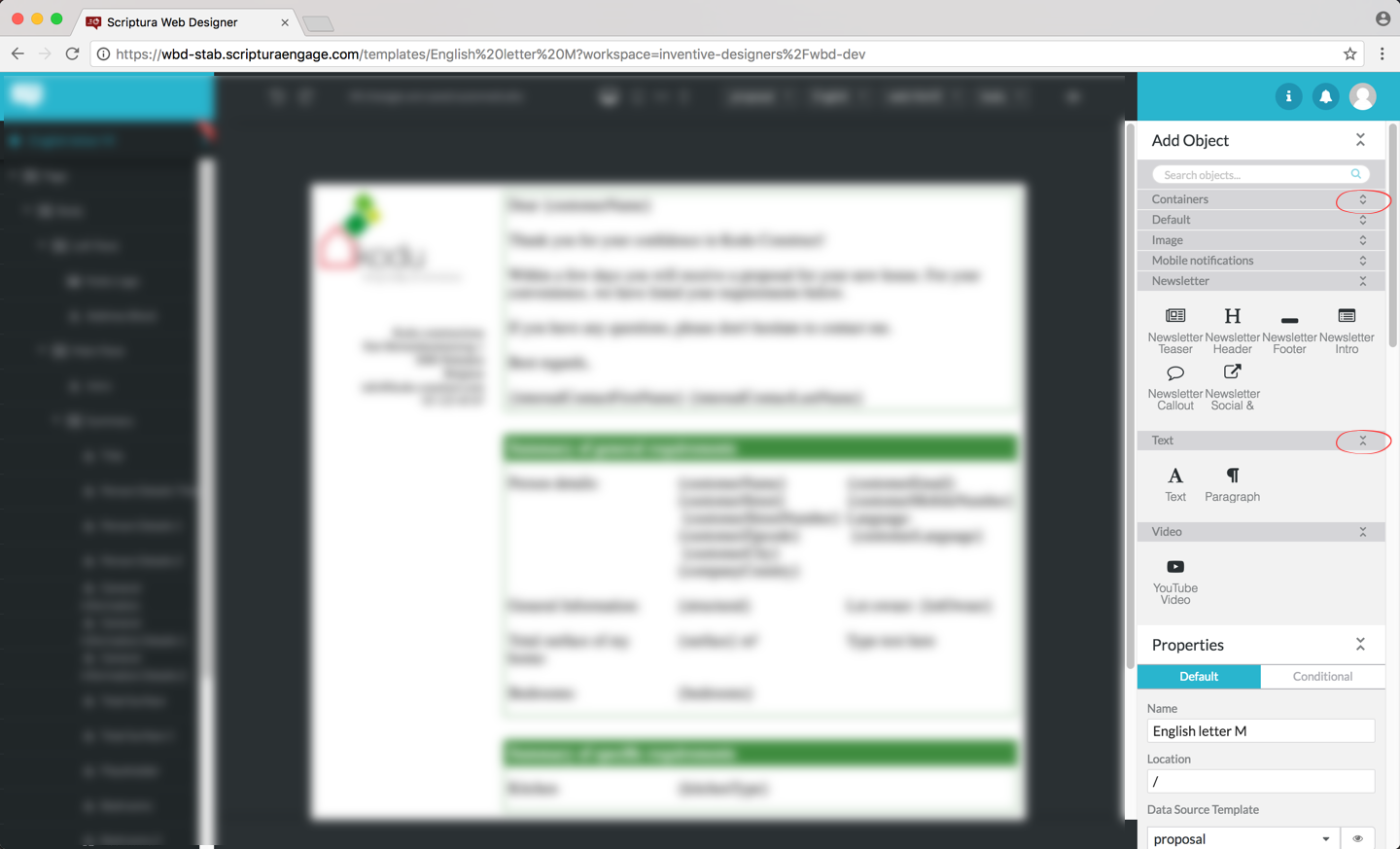
| 1 | The Add Object panel is used for adding objects to the template. |
| 2 | The Properties panel is used for inspecting and modifying the properties of the selected object. Remember objects can be selected by clicking on the object in the outline or by clicking the object on the template. |
| 3 | After associating a data model with the template, the Data panel allows you to search and inspect data fields included in the data model. |
The panels can be collapsed by clicking the  icon and expanded by clicking the
  icon found in the block title bar.
If your Web Designer supports more that 15 object types, the objects will automatically be displayed in a slightly different, categorized way to reduce clutter:
The object category panels can be collapsed by clicking the icon and expanded by clicking the icon found in the object category bar.
6. Creating a new template from scratch
The general procedure for creating a new template from scratch is:
-
Put the browse page in create mode by clicking CREATE in the
slider.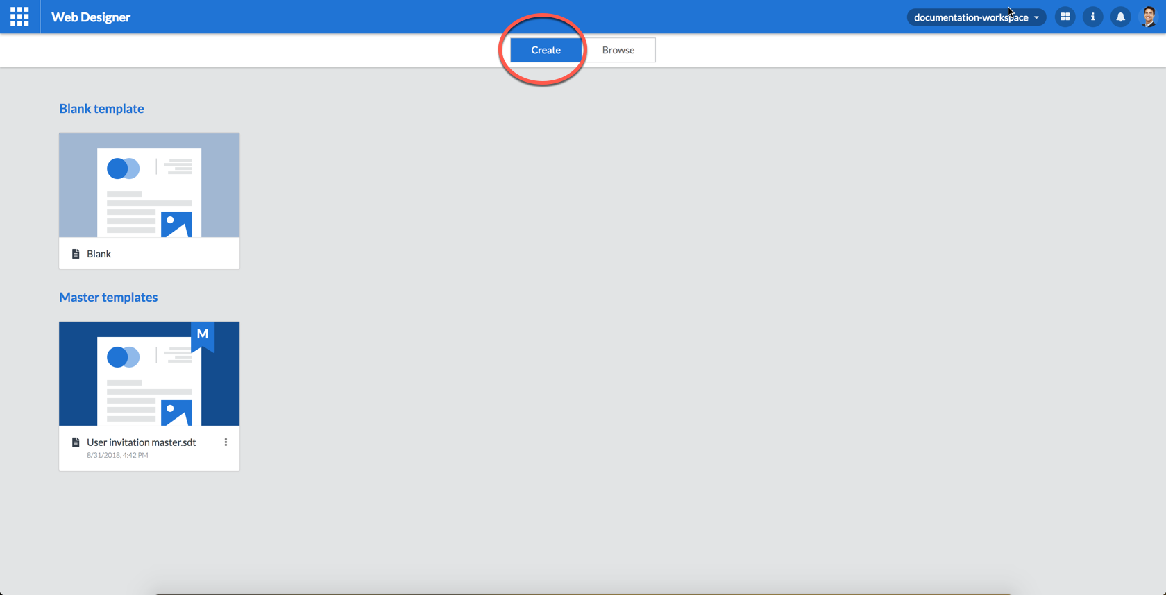 Figure 42. Put the browse page in create mode
 -
Double click the Blank template tile.
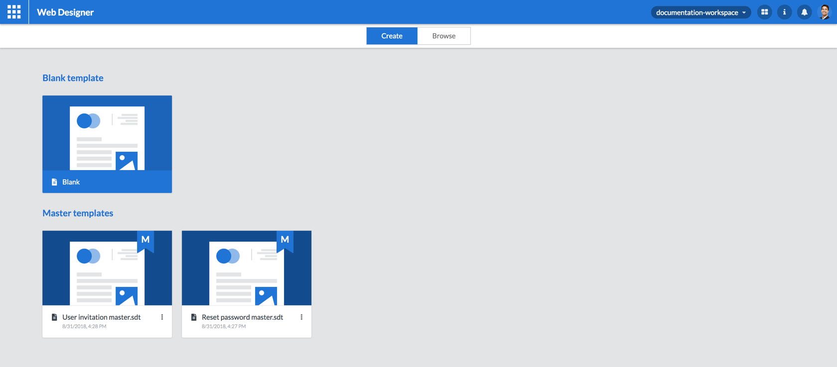 Figure 43. Double click the Blank template
 -
The design page will be displayed prompting you to give a name and location for your new template. Enter a unique name for your new template and click CREATE. Optionally select a folder where you want to save the new template.
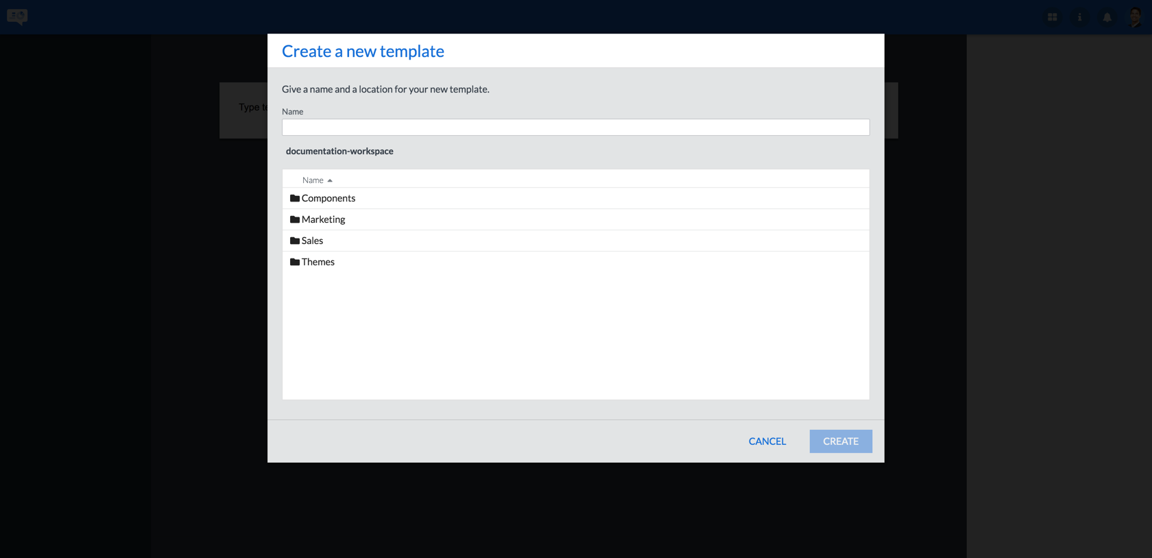 Figure 44. Enter the template name and location
The name of your template needs to be unique. If it is not, a clear error message will be displayed and you will have to enter a unique template name before you are allowed to continue:
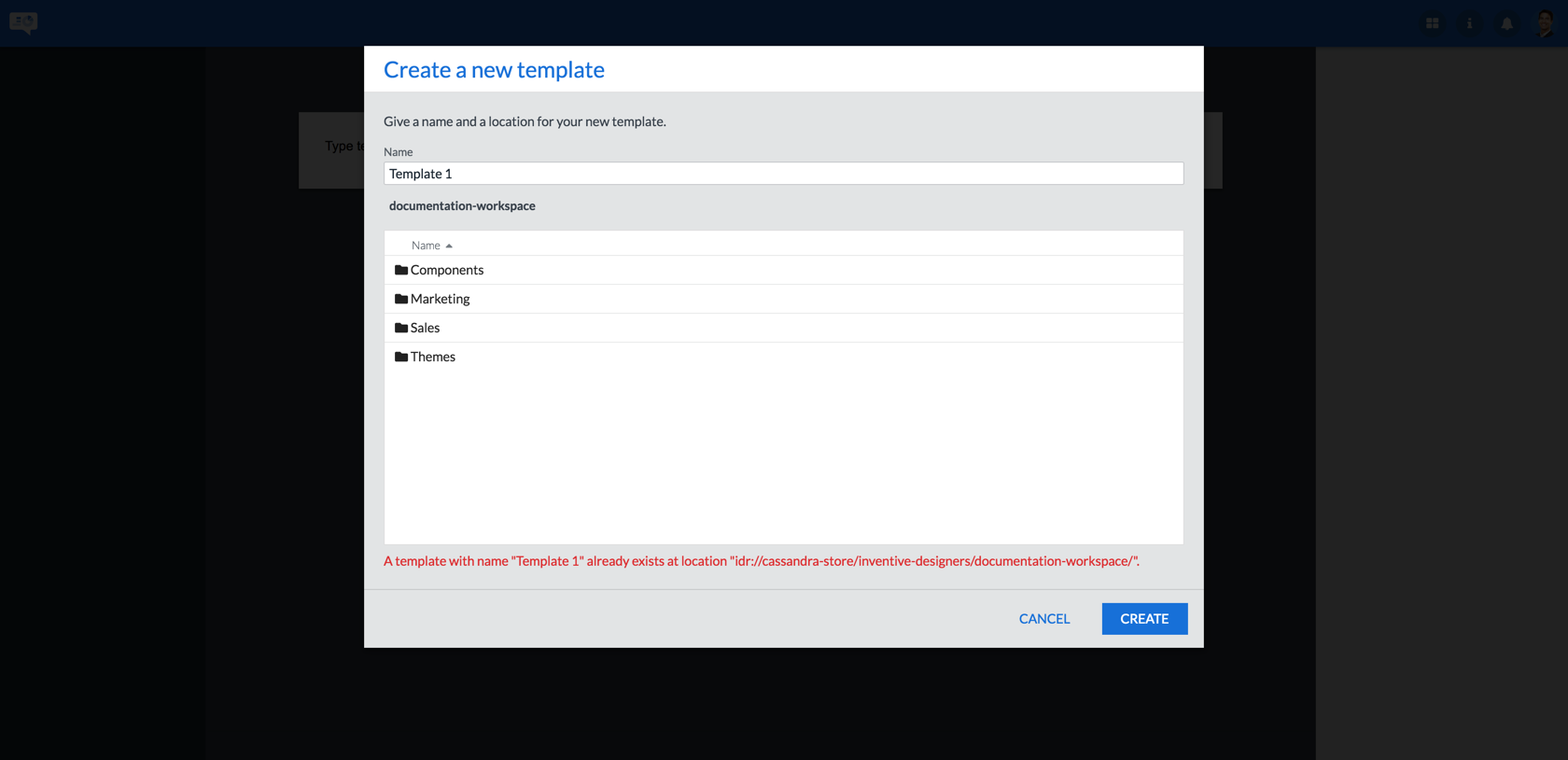 Figure 45. The template name is not unique
 -
You are now ready to start editing your template. More information on editing templates can be found in section Editing a template.
7. Creating a new template from a master template
When creating a template based on a master template your starting point will be a copy of that master template including all elements included in the master template such as objects, object properties, data model and so on.
The general procedure for creating a new template based on a master template is:
-
Put the browse page in create mode by clicking CREATE in the
slider.
Figure 46. Put the browse page in create mode -
Double click the master template you want to use.
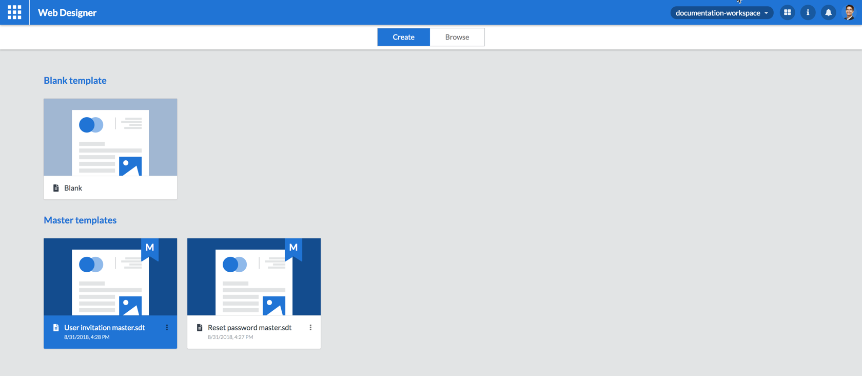 Figure 47. Double click the master template
 -
The design page will be displayed prompting you to give a name and location for your new template. Enter a unique name for your new template and click CREATE. Optionally select a folder where you want to save the new template.
Figure 48. Enter the template nameThe name of your template needs to be unique. If it is not a clear error message will be displayed and you will have to enter a unique template name before you are allowed to continue:
Figure 49. The template name is not unique -
You are now ready to start editing your template. More information on this step can be found in section Editing a template
8. Editing a template
If the template is not open for editing yet, use the following procedure:
-
Put the browse page in browse mode by clicking BROWSE in the
slider.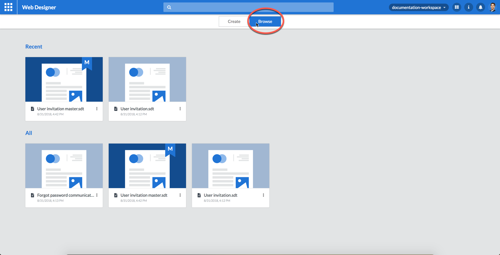 Figure 50. Put the browse page in browse mode
 -
Double click the template you want to edit.
Figure 51. Double click the template -
Double click the template tile to open the template for editing. Alternatively click the template tile’s icon and click Open in the menu.
-
You will now see the design page with your template opened for editing.
 Figure 52. The template ready for editing
8.1. Managing the template properties
A template has a number of properties influencing the behaviour of your template. Proceed as follows to manage the properties of the template you are editing:
-
To select the template click:
-
somewhere between the left edge of the template and the lefthand area
OR
-
somewhere between the top edge of the template and the top toolbar
OR
-
somewhere between the right edge of the template and the righthand area
as indicated in the following figure:
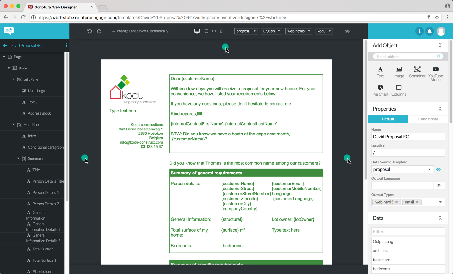 Figure 53. Selecting the template
-
-
You can now view and/or change the properties of the template:
-
Name: change the name of the template by typing the new, unique name and hitting Enter. If the template name is not unique an error message will be displayed and the template name will not be changed.
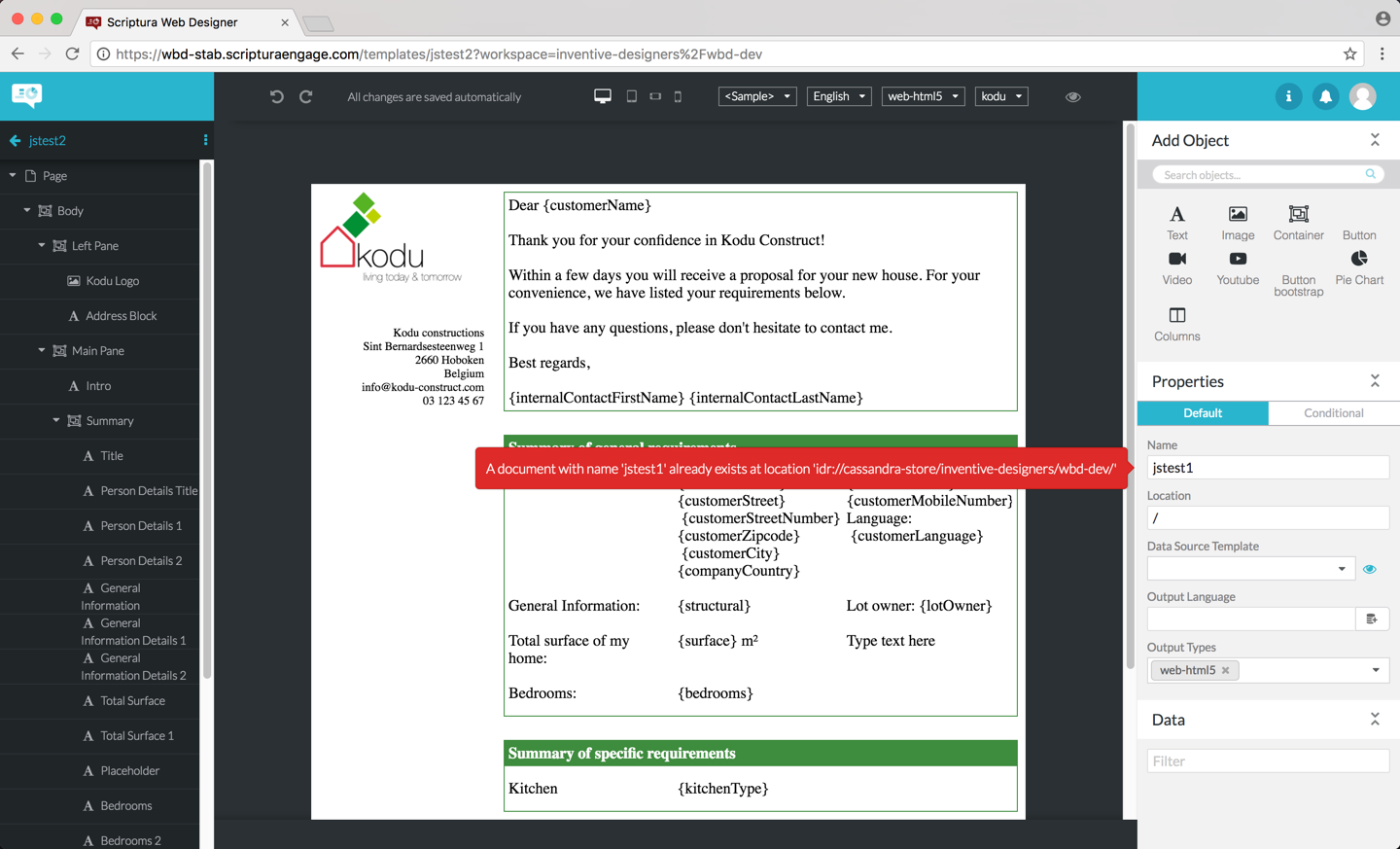 Figure 54. A duplicate template name
 -
Data Model: see Working with data.
-
Location: type in a path to store the template in a subfolder of your workspace. If the subfolder does not exist, Web Designer will create it for you. The
/indicates you are storing the template in your top level workspace. -
Output language: select the language to be used when generating output on basis of this template. Simply pick up the language from the data model associated with the template by clicking the
 icon and selecting the field to be used. See Multilingual templates for a comprehensive overview of Web Designer’s multilingual template support.
 -
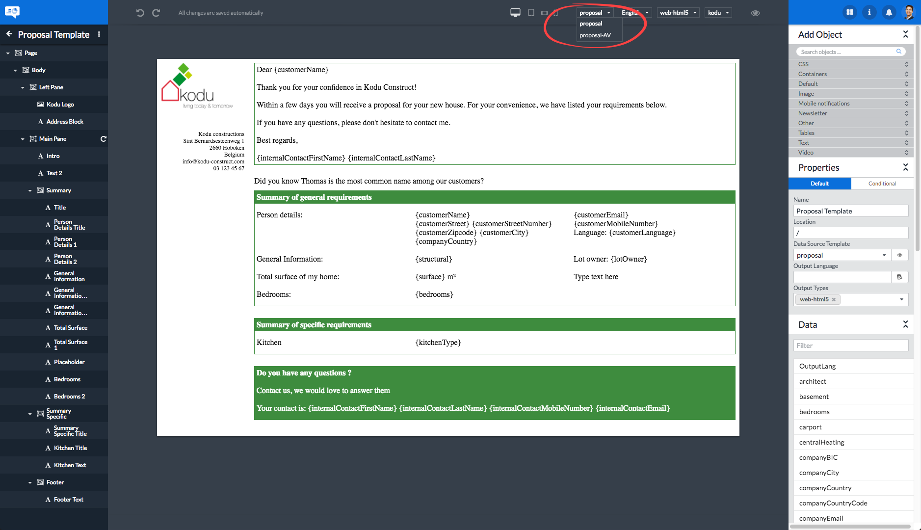
Output types: selects which output types have to be made available for previewing the template. Each label in this field adds a menu entry in the output type selection menu in the Web Designer toolbar. Remove a label by clicking the icon in the label. Adding an output type is done by clicking the icon and clicking the output type you want to add.
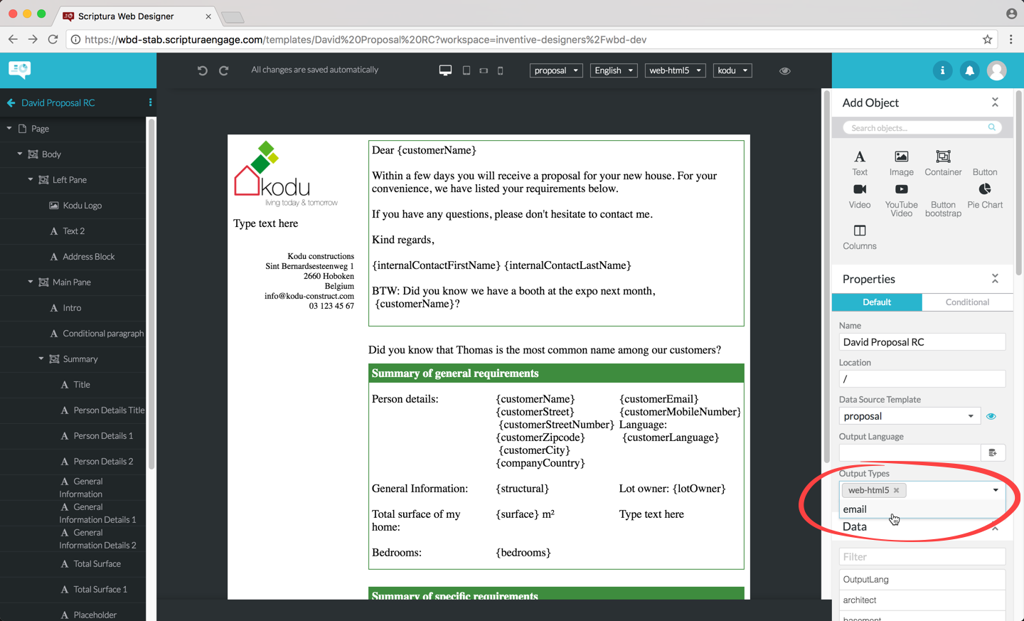 Figure 55. Adding an output type
 -
Tags (optional): Tag values are saved automatically when user inputs values to the pre-defined tags, which are defined through the WebDesigner Application Settings (section 12.1). Users are also able to download and save resources that contain tag information, which are restored when the resource is re-uploaded to a working project.
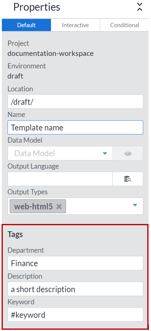 Figure 56. The list of tags can be found on the Properties panel in the WebDesigner application - Design screen.
-
8.2. Adding objects to a template
Adding objects to a template is a two step process:
-
Select the object after which you want to add a new object. Remember you can do this by clicking the object on the template or by clicking the object in the outline at the left.
-
In the Add Object panel, click the icon corresponding to the object type you want to add:
-
Click to add a text object.
-
Click to add an image object.
-
Click to add a container object.
-
|
You might see additional icons representing customer-specific objects in the Add Object panel. Ask your IT organization for more information on these pluggable objects. |
The object is now added after the initially selected object. Typically, your next action would be to review and edit the properties of the new object as explained in this chapter.
8.2.1. Adding an object before, after or in the selected object.
You can use the context menu on objects to pick an insertion method. These insertion methods are relative to your currently selected object and some of the options might be disabled because of this.
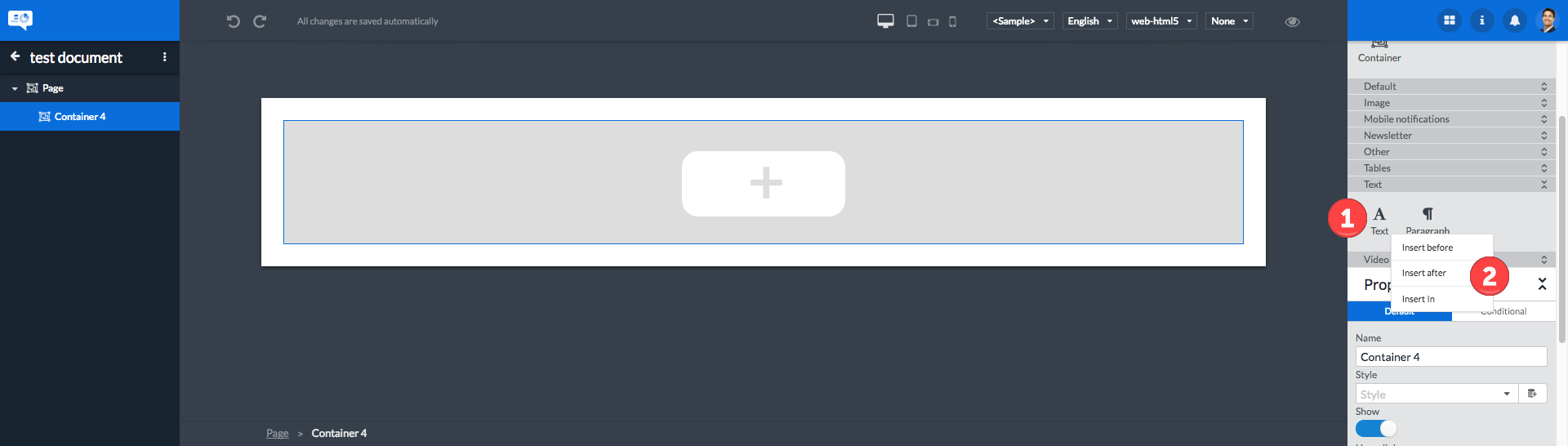
| 1 | Right click the object in the object-pane |
| 2 | Select the insertion method. |
8.3. Editing the properties of an object
Editing the properties of an object is straightforward:
-
Select the object of which you want to change one or more properties.
-
Review and edit the properties of the selected object using the property fields as listed in the Properties panel in the righthand area of the design page. Both the default and conditional properties can be edited. See section Object default and conditional properties for more information on this.
|
Make sure you have a proper understanding of the function of the object property you are changing. Incorrectly defined object properties will have negative side-effects on the processing of your template. |
8.4. Editing text in a text object -
To edit text you first have to select the text object by clicking it in the template or in the object outline in the lefthand area. After selecting the text object, click somewhere in the text to activate the text editor and to position the cursor.
| Action | Function |
|---|---|
Single click |
Position the cursor |
Double click |
Select the word |
Triple click |
Select the paragraph |
Drag the cursor over the text |
Select the text |
Basic editing actions supported are:
-
Adding text by positioning the cursor and typing the text to add
-
Deleting the character to the left of the cursor by hitting the Backspace key
-
Deleting the character to the right of the cursor by hitting the Delete key
-
Deleting selected text by using the Backspace or Delete key
Editing a text object will activate the text editor. Once active the text editor toolbar is displayed at the top of the central area, the toolbar is shown in Legacy or Non-legacy type, depending on the mode that you have chosen (check Text objects for more information).
There are some improvements for Non-legacy compared with the Legacy text object like:
-
Support for headings.
-
Support for table of contents based upon headings.
-
Additional bullet styling.
-
Sub- and superscript.
-
Intuitive output generation for that text (important for theme authors).


The button allows you to add a data field to the text object. See Adding a data field to text for more information.
The text editor toolbar in Non-legacy mode allows the user to specify if a text object is a heading or a paragraph text object. There are 5 options:
-
Paragraph (default)
-
Heading 1
-
Heading 2
-
Heading 3
-
Heading 4
In HTML output this would correspond to <p>, <h1>, <h2>, <h3> and <h4>, in PDF output this would enable a PDF viewer to recognize these elements as sections which enable a Table Of Contents. Defining this text object type allows accessibility tools to interpret the structure of your generated document and is required for some accessibility standards.
8.4.1. Inserting a hyperlink in the text
The button can be used to add a hyperlink to the text object:
-
Click the button
-
You will now be prompted for additional link information:
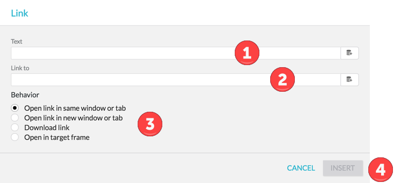 Figure 59. Inserting a hyperlink
1 The text to display in the template. 2 The web address or URL to open when the link is clicked. 3 The browser behaviour when the link is clicked. 4 Buttons to cancel or confirm the addition of the hyperlink.
Both the Text and Link to properties can contain static text or a data field. When using a data field the property will be read from the assigned data model at the time when the template and the data are merged. Static text is defined when designing the template and will not be altered when merging the template and the data.
8.4.2. Editing a hyperlink in a text object
To edit a hyperlink in a text object use the following procedure:
-
Select the text object containing the hyperlink by clicking the text object in the outline at the left or by clicking the text object in the template.
-
Click inside the selected text object in the template to activate the text editor.
-
Click on the hyperlink you want to edit.
The Link dialog box will be displayed allowing you to edit the hyperlink:
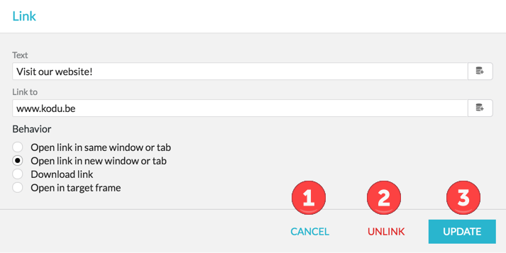
The Link dialog box is very similar to the one used when entering a new hyperlink (see Inserting a hyperlink in the text ).
However, the buttons used are different:
| 1 | Click the CANCEL button if you want to cancel the editing operation without making changes. |
| 2 | Click the UNLINK button if you want to convert the hyperlink into text, losing its hyperlink functionality. |
| 3 | Click the UPDATE button to update the hyperlink after changing its Text, Link to, and/or Behaviour properties in the dialog box. |
|
Unlinking a hyperlink will remove its hyperlink behaviour. The URL is lost but the contents of the hyperlink’s Text property will remain as pure text in your template. If needed you can remove this text manually. |
8.4.3. Adding conditional text
It is also possible to put conditions on text fragments. This allows you to display text fragments only if certain conditions are met. The conditions refer to the content of a data model linked to the template.
Proceed as follows to put conditions on a text fragment:
-
Select the text fragment on which you want to put one or more conditions.
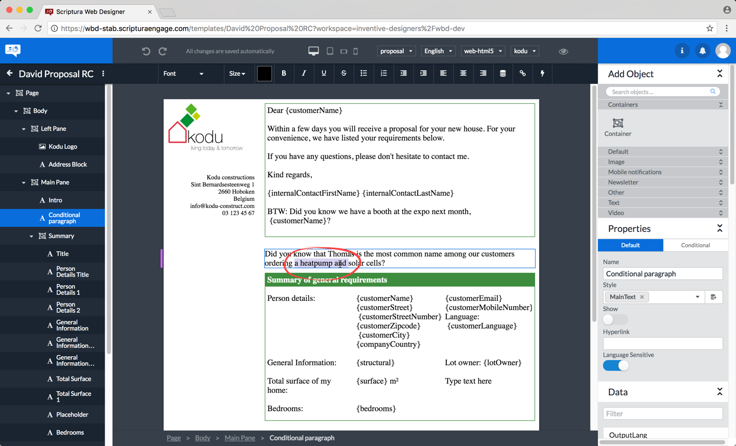 Figure 61. Selecting the text fragment by clicking and/or dragging
 -
Click the icon in the editor toolbar to open the Conditional Text dialog box.
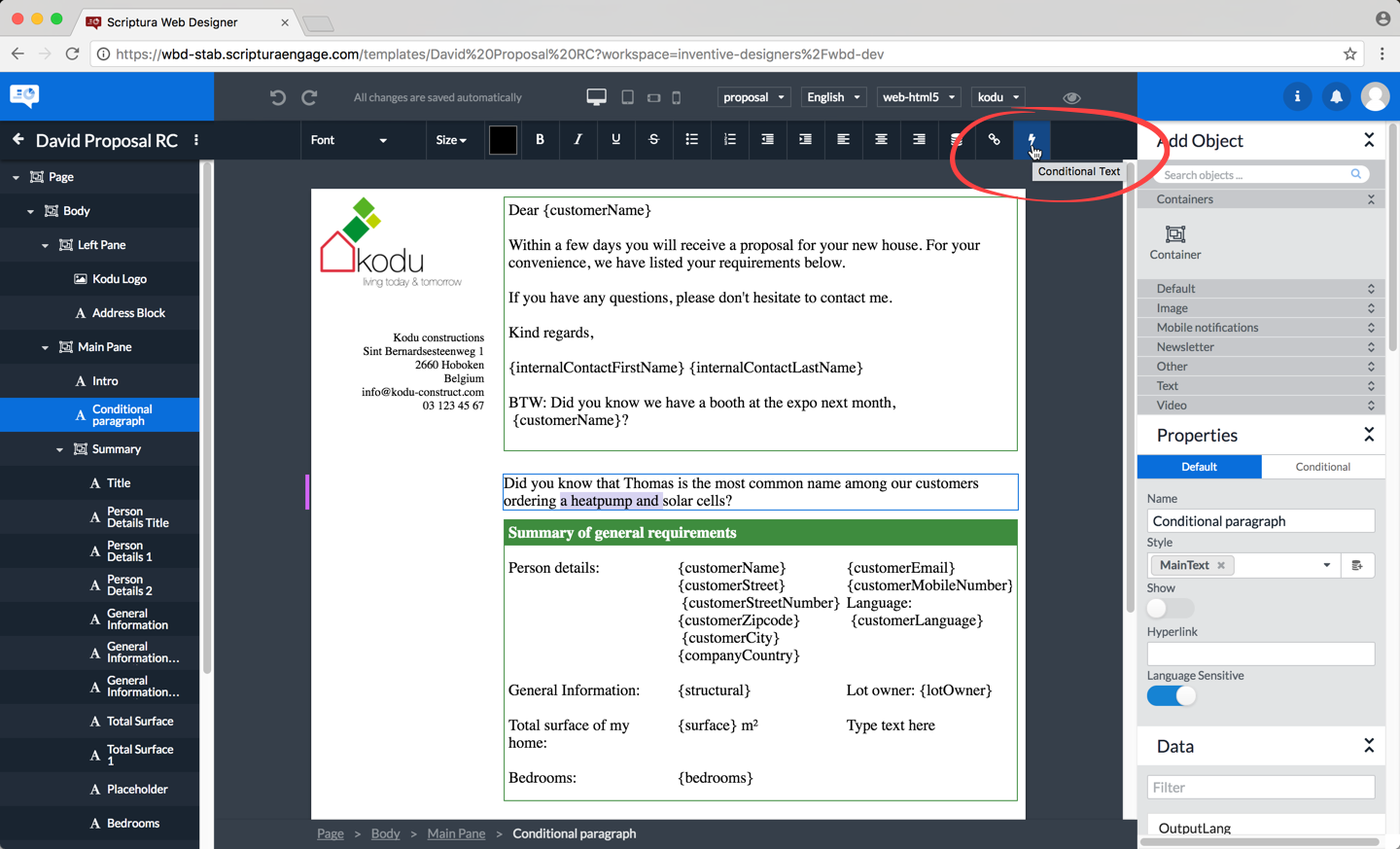 Figure 62. Clicking the Conditional Text icon in the editor toolbar
 -
You can now start entering the required information in the Conditional Text dialog box.
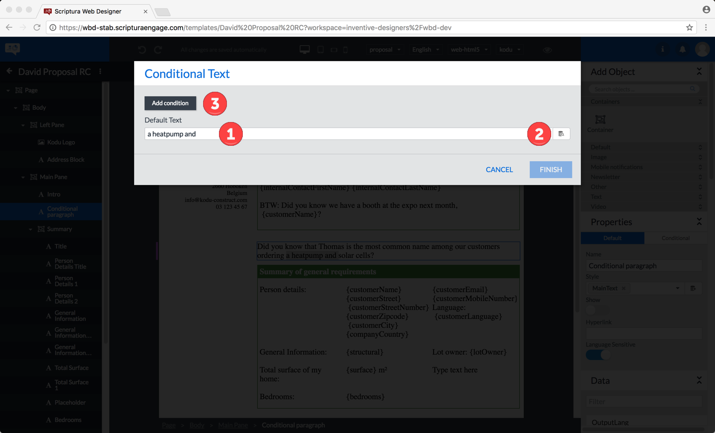 Figure 63. The Conditional Text dialog box
1 Enter the default text to display. 2 You can also set up the default text by inserting a data field. 3 Click the Add condition button to define the condition to be linked to the text. The remainder of the procedure is very similar to the procedure explained in section Using conditional properties.
8.5. Editing container objects -
8.5.1. Adding a container object
Adding a container object is very similar to adding other types of objects:
-
Select the object below which you want to add a container object
-
Click the icon representing a container object
The container object added will be displayed with a big button in the center as can be seen in following figure:
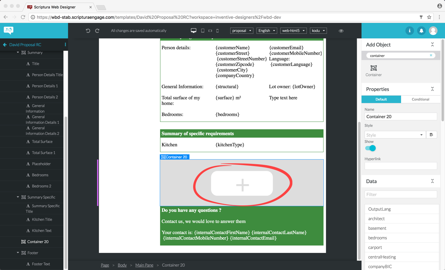
Clicking the button will now add a text object to the template.
If you wanted to add a text object in the container then click once on the text to activate the editor and start typing your text.
If you wanted to add another type of object to the template make sure the text object added in the previous step is selected and now click on the icon representing the object type you want to add. Your container now contains a text object and another type of object.
If you don’t need the text object added to the container by default, select and delete this text object as described in section Deleting objects from a template.
8.5.2. Adding an object to an existing container object
Adding an object to an existing container object is straightforward:
-
Select the object in the container after which you want to add a new object
 Figure 65. Selecting the object in the container
 -
Click the icon representing the object type you would like to add
 Figure 66. Adding an object after the selected object
8.5.3. Deleting an object from a container
Deleting an object from a container is similar to deleting an object from a template. See section Deleting objects from a template for more details.
|
Be careful in selecting the correct object to be deleted. Selecting the container object for deletion will lead to deletion of the container object and all objects stored in the container object. Use the icon to undo your deletion if necessary. |
8.6. Editing Table objects -
8.6.1. Add rows or columns
Adding rows or columns is done via the table helpers. These helpers will only appear in design modus and when the table is selected.
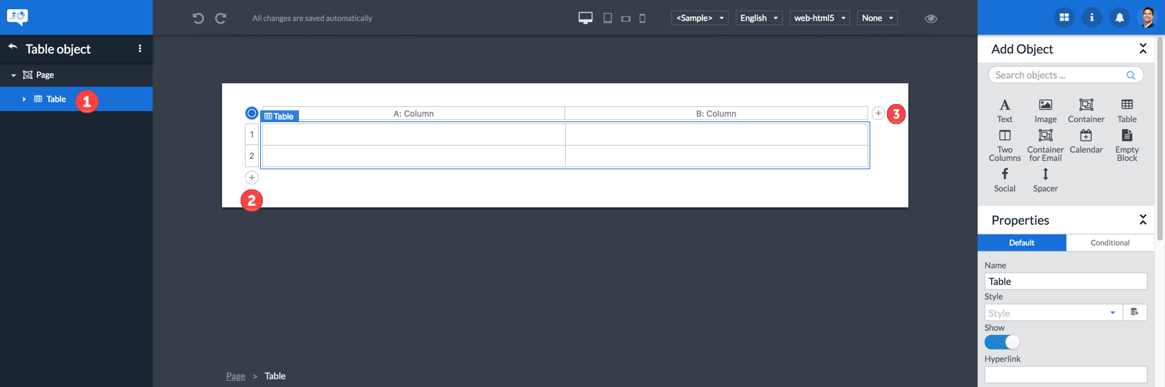
| 1 | Select the table object |
| 2 | Add a row by clicking the |
| 3 | Add a column by clicking the |
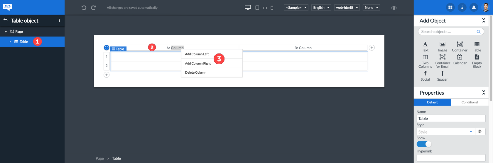
| 1 | Select the table object |
| 2 | Right click on the column or row helper |
| 3 | Choose how you want to add the row or column |
8.6.2. Delete rows or columns

| 1 | Select the table object |
| 2 | Right click on the column or row helper |
| 3 | Choose the delete option |
| 1 | Select the table object |
| 2 | Left click the column or row helper |
| 3 | Press Delete or fn + Delete on mac |
8.6.3. Resize columns
| 1 | Select the table |
| 2 | Drag your mouse in between 2 columns until you see |
| 3 | Hold the left mouse button down |
| 4 | Drag the mouse to the desired size |
| 5 | Lift up the left mouse button |
8.6.4. Inserting objects in table cells
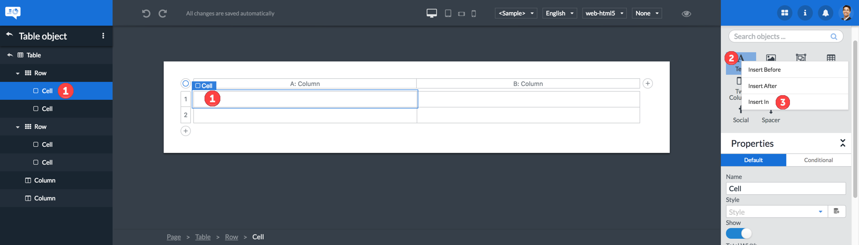
| 1 | Select a table cell |
| 2 | Right click the object you want to insert |
| 3 | Select the Insert in option on an object |
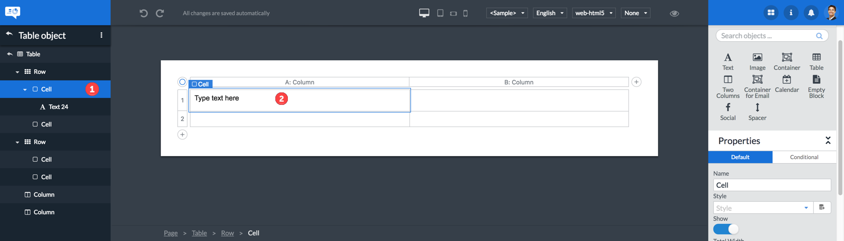
| 1 | Select a table cell |
| 2 | click in the center of the cell to automatically add a text object |
8.6.5. Creating a repeating row
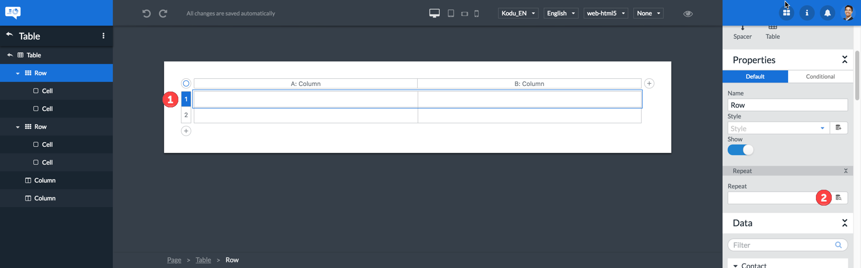
| 1 | Select a row |
| 2 | Click the button in the properties pane |
| 3 | Select the data field you want to repeat over. See Repeating objects |
8.7. Using conditional properties
Conditional properties allow you to give object properties a specified definition only when one or more conditions are met.
To add conditional properties to an object proceed as follows:
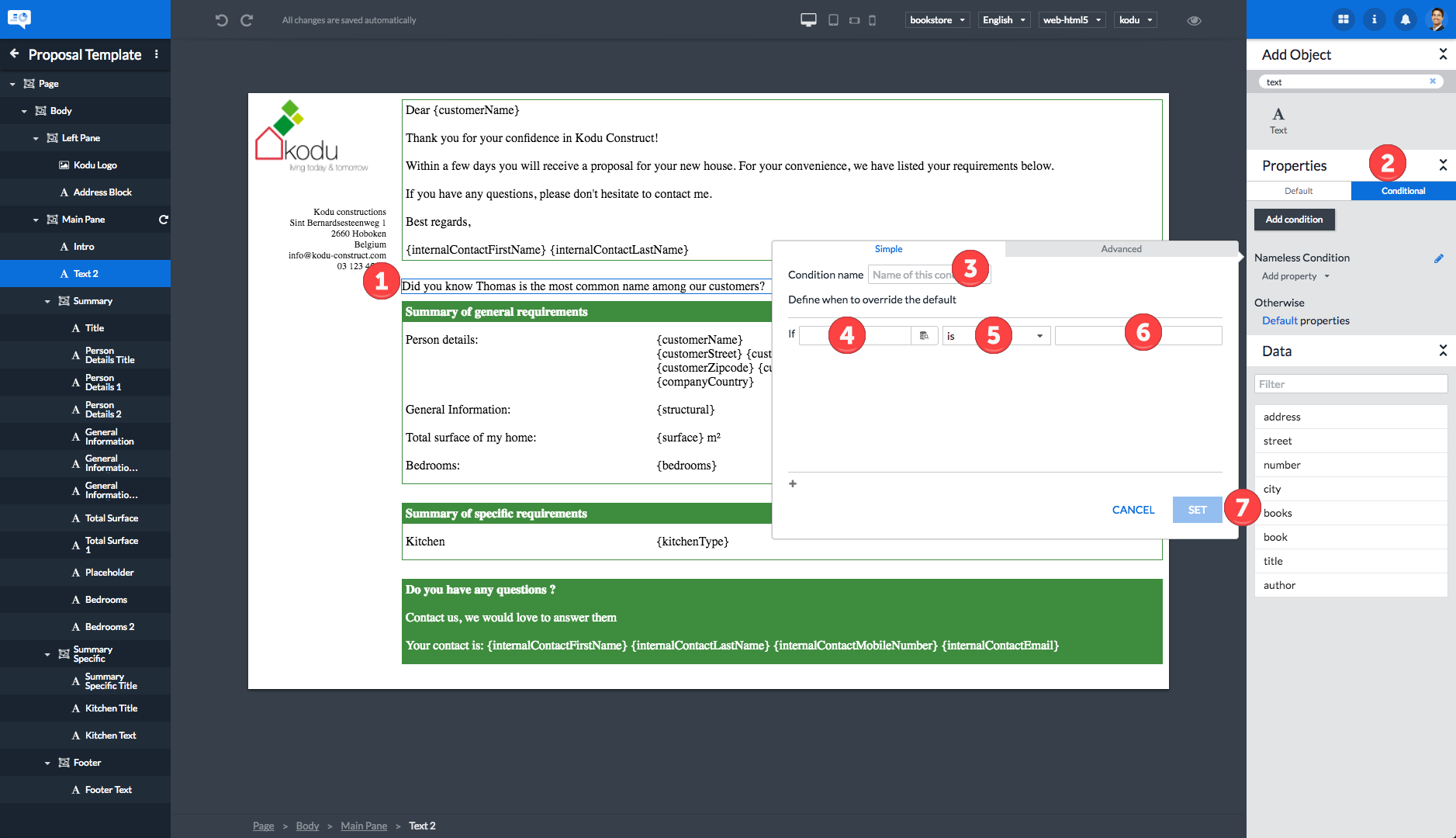
-
Select the object for which you want to add conditional properties.
-
Click the Conditional button.
-
Give your condition a meaningful name. Already existing conditions are also listed and available for selection here to allow for editing existing conditions.
-
Select the data field to use.
-
Select the operator to use.
-
Enter the value to use as second operand.
-
Click the SET button to confirm your input.
-
Click Add property.
-
Select the property you want to set up as a conditional property.
-
Define the selected property. In this example the Show property has been made active.
More complex scenario’s can be supported by creating more complex condition sets as illustrated in the following example:
| 1 | The paragraph for which you are defining conditional properties. |
| 2 | The condition name. |
| 3 | The simple condition(s). |
| 4 | How the simple conditions should be combined. |
| 5 | The property definition when the condition set is met. |
The highlighted is used to add additional conditions to the condition set.
It is also possible to have multiple condition sets active on an object as explained in section Objects. The condition sets are evaluated in the order listed. Per property Web Designer goes through the list of conditions that currently match. The first matching condition that has a value for that property, will have that value assigned to the property. So it could be that the value of the Show property comes from the first condition while the value of the Style property comes from for example the third condition.
-
The first condition set controlling the Show property - should the object be displayed or not.
-
The second condition set controlling the Style property - how is the text of the object styled.
-
The different icons for managing the condition set:
-
Move the condition up in the list of condition sets: .
-
Move the condition down in the list of condition sets: .
-
Delete the condition set: .
-
Edit the condition set: .
-
8.8. Changing the order of objects
You can change the order of the objects by dragging and dropping them in the outline as shown in the video. The place where you drop the object will be shown by a blue line. The line will be red if you are trying to position your object at an illegal position.
8.9. Deleting objects from a template
To delete an object:
-
Select the object by clicking it in the outline in the lefthand area or by clicking the object in the center area.
-
Hit the delete key to delete the object or type Ctrl+X on a PC or command+X on an Apple Macintosh.
|
Hitting the backspace key will not delete the selected object! Use the delete key! |
|
Remember you can undo accidental object deletions by clicking the icon or by typing Ctrl+Z on a PC or command+Z on an Apple Macintosh. |
9. Working with data
The Web Designer offers the capability of linking a data model to a template allowing the contents of the template to change dynamically. This dynamic behaviour can involve data fields in text, properties, conditions on properties and conditional text runs.
9.1. Data model
In this section we will use the following data structure as example:
store
  address
    street 'Baker Street'
    number 1
    city 'New York'
  books
    book
      title 'The Da Vinci Code'
      author 'Dan Brown'
    book
      title 'Harry Potter and the Goblet of Fire'
      author 'J.K. Rowling'
    book
      title 'The Hunger Games'
      author 'Suzanne Collins'
The Web Designer data model consists of 3 types of nodes:
| 1 | Variables: These are all the leaf nodes that are not repeated. They can be used as data field. |
| 2 | Intermediate nodes: Can not be selected for data fields as they don’t contain a direct value. They are there for structure and to distinguish between leaves with the same name. |
| 3 | Repeated nodes: Occur more than once in the data model and can be repeated on. These nodes are denoted by the repeating icon. See Repeating objects. |
9.2. Specifying a data model
In order to use dynamic content in the Web Designer you should first link a data model.

| 1 | Select the Data Model that you want to use as data model. Note that this is a property on the template itself (see Managing the template properties). |
| 2 | The icon allows you to preview the contents of the currently selected data model sample. |
If a data model contains multiple sample data sets, you can choose the sample data set to use by selecting it in the sample data set dropdown list as shown in the following figure:
If you attempt to insert a data field without first specifying a data model, the Web Designer will show the following dialog asking you to specify a data model first:

| 1 | Select the data model for which to insert a data field. |
After specifying a data model, the Insert data field wizard is shown.
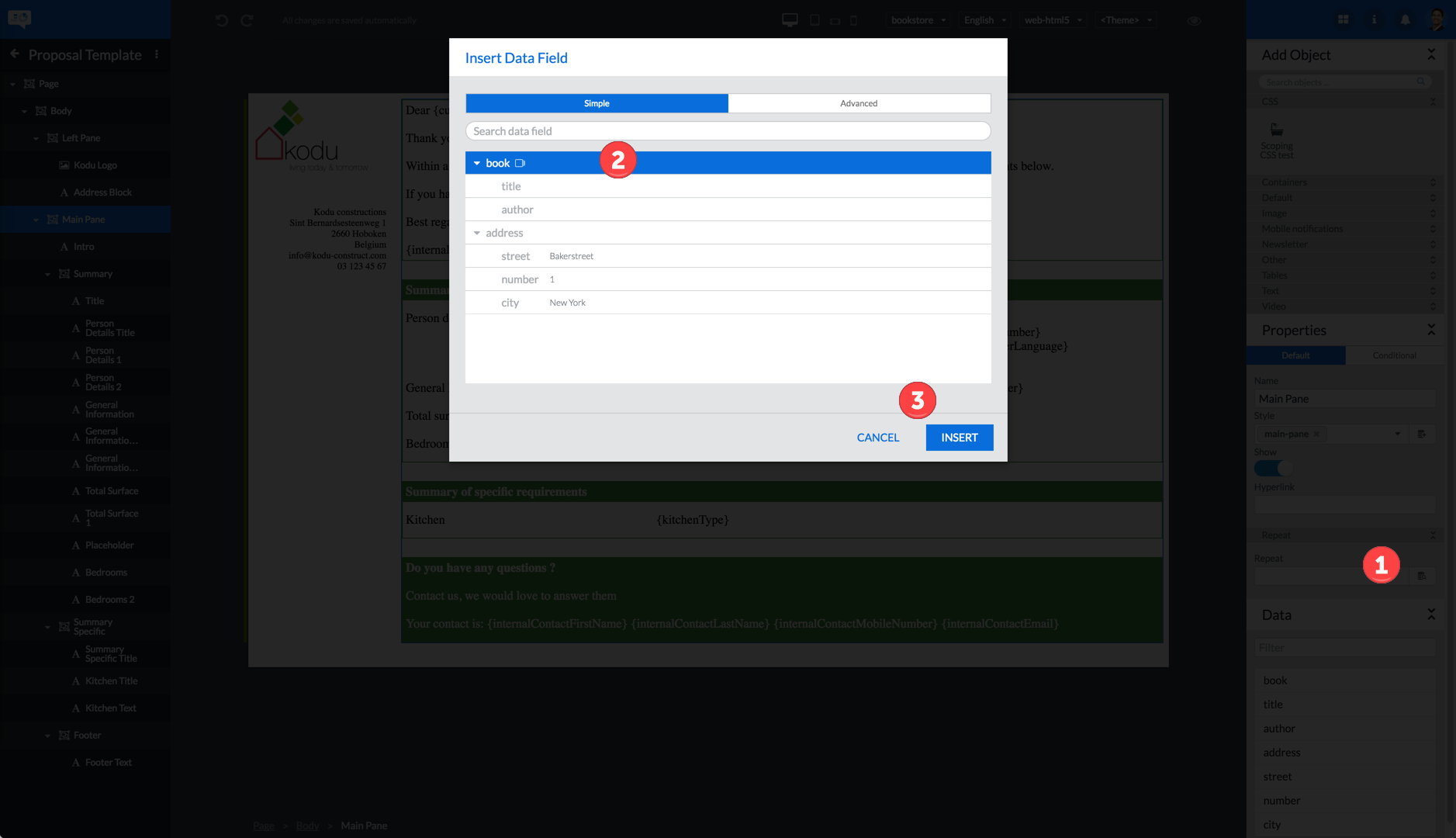
9.3. Insert data field wizard
The Insert data field wizard is used to insert new data fields or edit existing data fields.
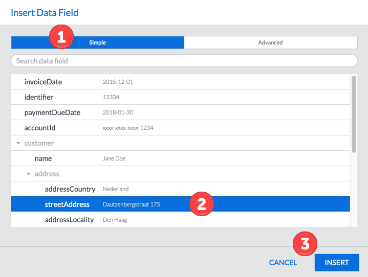
| 1 | Click the Simple tab at the top of the dialog box |
| 2 | Select the data field you want to use by clicking it. Note that you can only select leaf nodes and intermediate / repeating nodes are disabled. |
| 3 | Click the INSERT button at the bottom of the Insert Data Field dialog box |
You can close the Insert Data Field dialog box by clicking the CANCEL button or by pressing the esc key.
| 1 | Outside of a repeat, it is not possibe to select descendants of repeated nodes. These nodes will be grayed out in the wizard. |
| 2 | Leaf nodes outside of the repeated node are free for selection. |
9.3.1. Advanced tab
The Advanced tab of the Insert data field wizard allows you to view and edit the raw javascript expression for your data field. This allows you to write more complex expressions.
|
By default, when using data fields that don’t exist in your data model the entire expression will evaluate to the empty string. In some cases you will want only these non-existing data fields to evaluate to the empty string while the rest of your expression is still evaluated, for example when constructing a dynamic URL with parameters. For these cases, the designer contributes a guard function ("d('field_name')") that simply ensures that when the field doesn’t exist in your data model, an empty string is returned. Example for a dynamic URL: 'http://www.scripturaengage.com?lang=' + d('language') |
9.3.2. Formatting data
To format your data correctly we provided 3 helpful format functions: [_format_iban], [_format_date] and [_format_number].
Format IBAN
To format your ibans just include the following snippet in your text field.
{formatIban("insert IBAN here")}
The output will always be an IBAN formatted with a space between every 4 digits.
Example:
{formatIban("BE 041234 12341234")}
{formatIban("BE04123412341234")}
{formatIban("BE0412 3412 34 1234")}
{formatIban("BE04 123412341234")}
Will always output:
BE04 1234 1234 1234
Format Date
To format a date you can use the table with tokens beneath the example as a guide. You can combine these tokens in any way you want. The dates are translated depending on your output language.
Example:
{formatDate("<INSERT ISO DATE>", "<DATE_FORMAT>")}
{formatDate("1879-03-14T09:30:10Z", "hh:mm:ss - DD MMMM YYYY")}
{formatDate("1879-03-14T09:30:10Z", "dddd, MMMM Do YYYY, h:mm:ss a")}
Output:
09:47:40 - 14 March 1879
Friday, March 14th 1879, 9:47:40 am
If you are using a customized date (a date that is not in the ISO format) you can specify the expected incoming and outgoing date format.
Example:
{formatDate("<INSERT CUSTOM DATE>", { inputFormat: <INPUT_DATE_FORMAT>, outputFormat: <OUTPUT_DATE_FORMAT> })}
{formatDate("03-14-1879", { inputFormat: 'MM-DD-YYYY', outputFormat: 'DD MMMM YYYY' })}
{formatDate("14-03-1879", { inputFormat: 'DD-MM-YYYY', outputFormat: 'dddd, MMMM Do YYYY' })}
Output:
14 March 1879
Friday, March 14th 1879
| token | Output | |
|---|---|---|
Month |
M |
1 2 … 11 12 |
Mo |
1st 2nd … 11th 12th |
|
MM |
01 02 … 11 12 |
|
MMM |
Jan Feb … Nov Dec |
|
MMMM |
January February … November December |
|
Quarter |
Q |
1 2 3 4 |
Qo |
1st 2nd 3rd 4th |
|
Day of Month |
D |
1 2 … 30 31 |
Do |
1st 2nd … 30th 31st |
|
DD |
01 02 … 30 31 |
|
Day of Year |
DDD |
1 2 … 364 365 |
DDDo |
1st 2nd … 364th 365th |
|
DDDD |
001 002 … 364 365 |
|
Day of Week |
d |
0 1 … 5 6 |
do |
0th 1st … 5th 6th |
|
dd |
Su Mo … Fr Sa |
|
ddd |
Sun Mon … Fri Sat |
|
dddd |
Sunday Monday … Friday Saturday |
|
Day of Week (Locale) |
e |
0 1 … 5 6 |
Day of Week (ISO) |
E |
1 2 … 6 7 |
Week of Year |
w |
1 2 … 52 53 |
wo |
1st 2nd … 52nd 53rd |
|
ww |
01 02 … 52 53 |
|
Week of Year (ISO) |
W |
1 2 … 52 53 |
Wo |
1st 2nd … 52nd 53rd |
|
WW |
01 02 … 52 53 |
|
Year |
YY |
70 71 … 29 30 |
YYYY |
1970 1971 … 2029 2030 |
|
Y |
1970 1971 … 9999 +10000 +10001 Note: This complies with the ISO 8601 standard for dates past the year 9999 |
|
Week Year |
gg |
70 71 … 29 30 |
gggg |
1970 1971 … 2029 2030 |
|
Week Year (ISO) |
GG |
70 71 … 29 30 |
GGGG |
1970 1971 … 2029 2030 |
|
AM/PM |
A |
AM PM |
a |
am pm |
|
Hour |
H |
0 1 … 22 23 |
HH |
0 01 … 22 23 |
|
h |
1 2 … 11 12 |
|
hh |
01 02 … 11 12 |
|
k |
1 2 … 23 24 |
|
kk |
01 02 … 23 24 |
|
Minute |
m |
0 1 … 58 59 |
mm |
00 01 … 58 59 |
|
Second |
s |
0 1 … 58 59 |
ss |
00 01 … 58 59 |
|
Fractional Second |
S |
0 1 … 8 9 |
SS |
00 01 … 98 99 |
|
SSS |
000 001 … 998 999 |
|
SSSS … SSSSSSSSS |
000[0..] 001[0..] … 998[0..] 999[0..] |
|
Time Zone |
z or zz |
EST CST … MST PST |
Z |
-07:00 -06:00 … +06:00 +07:00 |
|
ZZ |
-0700 -0600 … +0600 +0700 |
|
Unix Timestamp |
X |
1360013296 |
Unix Millisecond Timestamp |
x |
1360013296123 |
Localized Date Formats
Because preferred formatting differs based on locale, there are a few tokens that can be used to format a moment based on its locale.
There are upper and lower case variations on the same formats. The lowercase version is intended to be the shortened version of its uppercase counterpart.
Example:
{formatDate("2021-09-06T23:59:59Z", "L")}
{formatDate("2021-09-06T23:59:59Z", "LL")}
Output in Dutch:
07-09-2021
7 september 2021
Output in English:
09/07/2021
September 7, 2021
| token | Output | |
|---|---|---|
Time |
LT |
8:30 PM |
Time with seconds |
LTS |
8:30:25 PM |
Month numeral, day of month, year |
L |
09/04/1986 |
l |
9/4/1986 |
|
Month name, day of month, year |
LL |
September 4, 1986 |
ll |
Sep 4, 1986 |
|
Month name, day of month, year, time |
LLL |
September 4, 1986 8:30 PM |
lll |
Sep 4, 1986 8:30 PM |
|
Month name, day of month, day of week, year, time |
LLLL |
Thursday, September 4, 1986 8:30 PM |
llll |
Thu, Sep 4, 1986 8:30 PM |
Format Number
To format a number you can use the table with characters beneath the example as a guide.
Example:
{formatNumber(<INSERT NUMBER>, "<NUMBER_FORMAT>")}
{formatNumber(123456.789,"0,0.0000")}
{formatNumber(123456.789,"00.000#")}
{formatNumber(123456.789,"0,0.##0#0")}
{formatNumber(123456.789,"+0,0.0000")}
Output:
123,456.7890
123456.789
123,456.7890
+123,456.7890
| Character | Description | |
|---|---|---|
0 |
A digit in the number. An insignificant 0 will appear in the results. |
|
# |
A digit in the number. An insignificant 0 will not appear in the results. |
|
,(comma) |
Formats numbers with a thousands separator. |
|
+ |
A sign will be visible in front of the number. |
9.4. Adding a data field to text
The content of Text Objects can be made more dynamic by inserting data fields which are replaced with actual content when the data is merged.
|
The following procedure assumes a data model has been linked to your template. See section Managing the template properties for details on how to do this. |
In order to add data fields to text, click the button in the text toolbar. This will bring up the Insert data field wizard which allows you to add a data field.
Editing an existing data field can be done by double-clicking the data field while in edit mode, or by selecting the data field and once again clicking the button in the text toolbar.
9.5. Adding a data field to a property or dialog field
A number of properties and dialog fields support the use of data fields. This allows these properties and dialog fields to get their definition from a data model at the time when the template and the data are merged. Properties not supporting this are given a value manually by the Web Designer user while designing the template.
|
The following procedure assumes a data model has been linked to your template. See section Managing the template properties for details on how to do this. |
The following table lists the properties supporting data fields for the built-in objects.
| Object type | Properties supporting data fields |
|---|---|
Text object |
Style property |
Link in text object |
Text property |
Link to property |
|
Image object |
Style property |
Location property |
|
Alt text property |
|
Container object |
Style property |
In the following figure a template image was selected. The data field enabled properties are highlighted in the righthand area.
9.5.1. Using the data field wizard
To add a data field to a property you first have to activate the Insert Data Field dialog box by clicking the icon next to the property in which you want to include a data field.
Then use the Insert Data Field dialog box as described in Insert data field wizard.
9.5.2. Entering the data field in the property (inline)
It is also possible to just enter simple data field expressions in the properties themselves. These expressions should be between { and } characters. It is also possible to combine these inline expressions with static strings:
|
When viewing these expressions in the advanced tab of the data field dialog you will notice that the guard function (d()) was automatically added to data fields to make sure that the rest of the expression is still returned when the data field does not exist in your data model. |
9.6. Repeating objects
The data model can have elements that can occur more than once. Certain objects can specify a repeat property which denotes this repeating element. The object will then be repeated for each occurrence of the element in the data.
In the example, the book element is repeated multiple times. The repeat property can be specified as follows:
| 1 | Open the Repeat property data field wizard by pressing the icon next to it. |
| 2 | Select a repeating data field (indicated by the icon). Note that non-repeating data fields (such as address) will not be available for selection at this time. |
| 3 | Click the INSERT button at the bottom of the Insert Data Field dialog box |
Once the repeat property is set, the outline pane on the left will show the icon, indicating that this object is being repeated. In design mode, the Web Designer will only show the first iteration of the repeated object. When switching to preview mode or when generating output, the object will be repeated for each occurence of the element denoted by the repeat property in the data.
9.6.1. Specifying a data field within a repeat
Once a repeat property has been set on a repeatable object, it can be useful to specify data fields on properties of the repeated object, a descendant of the repeated or in a text object within the repeated object. If the data fields are descendants of the repeated node in the data model, they will be evaluated relative to the repeat context, meaning they will derive their value based on the current repeat position.
Recall the example from before:
store
  address
    street 'Baker Street'
    number 1
    city 'New York'
  books
    book (1)
      title 'The Da Vinci Code'
      author 'Dan Brown'
    book (2)
      title 'Harry Potter and the Goblet of Fire'
      author 'J.K. Rowling'
    book (3)
      title 'The Hunger Games'
      author 'Suzanne Collins'
Repeating on the book element in the example above and inserting a data field author will cause the data field to have the value Dan Brown for the first iteration, J.K. Rowling for the second iteration and Suzanne Collins for the third and final iteration of the repeat.
|
When modifying the repeat property, keep in mind that there may be relative data fields on the object or in descendants of the object on which the repeat was specified. The Web Designer does not do any sort of automatic refactoring at this time so changing the repeat property may break existing data field references. |
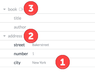
It is also posible to select nodes that are not descendants of the repeated node. These nodes will not be relative to the current repeat context and will therefore not derive their value based on the repeat position. Instead they will have the same value for every iteration of the repeat. For example, inserting a datafield street will have the value Bakerstreet in every iteration of the repeated object.
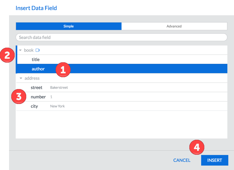
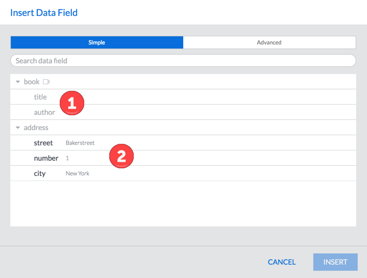
| 1 | Specify a data field relative to the current repeat element. |
| 2 | The blue line and blue repeat icon next to book indicate the current repeat context. All data fields selected within this context will be relative to the repeat context. |
| 3 | Select an element outside of the current repeat context. |
| 4 | Press the INSERT button to finish the dialog and insert the data field. |
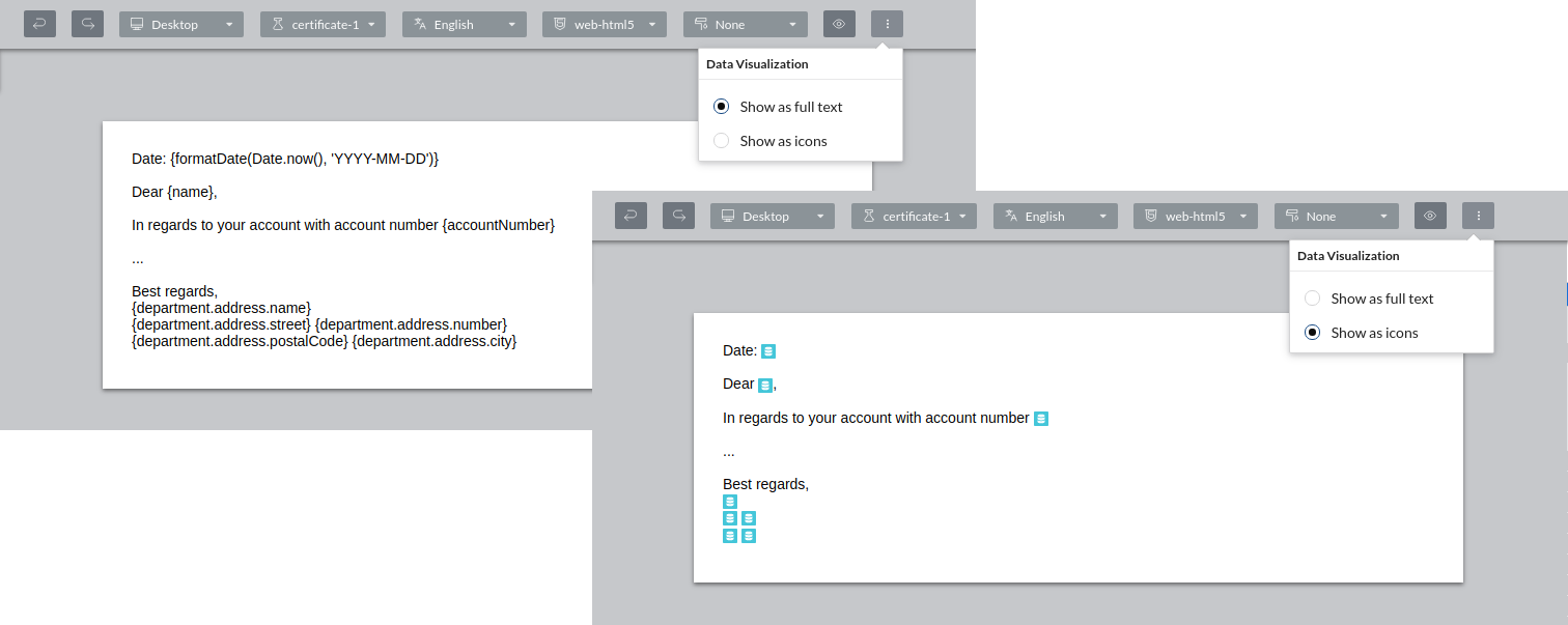
9.7. Visualizing data fields
When using data fields while designing your template you will see the full expressions by default. In cases where these expressions take up too much space or you want the data fields to be more noticeable, you can opt to show the data fields as icons instead.
To show data fields as icons click the more options button next to the preview button and select Show as icons under Data Visualization.
Your choice will be remembered for your user account.
10. Using styles and themes in a template
Communications as developed by Web Designer and other Scriptura Design components have two main aspects:
-
The actual content of the communication i.e. the text, images and other content such as video or audio.
-
The presentation of the content of the communication i.e. the fonts, colors, borders, margins, the background to use and so on. This aspect is handled by the Web Designer styles and themes.
Given the fact that a communication can be delivered over different channels such as email, SMS and/or printed publication, it is important to be able to manage content and the presentation of the content separately. A presentation developed for email delivery might be unpractical for use in SMS delivery.
Apart from handling the presentation aspect, Web Designer styles can optionally be used to add content to the template to which they are applied. This mechanism is often used to introduce mandatory corporate communication elements such as a company logo and a standard footer since content added through the application of a style cannot be removed using the standard Web Designer procedure.
Web Designer styles can be grouped in a logical collection. Such a collection of styles is called a theme.
Theme and style development is done outside of Web Designer but Web Designer can make use of themes as long as they have been registered for use by Web Designer.
As a Web Designer user, you can select a theme for use on your template and subsequently you can apply one or more styles included in the selected theme on the objects used in the template. By doing so you can make sure your communications have the required presentation and any mandatory corporate content if needed.
10.1. Using inline styles in a theme
|
If you are developing a theme, make sure any HTML elements that are added are not using the |
10.2. Managing the themes drop-down list
To manage the themes made available to you for selection via the drop-down list do the following:
-
Click the themes drop-down list and click Manage…
 Figure 94. Click the themes drop-down list
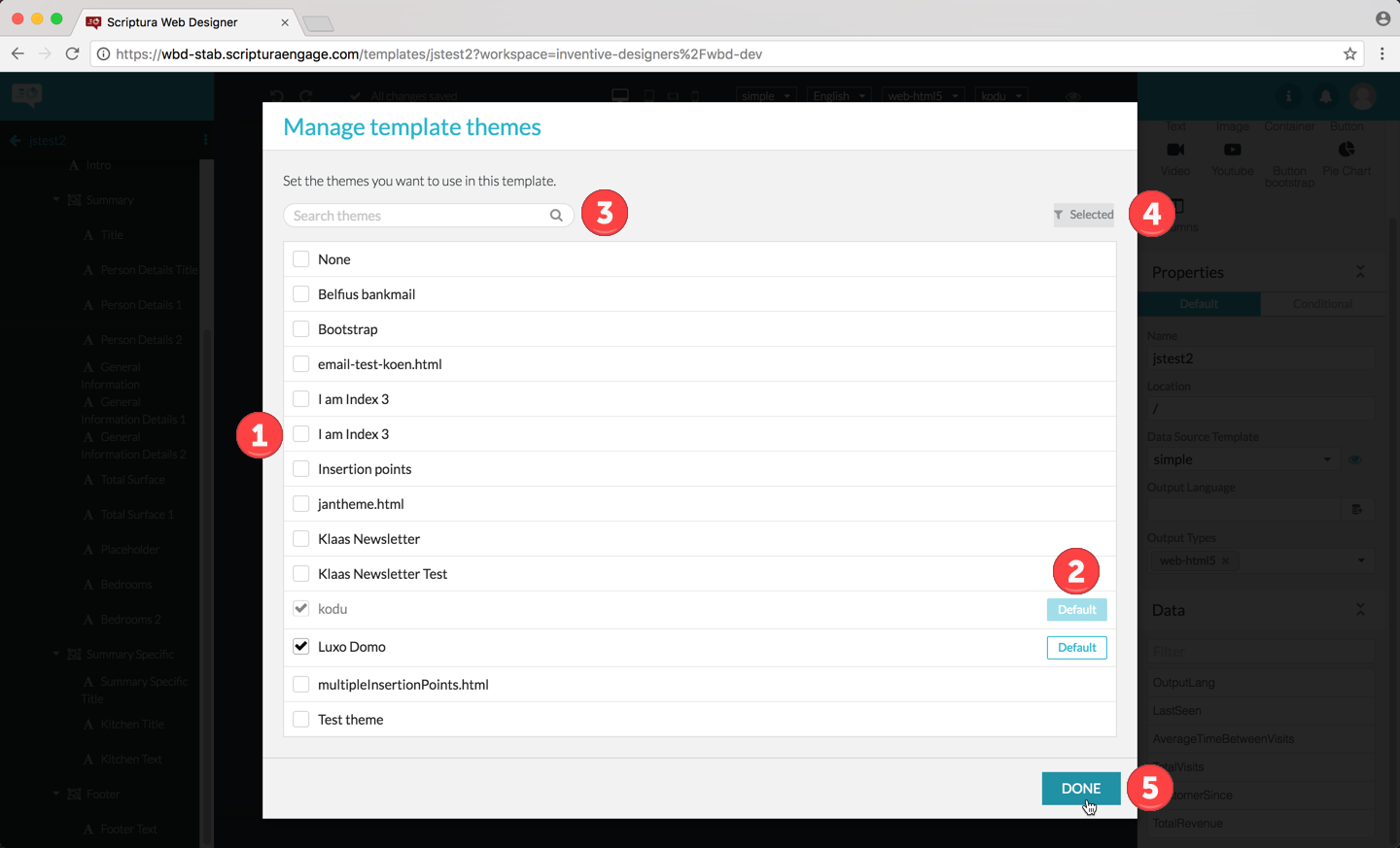 Figure 95. The Manage template themes dialog box
1 Use the checkboxes for selecting the themes you want to see in the drop-down list. A selected checkbox indicates that the corresponding theme should be included in your drop-down list. 2 Select the theme to use by default by your template by clicking the corresponding Default button. 3 Optionally: search for themes on basis of their name. 4 Optionally: display only the selected themes or display all available themes. 5 Confirm your selection by clicking the DONE button.
|
If the theme you would like to use is not in the list presented by the Manage template themes dialog box you will have to verify with your IT organization if the theme you would like to include in the list has been registered for use by Web Designer. |
10.3. Selecting a theme
To select the theme your template should use, do the following:
-
Select the theme you want to use, using the rightmost drop-down list in the toolbar.
After selecting the theme, the styles grouped in the theme are made available for application to the template objects.
|
If the theme you would like to select is not in the drop-down list check section Managing the themes drop-down list. |
10.4. Applying a style to an object
After selecting the theme, you are now ready to apply one or more styles included in the theme to your template objects:
-
Select the object to which you want to apply a style by clicking on the object in the object outline or by clicking the object on the template.
-
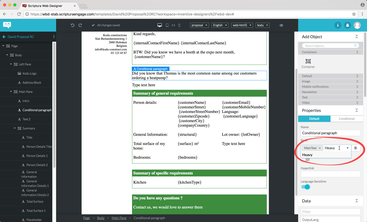
In the properties panel to the right, type in the name of the style you want to apply to the selected object in the style field and hit Enter. You can apply multiple styles if you want. Remove styles from the list of styles to be applied by clicking the icon in the corresponding style label.
10.5. Previewing your template
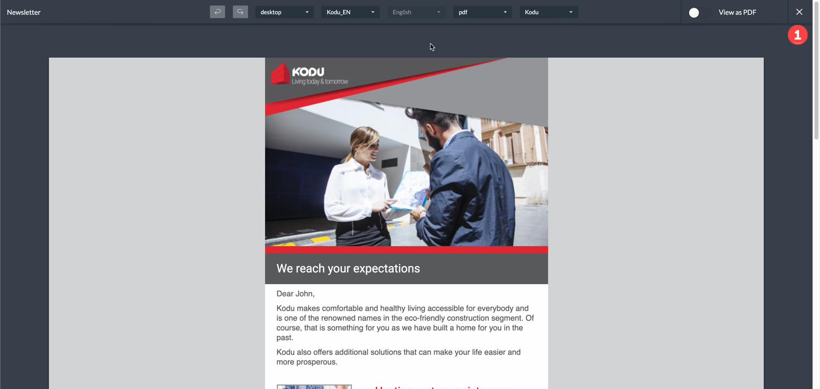
You can easily check the styling of your template by previewing it:
| 1 | Select the target output device. |
| 2 | Select the target output type. |
| 3 | Click the icon. |
| 1 | When ready click the icon to return to the design page. |
10.6. PDF preview
You can preview your templates as PDF via the Web Designer. There are a few prerequisites before PDF preview works for your project.
-
The Xribe runtime is enabled. Please contact support if you need to activate this.
-
The output type set to PDF. See Managing the template properties for more information
You can view your template as PDF when this is done by toggling the View as PDF button while you are in preview mode
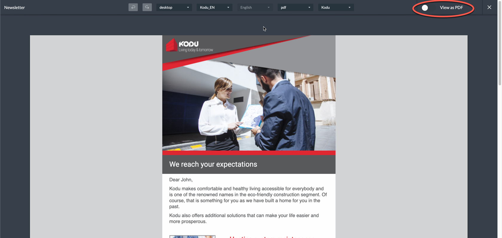
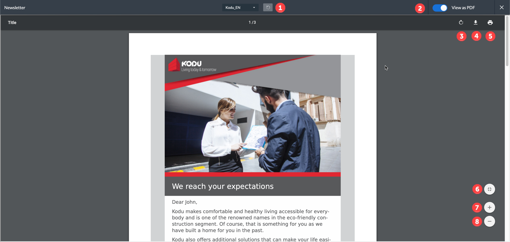
| 1 | Generate the preview again |
| 2 | Return to the normal preview |
| 3 | Rotate PDF |
| 4 | Download PDF |
| 5 | Print PDF |
| 6 | Fit to screen |
| 7 | Zoom in |
| 8 | Zoom out |
11. Multilingual templates
Web Designer supports the creation of multilingual objects.
This allows the objects to have a different content depending on the language selected. First you need to indicate what languages your current template should support.
11.1. Managing the supported languages list
The list of languages available for use by objects on your template is managed as follows:
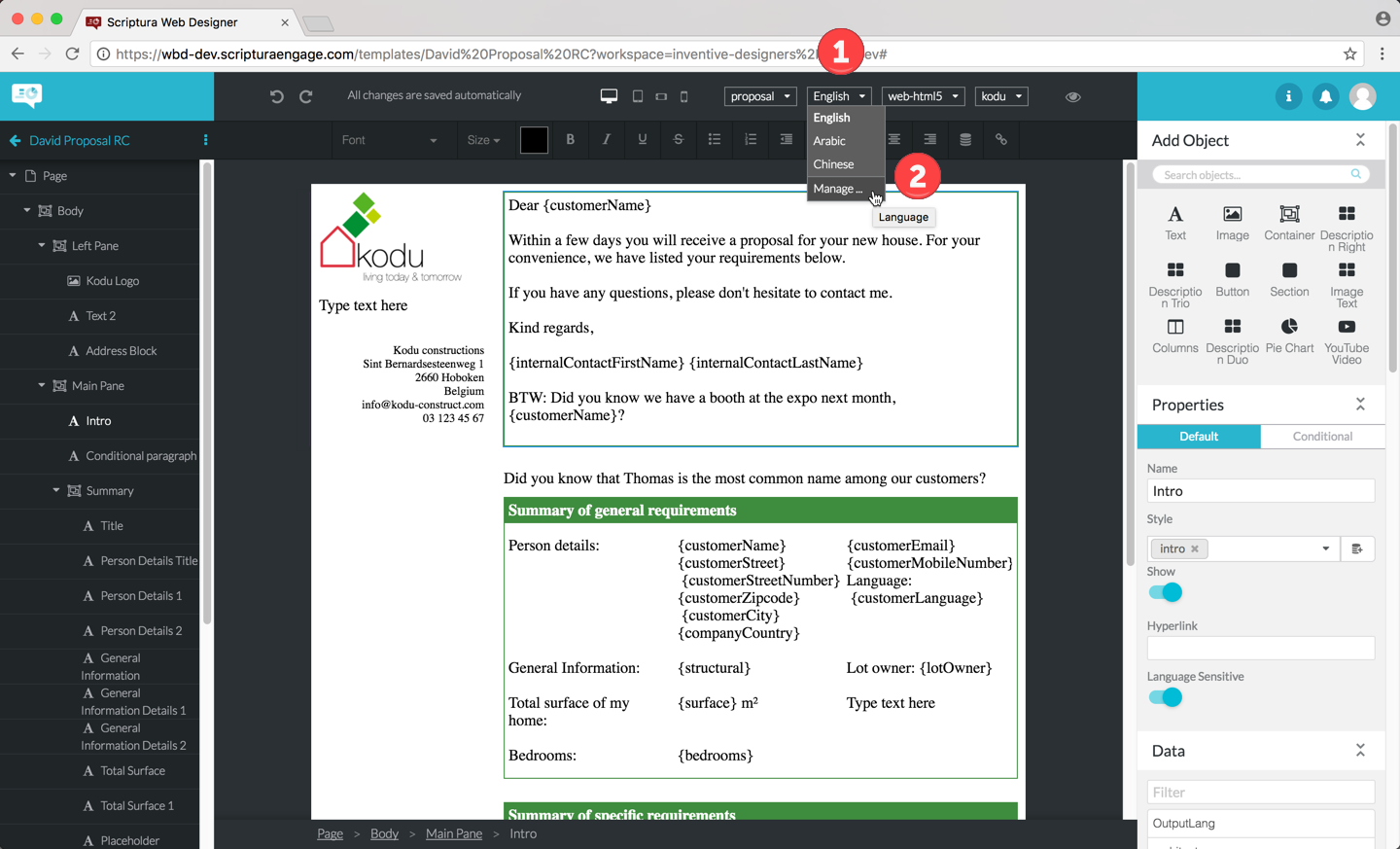
-
Click the language dropdown list at the top of the central area.
-
If the language(s) you need is not in the dropdown list yet click on Manage… to display the Languages dialog box.
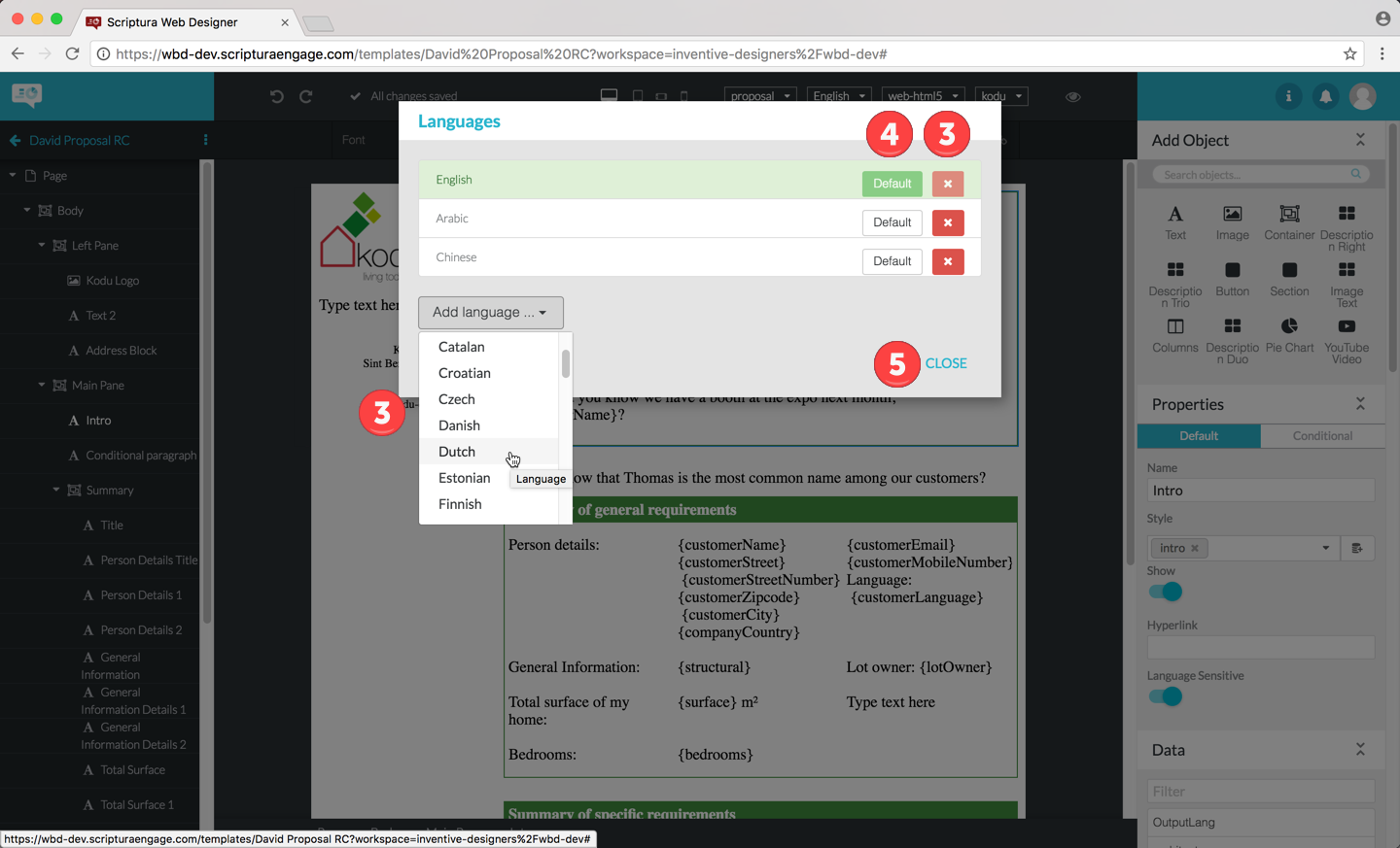 Figure 101. The Languages dialog box
 -
Languages can now be added via the Add language… button and removed via the X button next to the language you want to remove from the list.
-
If necessary (re)define the language to use as the default language by clicking the Default button next to the language.
The default language is the language used by an object when the Language Sensitive functionality is disabled i.e. the Language Sensitive slider is grey.
-
Click the CLOSE button to confirm your choice
Switching on multilingual support for an object is done as follows:
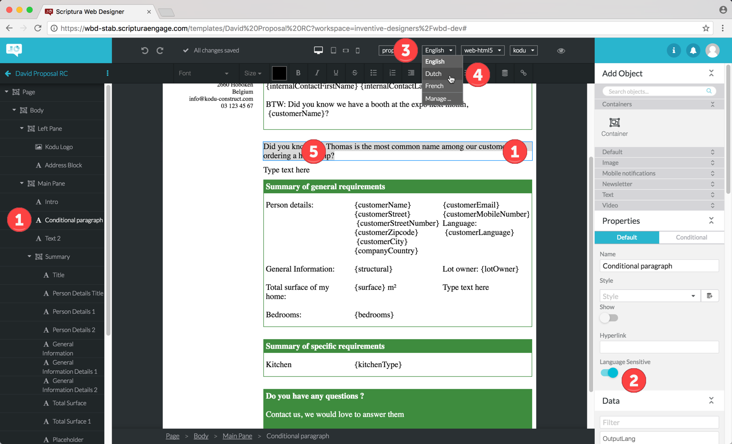
| 1 | Select the object in the outline in the lefthand area of the design page or by clicking the object on the template. |
| 2 | Slide the Language Sensitive slider to the right to activate multilingual support for the object. The slider is displayed in blue when active. |
| 3 | Click the Language dropdown menu to display the currently supported languages for the chosen object. |
| 4 | Choose the language for which you want to supply content. If you don’t see the language you need, then add the language using the procedure mentioned at the start of this section. |
| 5 | Add the content using the standard procedure. |
|
Language sensitivity is an object property so you will have to repeat this procedure per object for which you want to define content in multiple languages. |
|
Text objects are language sensitive by default. |
11.2. Managing the Output Language template property
The Output Language template property is used to define the language to be used when generating output based on this template. The property value should result in a 2 character ISO 639-1 language code. The property value is case insensitive.
| Language | ISO 639-1 Code |
|---|---|
Afar |
aa |
Abkhazian |
ab |
Avestan |
ae |
Afrikaans |
af |
Akan |
ak |
Amharic |
am |
Aragonese |
an |
Arabic |
ar |
Assamese |
as |
Avaric |
av |
Aymara |
ay |
Azerbaijani |
az |
Bashkir |
ba |
Belarusian |
be |
Bulgarian |
bg |
Bihari languages |
bh |
Bislama |
bi |
Bambara |
bm |
Bengali |
bn |
Tibetan |
bo |
Breton |
br |
Bosnian |
bs |
Catalan |
ca |
Chechen |
ce |
Chamorro |
ch |
Corsican |
co |
Cree |
cr |
Czech |
cs |
Church Slavic |
cu |
Chuvash |
cv |
Welsh |
cy |
Danish |
da |
German |
de |
Divehi |
dv |
Dzongkha |
dz |
Ewe |
ee |
Greek, Modern (1453-) |
el |
English |
en |
Esperanto |
eo |
Spanish |
es |
Estonian |
et |
Basque |
eu |
Persian |
fa |
Fulah |
ff |
Finnish |
fi |
Fijian |
fj |
Faroese |
fo |
French |
fr |
Western Frisian |
fy |
Irish |
ga |
Gaelic |
gd |
Galician |
gl |
Guarani |
gn |
Gujarati |
gu |
Manx |
gv |
Hausa |
ha |
Hebrew |
he |
Hindi |
hi |
Hiri Motu |
ho |
Croatian |
hr |
Haitian |
ht |
Hungarian |
hu |
Armenian |
hy |
Herero |
hz |
Interlingua (International Auxiliary Language Association) |
ia |
Indonesian |
id |
Interlingue |
ie |
Igbo |
ig |
Sichuan Yi |
ii |
Inupiaq |
ik |
Ido |
io |
Icelandic |
is |
Italian |
it |
Inuktitut |
iu |
Japanese |
ja |
Javanese |
jv |
Georgian |
ka |
Kongo |
kg |
Kikuyu |
ki |
Kuanyama |
kj |
Kazakh |
kk |
Kalaallisut |
kl |
Central Khmer |
km |
Kannada |
kn |
Korean |
ko |
Kanuri |
kr |
Kashmiri |
ks |
Kurdish |
ku |
Komi |
kv |
Cornish |
kw |
Kirghiz |
ky |
Latin |
la |
Luxembourgish |
lb |
Ganda |
lg |
Limburgan |
li |
Lingala |
ln |
Lao |
lo |
Lithuanian |
lt |
Luba-Katanga |
lu |
Latvian |
lv |
Malagasy |
mg |
Marshallese |
mh |
Maori |
mi |
Macedonian |
mk |
Malayalam |
ml |
Mongolian |
mn |
Marathi |
mr |
Malay |
ms |
Maltese |
mt |
Burmese |
my |
Nauru |
na |
Bokmal, Norwegian |
nb |
Ndebele, North |
nd |
Nepali |
ne |
Ndonga |
ng |
Dutch |
nl |
Norwegian Nynorsk |
nn |
Norwegian |
no |
Ndebele, South |
nr |
Navajo |
nv |
Chichewa |
ny |
Occitan (post 1500) |
oc |
Ojibwa |
oj |
Oromo |
om |
Oriya |
or |
Ossetian |
os |
Panjabi |
pa |
Pali |
pi |
Polish |
pl |
Pushto |
ps |
Portuguese |
pt |
Quechua |
qu |
Romansh |
rm |
Rundi |
rn |
Romanian |
ro |
Russian |
ru |
Kinyarwanda |
rw |
Sanskrit |
sa |
Sardinian |
sc |
Sindhi |
sd |
Northern Sami |
se |
Sango |
sg |
Sinhala |
si |
Slovak |
sk |
Slovenian |
sl |
Samoan |
sm |
Shona |
sn |
Somali |
so |
Albanian |
sq |
Serbian |
sr |
Swati |
ss |
Sotho, Southern |
st |
Sundanese |
su |
Swedish |
sv |
Swahili |
sw |
Tamil |
ta |
Telugu |
te |
Tajik |
tg |
Thai |
th |
Tigrinya |
ti |
Turkmen |
tk |
Tagalog |
tl |
Tswana |
tn |
Tonga (Tonga Islands) |
to |
Turkish |
tr |
Tsonga |
ts |
Tatar |
tt |
Twi |
tw |
Tahitian |
ty |
Uighur |
ug |
Ukrainian |
uk |
Urdu |
ur |
Uzbek |
uz |
Venda |
ve |
Vietnamese |
vi |
Walloon |
wa |
Wolof |
wo |
Xhosa |
xh |
Yiddish |
yi |
Yoruba |
yo |
Zhuang |
za |
Chinese |
zh |
Zulu |
zu |
To manage this template property proceed as follows:
-
Select the template by clicking:
-
just above the top edge of the template or
-
just to the left of the left edge of the template or
-
just to the right of the right edge of the template as indicated in the following figure:
Figure 103. Selecting the template
-
-
You can now view and/or change the Output Language property of the template by simply picking up the language from the data model associated with the template by clicking the
icon and selecting the field to be used.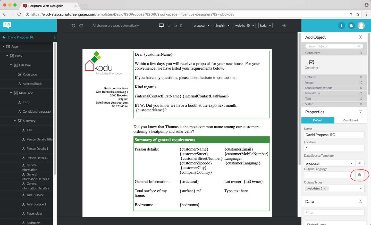 Figure 104. Clicking the icon
 -
Select the field to be used and click INSERT to confirm your choice or CANCEL to cancel this operation and return to the template design page.
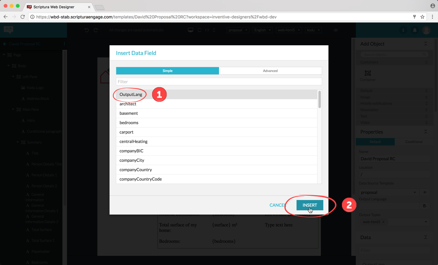 Figure 105. Selecting the field to be used
12. Application settings
12.1. Access Application Setting
In order to define tags for a project, click on the application setting icon located in the WebDesigner application top bar. Note that in order to edit the Application Settings, the user needs the ‘configuration:app:webdesigner’ permission.
12.2. Managing tags
Initially a project will not have any tags configured. To set up tags for a project, add a tag config as shown below:
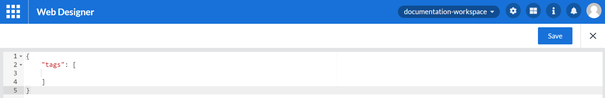
 "tags": [
        {
            "id": "Department",
            "name": {
                "en": "Department"
            },
            "type": "string",
            "value": {
                "options": [
                    {
                        "id": "humanresource",
                        "name": {
                            "en": "Human Resource"
                        }
                    },
                    {
                        "id": "Operation",
                        "name": {
                            "en": "Operation"
                        }
                    },
                    {
                        "id": "finance",
                        "name": {
                            "en": "Finance"
                        }
                    },
                    {
                        "id": "marketing",
                        "name": {
                            "en": "Marketing"
                        }
                    }
                ]
            }
        },
        {
            "id": "description",
            "name": {
                "fr": "Description",
                "en": "Description"
            },
            "type": "string"
        },
        {
            "id": "keyword",
            "name": {
                "en": "Keyword"
            },
            "type": "string"
        }
    ]
The above config will result in the following tag properties:
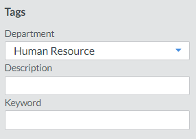
The first tag value in the predefined list is the default tag value when a new template is created.
Currently, the WebDesigner only supports:
-
English (‘en’) as default value for tag name
-
‘string’ type for tag values
12.3. Disable legacy text object by default
A project defines the default mode of new text objects. To disable the legacy mode by default add the following configuration in the Application Settings as below:
"designer": {
        "text-object": {
            "legacy-is-default": false
        }
    }
By changing this, it will be applied to new text objects and does not affect the existing text objects in the project.
12.4. Managing objects and content blocks display type
panel-display-type property affects the way objects and content blocks items are displayed in the template editor. You can set its value to either grid or list
"designer": {
        "text-object": {
            "legacy-is-default": false
        },
        "panel-display-type": "list"
    }
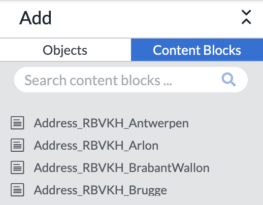
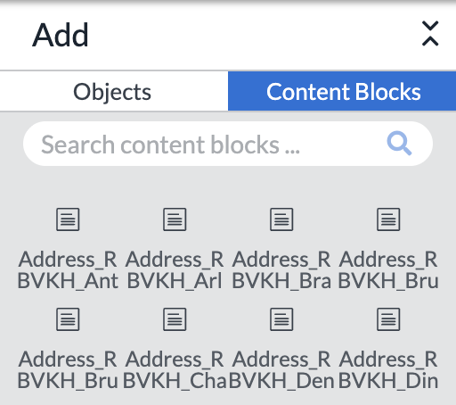
13. Saving templates
13.1. Saving your template
As also mentioned in section The central area, the Web Designer automatically saves your work. When you try to leave the Web Designer while you still have outgoing changes (for instance when you lost your internet connection), you will see the following dialog:
13.2. Saving a template as a master template
In order for your template to be saved as a master template, you need to:
-
Click the icon to the right of the template name
-
Click the Save as master… menu entry
From now on your template is flagged as a master and will be saved as such.
A banner clearly indicates you are now editing a master template.
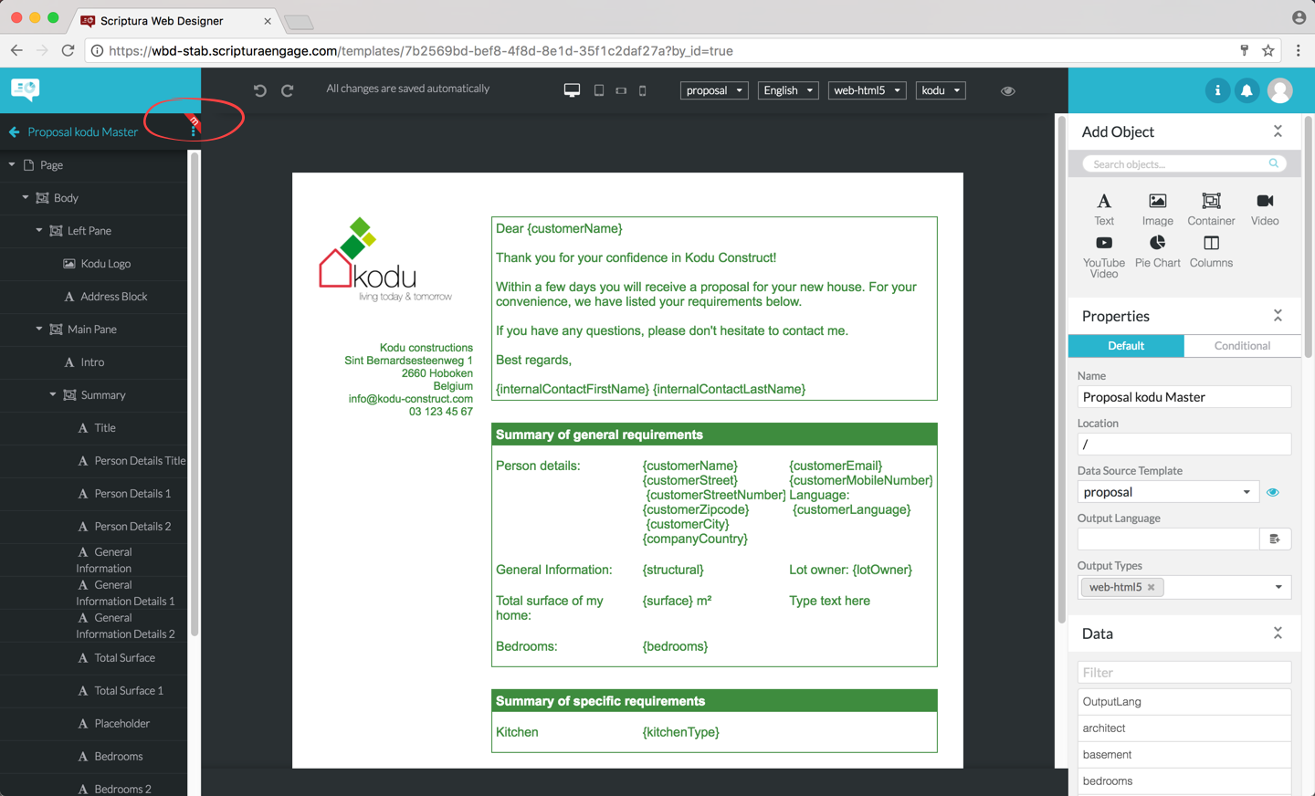
Glossary
- Browse page
-
The Web Designer browse page allowing you to either open an existing template for editing or create a new template on basis of a master template or starting from scratch. Available templates are displayed as a set of tiles.
- CDN
-
Content Delivery Network. A content delivery network is a globally distributed network of proxy servers deployed in multiple data centers. The goal of a CDN is to serve content to end-users with high availability and high performance.
- Container object
-
A container object is used to group other objects. This can be done for logically organizing the content of the template in for example header, footer and body. Container objects can also be used for managing properties such as the style not on an object-by-object basis but on multiple objects simultaneously.
- Data Model
-
A Data Model (DST) defines the structure of the data to be used by a template. The structure is defined in terms of one or more sample inputs which are then used to generate a Data Model. This Data Model can also be used during output generation where it will transform the input data to the structure defined by the model.
- Data field
-
A data field represents a dynamic element on a template or in an object property. When merging a template and the data from the data model, data fields are replaced with data extracted from the data model associated with the template being processed. Data fields are easily recognized: a data field is displayed as a symbolic name enclosed in {} characters such as {CustomerID}.
- Design page
-
The Web Designer design page used for designing a template.
- Dynamic text
-
Text defined at the time when a template is merged with data from a data model. Dynamic text is not defined when designing the template. It consists of a data field in the template which is replaced with actual text during subsequent processing of the template and the data. See also: Static text.
- Image object
-
The image object type allows you to include images and/or pictures in your template. The file representing the image needs to be in a format recognized by your web browser.
- Master template
-
A template that is used as the starting point for a new template.
- oAuth
-
OAuth is an open standard for authorization, commonly used as a way for Internet users to authorize websites or applications to access their information on other websites but without giving them the passwords.
- Object
-
Objects define the content of a template. Objects have a number of editable properties defining the behavior of the object. Standard object type supported by Web Designer include text, image and container objects. Additional objects can be made available if needed.
- Panel
-
The righthand area consists of a number of panels. From to top to bottom: the Add Objects panel for adding objects to the template, the Images panel for adding images from the image library to the panel, the Properties panel for managing the properties of objects and the Data panel for adding data fields to the template.
- Pluggable object
-
A custom object type that is used to support content types not covered by the built-in objects.
- Design & Compose Resource Server
-
The server on which your templates are saved.
- Static text
-
Text defined during the design of a template. Static text is not altered by the merging of a template and data from a data model. See also Dynamic text.
- Style
-
A collection of settings that control how template elements are to be displayed on screen, paper, or in other media. Styles can be applied to individual objects or to a template.
- Template
-
An electronic document containing static and/or dynamic objects that is used to generate output such as emails, web pages or PDF files.
- Text object
-
A basic object type allowing you to add static and/or dynamic text to your template.
- Theme
-
A theme is a collection of styles. As such a theme and its styles are used to define the look and feel of the objects on a template and can optionally also include HTML content such as a corporate logo for example.
- Tile
-
A graphical representation of a template used on the WEB Designer browse page.
- URL - Uniform Resource Locator
-
A Uniform Resource Locator (URL), commonly informally called a web address is a reference to a web resource that specifies its location on a computer network and a communication language for retrieving it.